

Shadcn UI Blocks & Examples
A library of 83 ready to use Shadcn UI blocks and examples: admin dashboards, landing pages, e-commerce layouts, forms, and full page templates. Every block is built with Shadcn UI components and Tailwind CSS, ships in React, Vuejs, and Svelte versions, and supports dark and light themes. Preview any block live, copy the source code, or install it with the shadcn CLI.
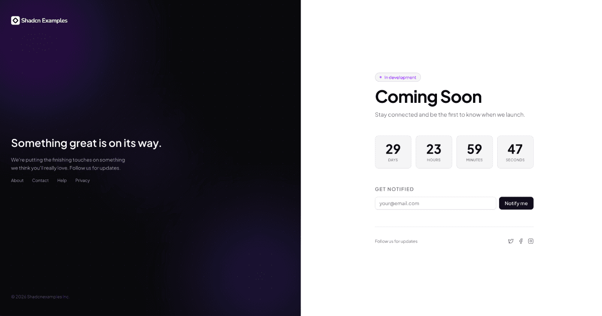
Coming Soon Pages
1 exampleComing Soon Pages is a collection of pre-launch page blocks for announcing an upcoming product or website. The blocks pair Shadcn UI inputs and buttons with Tailwind visuals such as gradients, countdown timers, and social links to capture early interest. Built in React, with matching Vuejs and Svelte versions.
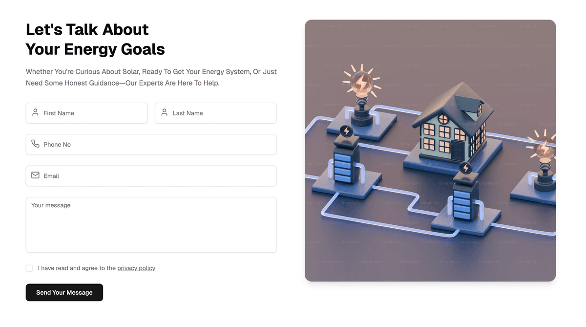
Contact Pages
1 exampleContact Pages is a collection of full-page contact blocks for letting visitors reach a business or team. Each block combines Shadcn UI form components with a Tailwind layout, pairing message forms with supporting content like imagery or contact details. They work out of the box in React projects, and every block also ships in Vuejs and Svelte versions.
Resume/CV Templates
1 exampleResume CV Templates is a collection of resume and CV page blocks for presenting work experience, skills, and education in a clean, professional layout. Each template is composed from Shadcn UI components and Tailwind utility classes, so typography and spacing stay consistent in light and dark themes. Every template comes in React, Vuejs, and Svelte versions.
Dashboard Layouts
1 exampleDashboard Page Layouts is a collection of admin layout blocks that provide the structural shell for dashboard applications, including sidebars, headers, and content areas. Each layout is assembled from Shadcn UI components with responsive Tailwind grids, so panels and navigation adapt cleanly from mobile to desktop. They serve as ready starting points for admin panels, shipping in React, Vuejs, and Svelte versions.
Directory lists
1 exampleDirectory Lists is a collection of listing blocks for browsing structured collections of people, companies, or resources. Each block pairs Shadcn UI cards, avatars, and inputs with Tailwind layouts to support searching, filtering, and scanning long lists. All the blocks are available in React, Vuejs, and Svelte versions.
Empty States
1 exampleEmpty States is a collection of placeholder UI blocks shown when a screen has no data, content, or search results to display. Each block uses Shadcn UI's Empty component primitives with Tailwind styling to pair an icon or illustration with a clear title, description, and optional action. Drop them into React apps wherever lists or dashboards can be empty, or use the matching Vuejs and Svelte versions.
Error Pages
1 exampleError Pages is a collection of full-page blocks for HTTP error screens like 404 not found, 503 service unavailable, and restricted access. Each page uses Shadcn UI components and Tailwind typography to explain the problem clearly and route users back to safety with a prominent action. Built for React and Next.js error boundaries, with Vuejs and Svelte versions available for other routers.
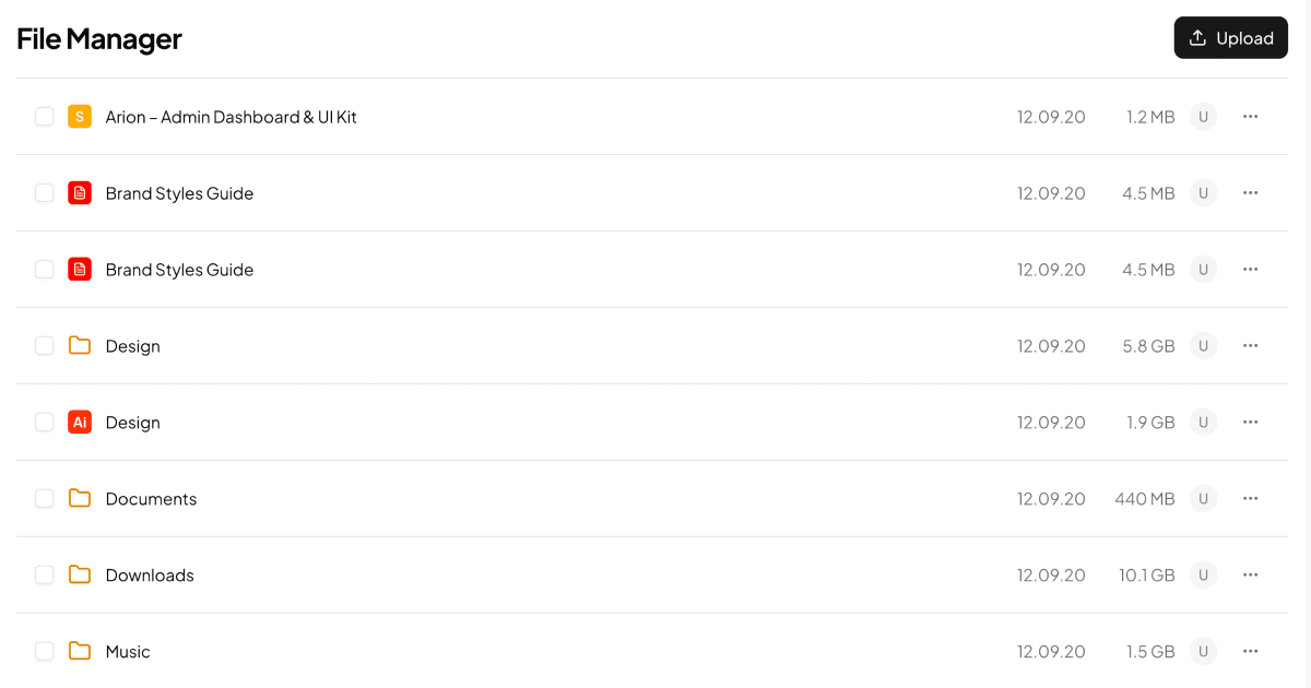
File Manager Apps
1 exampleFile Managers is a collection of app-style blocks for browsing, organizing, and uploading files and folders. Each block combines Shadcn UI components like breadcrumbs, dropdown menus, sheets, and checkboxes with Tailwind layouts to support navigation, sorting, and bulk actions. Each block ships in React, Vuejs, and Svelte versions.
File Upload Forms
1 exampleFile Upload Forms is a collection of form blocks that let users select and submit files from their device. Each block builds on Shadcn UI inputs, buttons, and progress components with Tailwind styling, covering patterns like drag and drop zones, file lists, and upload feedback. Ready for React forms, with matching Vuejs and Svelte versions.
Hero sections
1 exampleHero Sections is a collection of landing page blocks for the first screen visitors see, pairing bold headlines with supporting copy and calls to action. Each block is assembled from Shadcn UI components and Tailwind utilities, so typography, spacing, and dark mode stay consistent out of the box. Every block comes in React, Vuejs, and Svelte versions built on the same design.
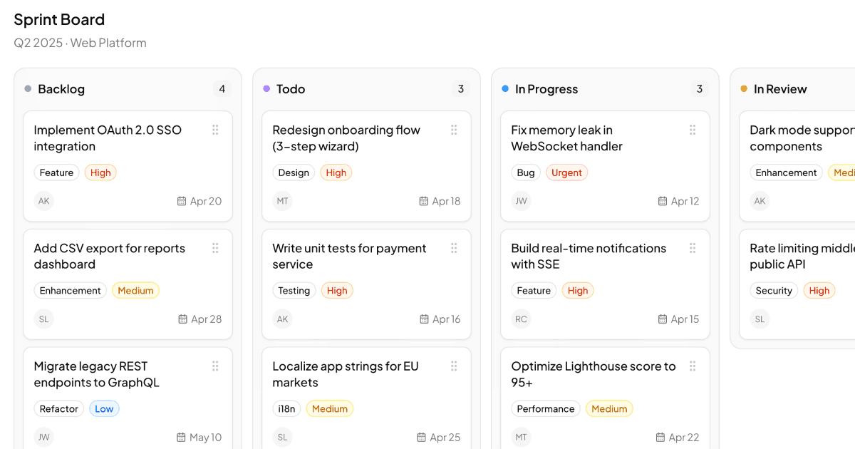
Kanban Boards
1 exampleKanban Boards is a collection of project management blocks for tracking tasks as cards moving across workflow columns. The boards are built with Shadcn UI components, styled with Tailwind, and wired up with dnd-kit for smooth drag and drop between columns. Everything is available in React, Vuejs, and Svelte versions.
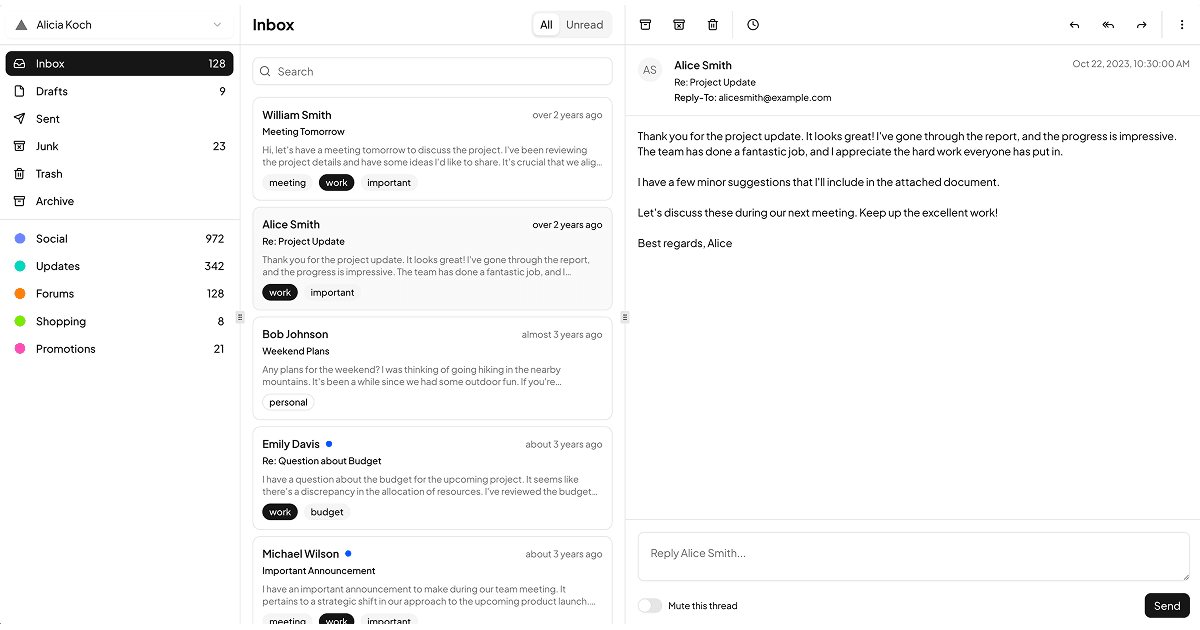
Mail Apps
1 exampleMail Apps is a collection of email client blocks for building inbox interfaces inside a web application. The layouts use Shadcn UI components and Tailwind to combine navigation sidebars, message lists, and reading panes into one cohesive app shell. Each layout comes in React, Vuejs, and Svelte versions.
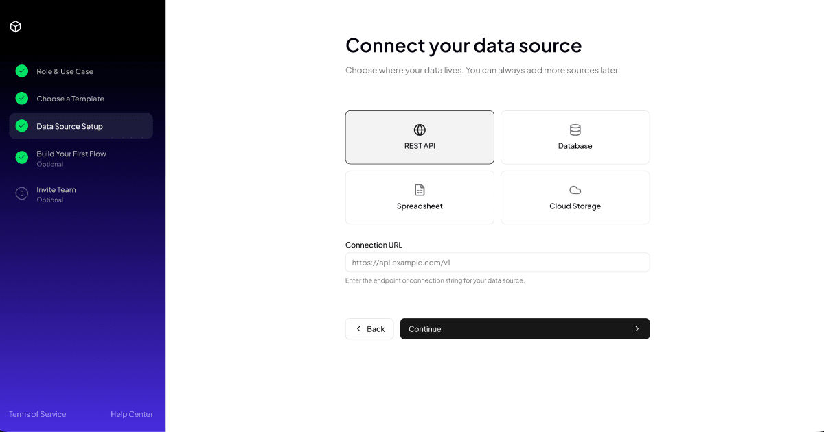
Multi Step Forms
1 exampleMulti Step Forms is a collection of wizard blocks that split long forms into a sequence of smaller, focused steps. Each flow pairs a step navigation sidebar with Shadcn UI form components and Tailwind layouts, keeping progress visible from start to finish. All of them are available in React, Vuejs, and Svelte versions.
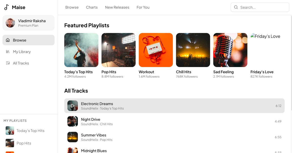
Music Apps
1 exampleMusic Apps is a collection of audio streaming blocks for building players, libraries, and browsing screens. The interfaces combine Shadcn UI components with Tailwind styling to cover sidebars, playlists, track lists, and persistent player bars. Everything ships in React, Vuejs, and Svelte versions.
Media Galleries
1 exampleMedia Galleries is a collection of layout blocks for displaying images, videos, and other media in an organized grid. Each gallery uses Shadcn UI components and responsive Tailwind columns to keep thumbnails, captions, and previews tidy across screen sizes. Available in React, Vuejs, and Svelte versions built on the same design.