

Inside the Event Calendar Block
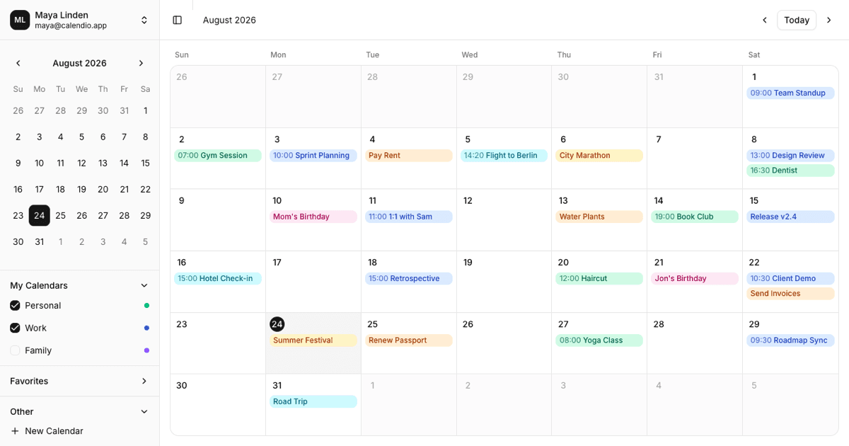
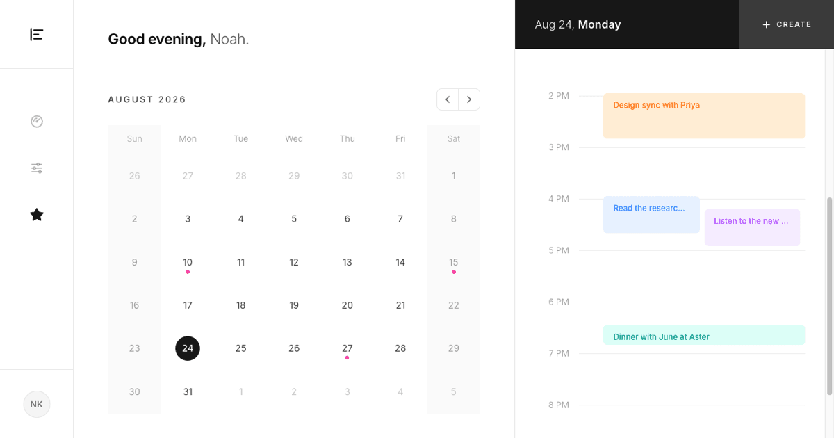
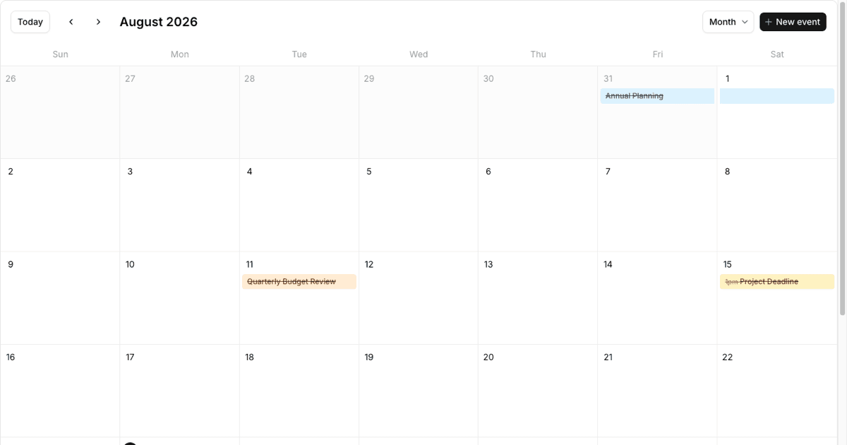
An event calendar is an interface for viewing and managing scheduled items across time, and this block delivers a genuinely full-featured one: month, week, day, and agenda views, switchable from a Shadcn UI dropdown that also responds to keyboard shortcuts. Events carry titles, descriptions, locations, color coding, and either timed ranges or all-day flags.
Interaction goes well beyond display. Events can be dragged between days and time slots, created by clicking empty cells, and edited or deleted through a dialog. A current time indicator tracks the present moment in the time-based views, and an events popup expands days that hold more entries than the month cell can show.
Scheduling Scenarios It Handles
Booking and appointment products are the most direct fit: clinics, salons, and consulting tools all need day and week views with draggable rescheduling. Team-facing software uses the same block for editorial calendars, shift planning, and sprint ceremonies, and it complements a kanban board by answering when, where the board answers what.
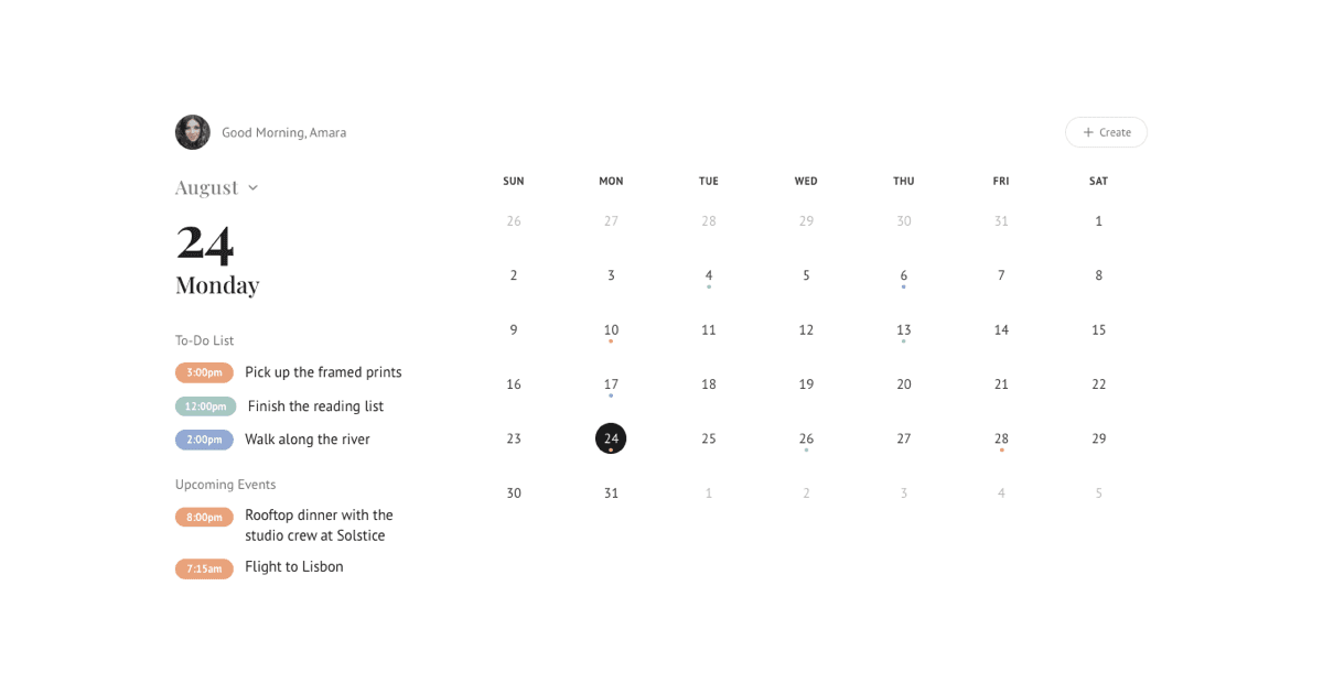
The agenda view widens the audience further. Event-driven products such as conference apps and community platforms often lead with a chronological list rather than a grid, and roadmap-adjacent tools can pair the calendar with timeline blocks for longer horizons.
Under the Hood: dnd-kit, date-fns, and Sonner
Drag and drop is powered by dnd-kit, with a dedicated calendar drag context, draggable event components, and droppable cell components coordinating moves between days and fifteen-minute time slots. Date arithmetic, adding days, comparing intervals, measuring durations in minutes, runs on date-fns, and user feedback after create, update, and delete actions appears as sonner toasts.
The code is organized as a set of focused React components: one file per view, plus the event dialog, event item, drag context, and popup, supported by hooks for the current time indicator and event visibility measurement. State is handled with React hooks throughout, so there is no store to configure and the sample events are easy to replace.
Four Views, One Component Set
The Shadcn UI surface area is broad: Button and dropdown menu drive navigation and view switching, Dialog hosts the event editor, and the editor itself uses Input, Textarea, Label, Select, Checkbox, RadioGroup for color selection, and Popover with the Calendar component for date picking. Icons come from lucide-react and Remix Icon.
The full calendar is available in React, Vuejs, and Svelte versions. The Vuejs and Svelte editions build on the shadcn-vue and shadcn-svelte ports, reproducing the same views, drag behavior, and dialog flow with framework-native components.
Matching the Calendar to Your Theme
Every surface references Shadcn UI design tokens, so the grid lines, cell hovers, and dialog chrome follow your globals.css variables in both light and dark mode. Event colors are a small utility-driven palette mapped through a helper function, which gives you one place to add brand categories or change the color set.
Behavioral tuning lives in a constants file: visible start and end hours, the default event duration, and agenda range are plain values you can edit. Because each view is its own component, removing a view or defaulting to week instead of month is a one-line change.
Getting the Calendar Into Production
Install with the shadcn CLI command shown at the top of the example page, in npm, pnpm, yarn, or bun form; it brings in the page, all view components, hooks, types, and utilities. Copying from the code tab works as well. Since this is a pro block, both paths unlock with an All Access plan, available via pricing.
To connect real data, replace the sample event array with events fetched from your API and persist the create, update, move, and delete callbacks back to it. The CalendarEvent type documents exactly which fields the views expect, so mapping your schema onto it is straightforward.