


Onboarding Flows in a Nutshell
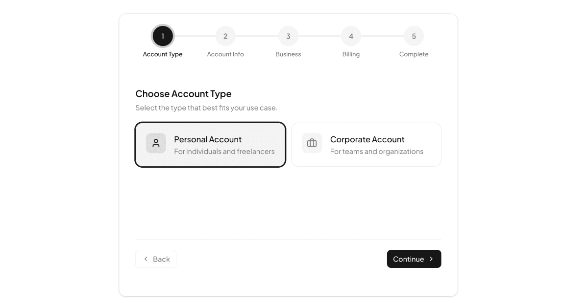
An onboarding flow is the guided sequence that turns a fresh signup into a configured account. The blocks in this collection implement a five-step wizard: choosing a personal or corporate account type, naming the team and picking a plan, entering company details with an industry select, adding billing information, and finishing on a completion screen. A step indicator with numbered circles and connecting lines keeps progress visible the whole way.
The billing step is unusually complete for a UI block. The card number input formats itself into four-digit groups as you type, expiry month and year use selects, the CVV is length-limited, and a switch offers to save the card for future payments.
Two Variants, One Wizard
The collection contains two examples that share their logic. Onboarding Flow presents the wizard as a single centered card, a compact layout that drops into any page. Onboarding Flow with Cover splits the screen instead, pairing the same steps with a full-height cover photo, a dark overlay, and a corner logo for a branded first-run experience; the cover hides on small screens so the form takes over.
Because both variants read and write the same store, you can start with the centered card and graduate to the split-screen version, or use each in a different context, without rewriting any step logic.
Where Guided Signup Pays Off
Any product that needs more than an email and password benefits: SaaS platforms collecting team and billing details, marketplaces onboarding sellers, fintech apps gathering business information, and B2B tools distinguishing personal accounts from corporate ones. The account-type fork on step one is the key move, letting one flow serve both audiences.
For setup journeys that configure a product rather than an account, the neighboring multi step forms category applies the same stepped pattern to roles, templates, and data sources.
Zustand, Validation, and the Stack
Form data and navigation live in a Zustand store with a typed FormData interface, next and prev actions clamped to the valid step range, a field updater, and a reset. Keeping state outside the components means answers survive as users move back and forth between steps.
Validation runs per step in plain React before advancing: the team name is required on step two, company name and industry on step three, and the billing step checks the cardholder name, a full sixteen-digit number, expiry, and CVV, surfacing inline error messages when something is missing. Everything is styled with Tailwind and typed end to end.
Restyling the Flow with CSS Variables
The wizard uses design tokens throughout: primary for active step circles and buttons, muted for pending steps, border and background tokens for the card surfaces. Since those tokens are CSS variables in globals.css, your brand colors, radius, and dark mode support arrive automatically, and the step indicator's ring highlight follows your primary color.
The cover variant adds one branded surface, the image panel, which is a single component: swap the photo, adjust the overlay opacity, and replace the logo mark to make it yours.
Getting Started in React, Vuejs, or Svelte
Both variants install through the shadcn CLI command at the top of their example pages, with npm, pnpm, yarn, and bun tabs, or by copying the store, step components, and page from the code tab. These are pro blocks, so source and CLI access unlock with an All Access plan, described on the pricing page.
Each flow ships in React, Vuejs, and Svelte versions, the Vuejs and Svelte editions building on the shadcn-vue and shadcn-svelte ports of the same radio groups, selects, inputs, and switches. To ship it, submit the store's collected FormData to your API on the final step and hand card details to your payment provider's tokenization rather than your own backend.