

Two Blocks for a Complete Blog
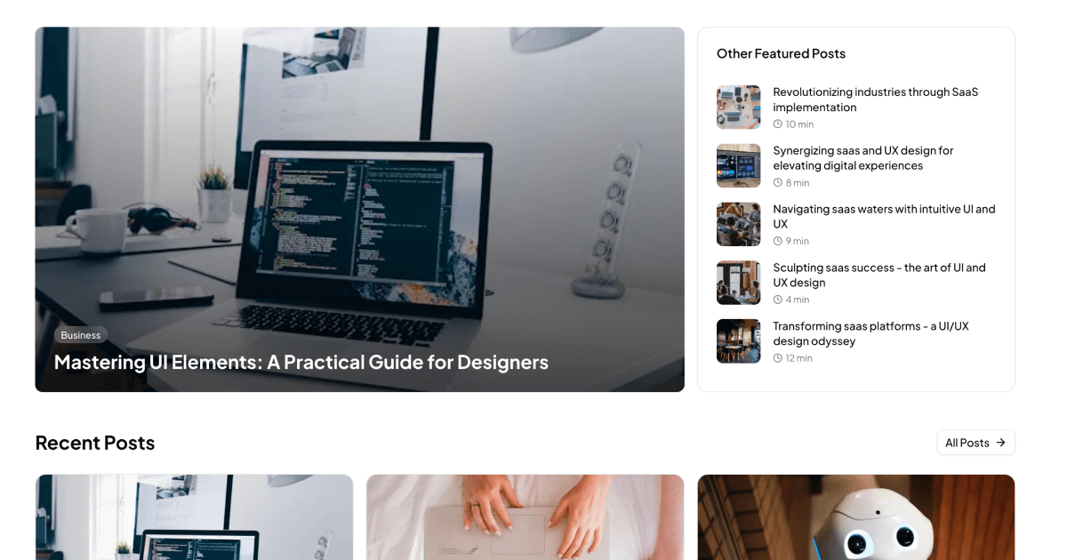
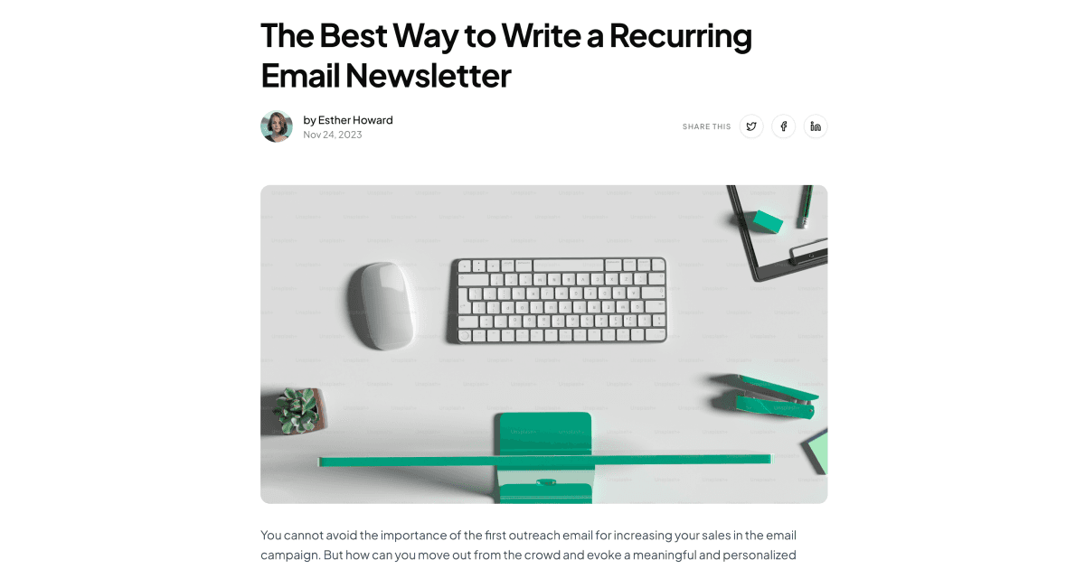
Blog Pages bundles the two screens every content site needs. The Blog Page block is a magazine-style home: a hero that spotlights the latest post over a gradient image overlay, a featured posts card beside it, and a responsive grid of recent post cards with author avatars, category badges, and dates. The Blog Detail Page block handles the reading experience: an article header with category, author, and publish date, clean typographic body content, and an interactive comment section where readers can like and reply.
Together they form a listing-to-article flow you can drop into a marketing site, a company blog, or a documentation hub, with both screens sharing the same Shadcn UI components so the transition between them feels seamless.
Content Sites That Fit These Pages
The listing block suits company blogs, news sections, and editorial sites where a strong featured story sets the tone. The detail block works for long-form articles, tutorials, and announcements, and its comment section makes it a fit for community-driven publications too.
These blocks also pair naturally with adjacent content patterns in the library. Product teams often run a blog for stories and a changelog page for structured release notes; using both keeps narrative content and version history in the right formats.
A Data-First Architecture
The listing page reads from a single typed data file of posts, sorted by date, so the hero automatically features the newest entry and the grid fills itself from the same array. Swapping in a CMS or database means replacing one import with your own fetch that returns the same shape, and TypeScript will flag any missing fields.
The detail page splits its concerns into small React components: a header, the article content, and a comment section driven by useState, which handles adding comments and toggling likes entirely on the client. Both blocks are styled with Tailwind spacing and typography utilities rather than any blog-specific framework, so nothing about them assumes a particular backend.
Typography, Tokens, and Theme Modes
Both pages draw every color from Shadcn UI CSS variables: card surfaces, muted metadata text, badge accents, and borders all resolve from globals.css. That keeps the blog consistent with the rest of your product and makes dark mode work without a separate stylesheet.
Customization mostly means content and rhythm. Adjust the Tailwind max-width on the article column to change the measure, restyle category badges with your accent tokens, or replace the hero gradient overlay with a flat brand color. Since posts carry their category and author data, the visual treatments update wherever a post appears.
The Shadcn UI Pieces Inside
The listing block composes Card, Badge, Avatar, and Button components with Lucide icons; the detail block adds Textarea for the comment form alongside the same avatar and badge primitives. Because these are unmodified registry components, they inherit any component-level theming you have already done.
Both blocks are available in React, Vuejs, and Svelte versions of the same design. The Vuejs and Svelte editions build on the shadcn-vue and shadcn-svelte ports, so multi-framework teams can keep one blog design across codebases.
Bringing Your Own Posts
The Blog Page listing is a free block: its code tab is open and the shadcn CLI command at the top of the page installs it with npm, pnpm, yarn, or bun. The Blog Detail Page is a pro block, unlocked with an All Access plan described on the pricing page.
Integration is intentionally boring. Install or copy the files, point the posts data at your CMS, markdown pipeline, or database, and route each card to your article URLs. For the detail page, wire the comment handlers to your API instead of local state when you are ready for persistence; the optimistic UI is already in place.