

Two Ways to Show Time: Timeline and Activity Feed
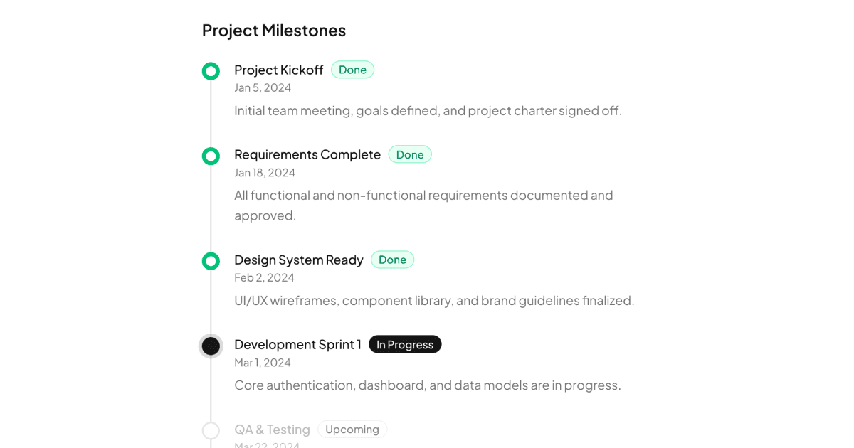
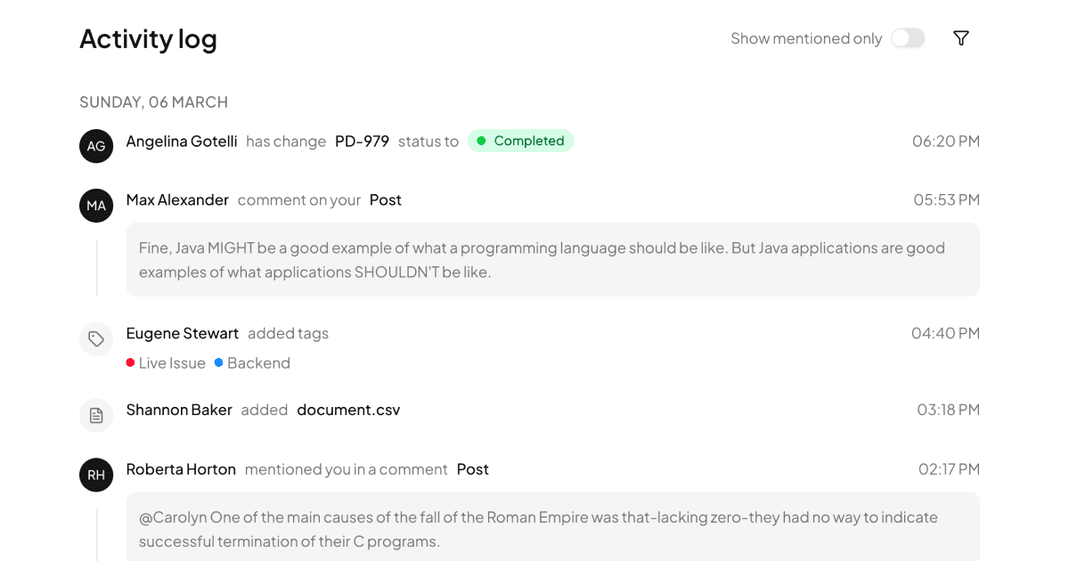
The Timelines collection contains two blocks that both put events in chronological order but tell different stories. Timeline is milestone-focused: a vertical spine that walks a project from kickoff to production release, with each node marked done, active, or upcoming and a recent activity list alongside. Activity Feed is people-focused: a stream of user events grouped under date headings, pairing avatars with entries for status changes, comments, mentions, tags, file uploads, and ticket assignments.
Choosing between them is a question of subject. Timeline answers where is the project; Activity Feed answers what has everyone been doing.
Picking the Right Variant for Your Product
Timeline suits anything with phases: project status pages, release plans, onboarding progress, order tracking, or the public side of a roadmap. Its done, active, and upcoming states communicate progress at a glance without any interaction.
Activity Feed belongs where history matters: audit trails in admin panels, team activity in collaboration tools, or a running record styled like a changelog for your team's work rather than your product's releases. Its date-grouped structure also translates directly to updates pages.
How Both Blocks Are Constructed
Both blocks are static server-rendered React components with no client state at all, which makes them among the lightest blocks in the library: no hydration cost, no effects, just markup from data arrays. Tailwind draws the connecting spine, node markers, and spacing, while lucide-react supplies the event icons.
Timeline uses Shadcn UI Badge components for milestone metadata. Activity Feed adds Avatar for actors, colored badges for event categories, and a Switch plus Button pair as filter and view controls above the list. Both blocks ship in React, Vuejs, and Svelte versions, with the Vuejs and Svelte editions built on the shadcn-vue and shadcn-svelte ports.
Tokens, Themes, and Dark Mode Support
The spine, node states, and badge colors are all expressed through the CSS variables in globals.css. Completed nodes lean on primary, upcoming ones on muted tones, and surfaces on background and border, so redefining the tokens rebrands both blocks at once. The dark values of those variables handle dark mode automatically, keeping the timeline legible on both themes without extra styling.
Because events are plain array entries, adding a new event type is just a new icon and badge mapping, and the token system keeps whatever colors you choose consistent across light and dark.
Bringing a Timeline Into Your Project
Each variant has its own shadcn CLI command at the top of its page, shown for npm, pnpm, yarn, and bun, and its full source in the code tab. Access differs by variant: Timeline is a pro block and Activity Feed is a premium block, and both unlock with an All Access plan, detailed on the pricing page.
Since neither block holds client state, integration is pure data mapping: transform your milestones or event log into the arrays the components render, sorted by date. Server components can fetch that data directly, making these blocks a natural fit for React Server Component architectures.