

What Counts as an Admin Dashboard Block?
An admin dashboard is the control room of a product: one screen where operators read metrics, scan records, and act on them without hopping between pages. In this collection, each dashboard is packaged as a full-page Shadcn UI block, meaning a complete layout of sidebar, header, and content panels that you can drop into an app and start editing, rather than a pile of loose components you have to assemble yourself.
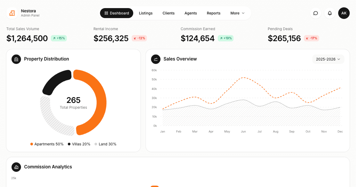
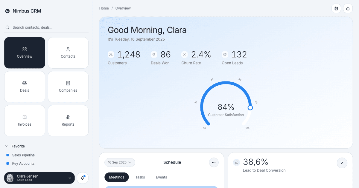
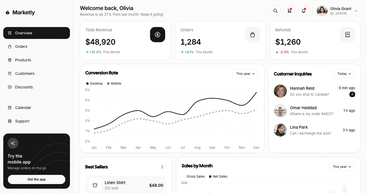
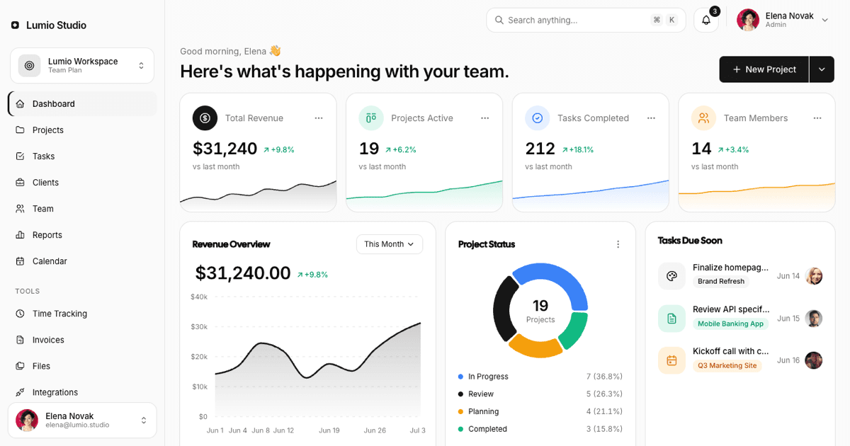
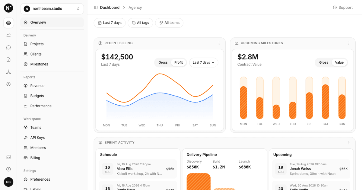
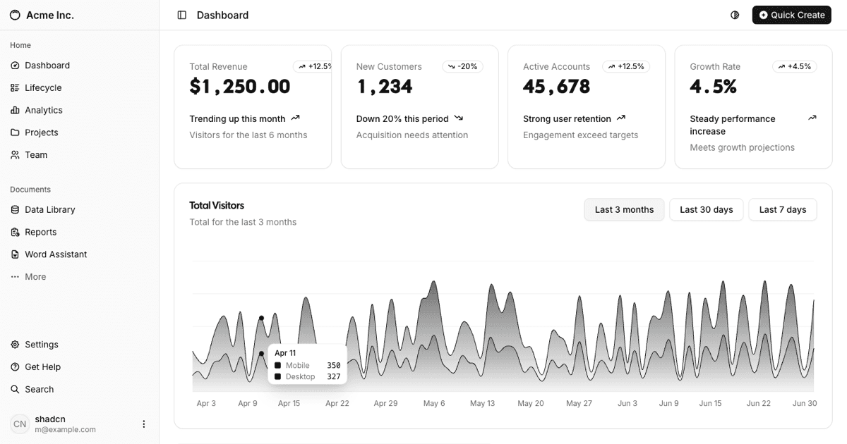
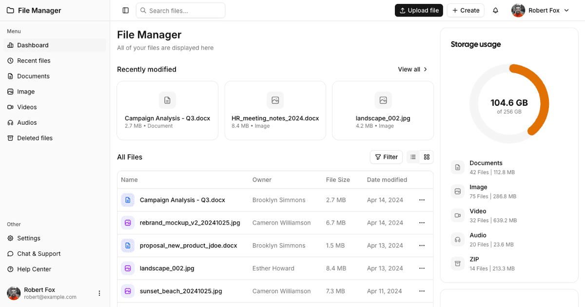
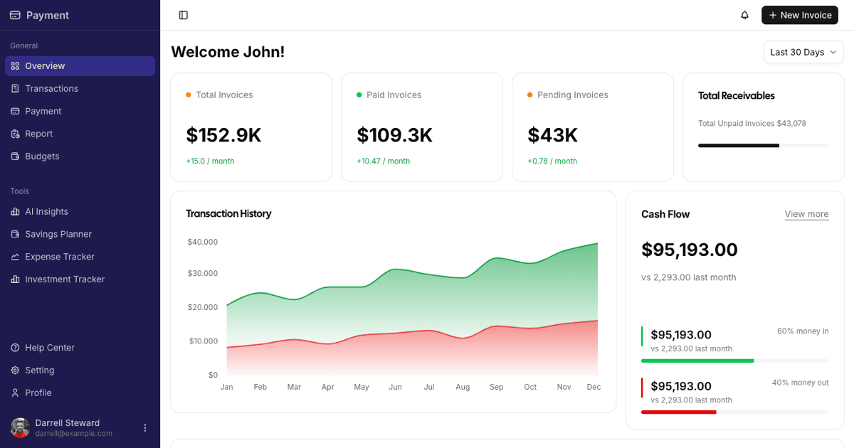
The collection currently holds three blocks. The Classic Dashboard tracks website analytics with stat summary cards, an interactive area chart, and a reorderable data table. The File Manager Dashboard turns the same shell into a file browser with a recent files row, an all-files table with per-row actions, and a storage usage panel. The Payment Dashboard leans into finance, framing stats cards, a cash flow chart, and a filterable invoices table inside a dark indigo sidebar.
Where These Layouts Earn Their Keep
Admin dashboards fit anywhere a team needs an internal view of live data: SaaS admin panels, analytics consoles, back offices for e-commerce stores, billing and invoicing tools, or content operations screens. Because each block is a complete page, they also work well as the authenticated home screen of a product, the first thing a user sees after login.
The three variants map to different starting points. Reach for the Classic Dashboard when metrics and tables are the core job, the File Manager Dashboard when your product deals in documents and storage, and the Payment Dashboard when invoices and cash flow drive the interface. If you want a lighter structural shell instead of a finished screen, the related dashboard page layouts category covers that ground.
The Stack Behind the Screens
All three blocks are React components styled with Tailwind utility classes on top of Shadcn UI primitives. Charts are rendered with Recharts through the Shadcn UI chart wrapper, which is how the analytics area chart, the storage panel, and the cash flow section all stay consistent with your theme. Tables are built on TanStack Table, giving the invoices table its filtering, sorting, and pagination and the analytics table its column model.
The Classic Dashboard goes further: its data table supports drag and drop row reordering through dnd-kit, its rows are typed with a Zod schema, and a theme toggle built on next-themes switches dark and light mode. Icons across the collection come from the Tabler icon set, and mobile behavior is handled with a shared use-mobile hook plus the collapsible Shadcn UI sidebar.
Theming With Design Tokens
None of the dashboards hardcode colors. Backgrounds, borders, chart series, and text all read CSS variables such as background, card, muted, and the chart-1 through chart-5 tokens defined in globals.css. Change those variables once and every stat card, sidebar item, and chart in all three blocks follows, in both dark and light mode.
Layout customization is just as direct because everything is Tailwind classes in plain component files. Tighten the grid of stat cards, swap the sidebar navigation items, or remove a chart section by editing JSX, not by fighting a configuration API. The Payment Dashboard shows how far this goes: its dark indigo sidebar is only a different set of token values applied to the same sidebar component the other two blocks use.
Included Components Across the Collection
Between the three blocks you will find a wide slice of the Shadcn UI catalog: Sidebar, Card, Table, Chart, Badge, Avatar, Button, Dropdown Menu, Select, Tabs, Checkbox, Drawer, Toggle Group, Progress, Input Group, Button Group, Tooltip, Separator, and Label. Because these are the standard registry components, anything you already use elsewhere in your app will look identical inside the dashboard.
Every dashboard also ships in React, Vuejs, and Svelte versions built from the same design. The Vuejs and Svelte editions build on the shadcn-vue and shadcn-svelte ports, so the component names, tokens, and structure carry over no matter which framework your team runs.
Shipping a Dashboard Into Your App
The fastest route is the shadcn CLI command shown at the top of each example page, with ready tabs for npm, pnpm, yarn, and bun. One command pulls the block, its components, and its data file into your project. Alternatively, open the code tab and copy the files by hand, which is useful when you only want a piece such as the invoices table or the storage panel.
The Classic Dashboard is a free block, so its full source is viewable and copyable by anyone. The File Manager and Payment dashboards are premium blocks, and their code tab and CLI install unlock with an All Access plan, detailed on the pricing page. After install, replace each data.json file with your API responses; the components are typed, so your editor will point out exactly which fields the tables and charts expect.