

The Split-Screen Sign-Up Block Explained
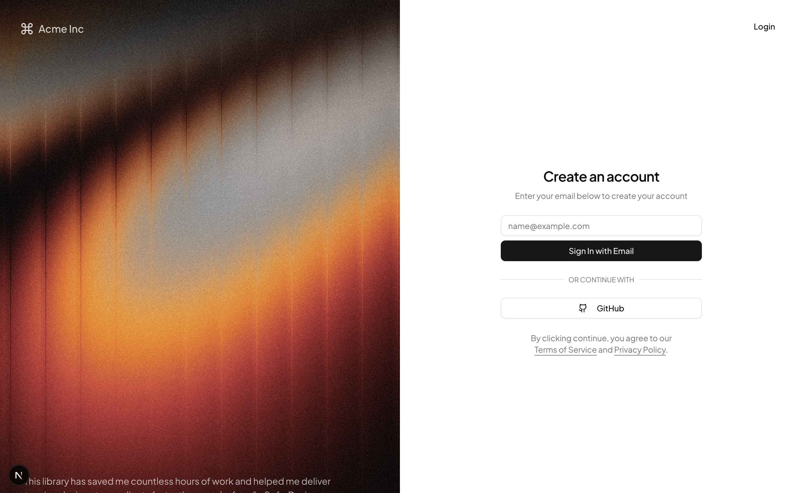
Authentication is a full-page sign-up block built around a classic split-screen: a visual brand panel on the left with a background image, logo, and testimonial quote, and a focused Shadcn UI form on the right with an email field, a submit button that shows a loading spinner, a GitHub social login option, and terms and privacy links underneath.
This layout suits any product where account creation is the front door: SaaS onboarding, developer tools, membership sites, and internal platforms. Because the brand panel collapses away on small screens, the same block works as a minimal mobile sign-up form without extra work. For the sign-in side of the flow, the login pages category offers matching entry screens, and two-step verification blocks cover the code-entry stage that often follows.
Form Primitives and the Code Behind Them
The block is a React component styled with Tailwind utilities and composed from three Shadcn UI primitives: Button, Input, and Label. The label is rendered screen-reader only, so the form stays visually minimal while remaining accessible, and the email input carries the right type, autocomplete, and autocapitalize attributes for mobile keyboards.
Submission is handled with local React state: the form disables its fields, swaps in a Lucide loader icon, and simulates a request so you can see the loading behavior before wiring a backend. The GitHub button is an inline SVG icon on a standard outline Button, ready to trigger your OAuth flow. The same screen ships in React, Vuejs, and Svelte versions, with the Vuejs and Svelte editions building on the shadcn-vue and shadcn-svelte ports.
Restyling It for Your Brand
Every color in the block resolves from CSS variables in globals.css, so the form follows your theme tokens for background, foreground, border, and primary in both dark and light mode. The left panel is the natural place to make the page yours: swap the background image, drop in your logo, and replace the quote with a customer testimonial or product screenshot.
Since the layout is a two-column Tailwind grid, structural changes stay simple. Flip the panels, center the form on a plain background, or add a password field and confirm field alongside the email input; the form pieces are ordinary Shadcn UI components that accept the same props as the rest of your app.
Wiring It Into a Real Auth Flow
Authentication is a pro block, so the source and CLI install unlock with an All Access plan. Once available, the shadcn CLI command at the top of the example page adds the block to your project with npm, pnpm, yarn, or bun; copying the two files from the code tab works just as well since the block is intentionally small.
To go live, replace the simulated submit with a call to your auth provider, whether that is a hosted service or your own API, and point the GitHub button at your OAuth route. Because loading and disabled states are already modeled in the component, connecting real requests usually means changing one handler function.