

The Profile Card, Reimagined as a Block
A profile card condenses a person into a single glanceable surface: who they are, what they do, and how to reach them. This collection ships two ready-made Shadcn UI takes on that idea, both built as compact cards you can drop into a marketplace listing, a team page, or a directory without designing from scratch.
Both cards are data-forward rather than decorative. Skills, rates, stats, and contact routes are first-class content, which makes them practical for products where people are the inventory: freelance platforms, talent networks, and expert marketplaces.
Choosing Between the Two Cards
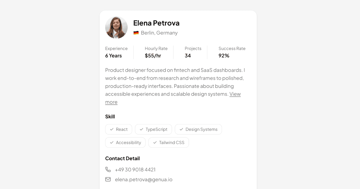
Profile Card is the stats-first variant. It leads with an avatar and name, then a four-item row covering experience, hourly rate, project count, and success rate, followed by a bio, checkmark skill badges, and phone and email details. A bordered meeting card at the bottom shows an upcoming call's date, platform, and start-to-end timeline above a call-to-action button, making it ideal for booking-centric products.
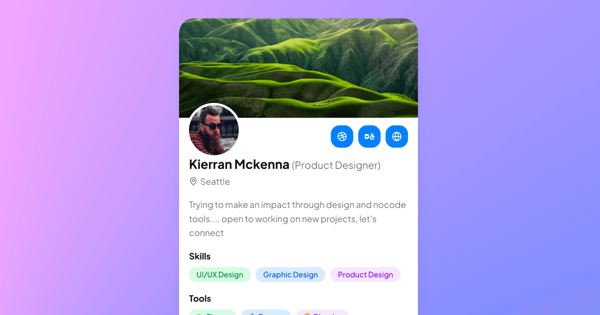
Profile Card with Cover Image is the visual-first sibling. A full-width cover photo tops the card with the avatar overlapping its lower edge inside a background-colored ring, social buttons for Dribbble, Behance, and a personal site sit alongside, and the body groups color-coded badges into Skills, Tools, and Rate sections before an experience entry with a company logo. Its footer pairs View Profile and Get in Touch buttons.
Use It Anywhere People Appear
Freelance marketplaces and hiring tools are the natural fit, but the cards also serve team sections on agency sites, speaker lineups for events, mentor directories, and community member spotlights. Anywhere you list people, a consistent card keeps the grid scannable.
For lighter-weight contexts there are related patterns in the collection: user cards cover minimal identity chips, while full profile pages expand the same information into a dedicated route. These cards sit in the middle: richer than a chip, more portable than a page.
The Build: Shadcn UI Components and Tailwind
Both cards compose the Shadcn UI avatar, badge, button, and separator components with lucide-react icons, arranged with Tailwind flex and spacing utilities inside rounded, shadowed containers. The stats row uses divided flex items, skills render as outline badges with check icons, and the cover variant's social buttons and Section badges are small, easily edited arrays of data.
Content colors ride on design tokens, so backgrounds, muted labels, and borders come from your globals.css variables and both cards stay readable in dark and light mode; the cover variant's colorful skill, tool, and rate badges each carry explicit dark-mode classes. The same cards are available in React, Vuejs, and Svelte versions, with the Vuejs and Svelte editions building on the shadcn-vue and shadcn-svelte ports.
Theming and Installation
Install either card with the shadcn CLI command shown at the top of its example page, in npm, pnpm, yarn, or bun form, or copy the single-file source from the code tab. Both are pro blocks, so code and CLI access unlock with an All Access plan; see pricing for details.
Each card is one self-contained file with its data declared in small arrays at the top: stats, skills, tools, and rates. Integration is as simple as replacing those arrays with values from your user API, swapping the avatar and cover URLs, and pointing the action buttons at your booking or messaging routes. Restyling beyond that is a globals.css exercise, since radius, borders, and base colors are all token-driven.