

A Cover Photo Card for Designers and Creators
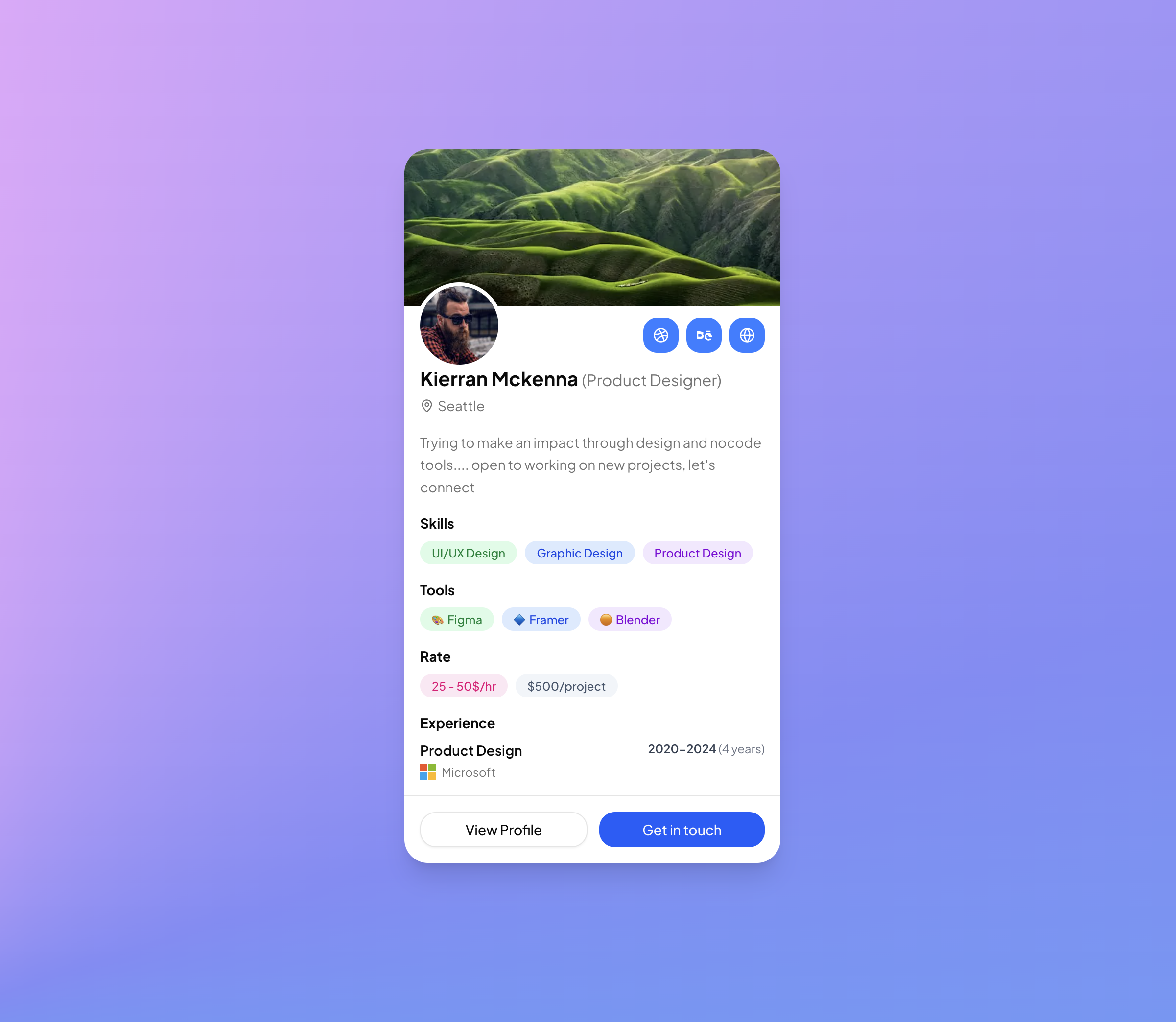
Profile Card with Cover Image leads with a full width landscape photo before a single word of text, giving the block the feel of a portfolio piece rather than a database record. A designer persona, complete with Dribbble and Behance links, sets the tone: this is the card for creator marketplaces, community directories, and social media style products where personality sells. The demo page even sits on a conic gradient backdrop to show how the rounded-3xl card pops against expressive backgrounds.
Floating the Avatar With a Ring
The transition between cover and content is handled by a classic trick executed with Tailwind utilities: the size-20 Avatar gets a negative -mt-10 margin so it straddles the photo's bottom edge, and a ring-4 ring-background halo carves a clean gap between portrait and cover. Because the ring color is the background token rather than white, the cutout effect survives dark mode without any extra classes.
Social Buttons Drawn as Inline SVGs
Three blue rounded-xl buttons line up opposite the avatar, and two of their icons, Dribbble and Behance, are hand written inline SVG components rather than library imports, with a lucide GlobeIcon covering the personal site. Further down, the experience row includes a tiny four square Microsoft logo built from four SVG rects. These embedded vectors keep the block dependency free while still carrying recognizable brand marks.
Pastel Badge Palettes for Skills, Tools, and Rates
Skills, tools, and rates are three arrays of label and className pairs, each rendered as a borderless secondary Badge. Every entry carries a matched pair from the Tailwind color scale, such as bg-green-100 text-green-700 with dark:bg-green-950 dark:text-green-300, so the pastel coding stays legible when the theme darkens. The tools array adds emoji glyphs for Figma, Framer, and Blender, a zero asset way to give each badge an icon.
Sections That Tell a Story: Bio, Rate, Experience
Between the badges the card walks through a narrative: name with role in muted parentheses, a map pin location, a short bio, then the experience block pairing a Product Design title with the Microsoft logo and a 2020-2024 span. Two footer buttons close the pitch, an outline View Profile and a solid Get in touch, both rounded-2xl to echo the card's soft geometry. Reordering the sections is trivial since each is an independent space-y group.
Access, Theming, and Install Paths
The structural components come from Shadcn UI, Avatar, Badge, and Button, and the neutral surfaces use bg-background and text-muted-foreground, so global theming changes flow straight in; only the deliberate pastel accents are opt in literals you can retune or tokenize. The card is gated at the Pro level, so grab All Access once and the code tab along with the registry install becomes available. Two integration paths exist after that: the one line shadcn CLI install, with npm, pnpm, yarn, and bun variants shown in the page header, or a plain copy paste from the code view.