

Onboarding Beside a Full Height Cover Image
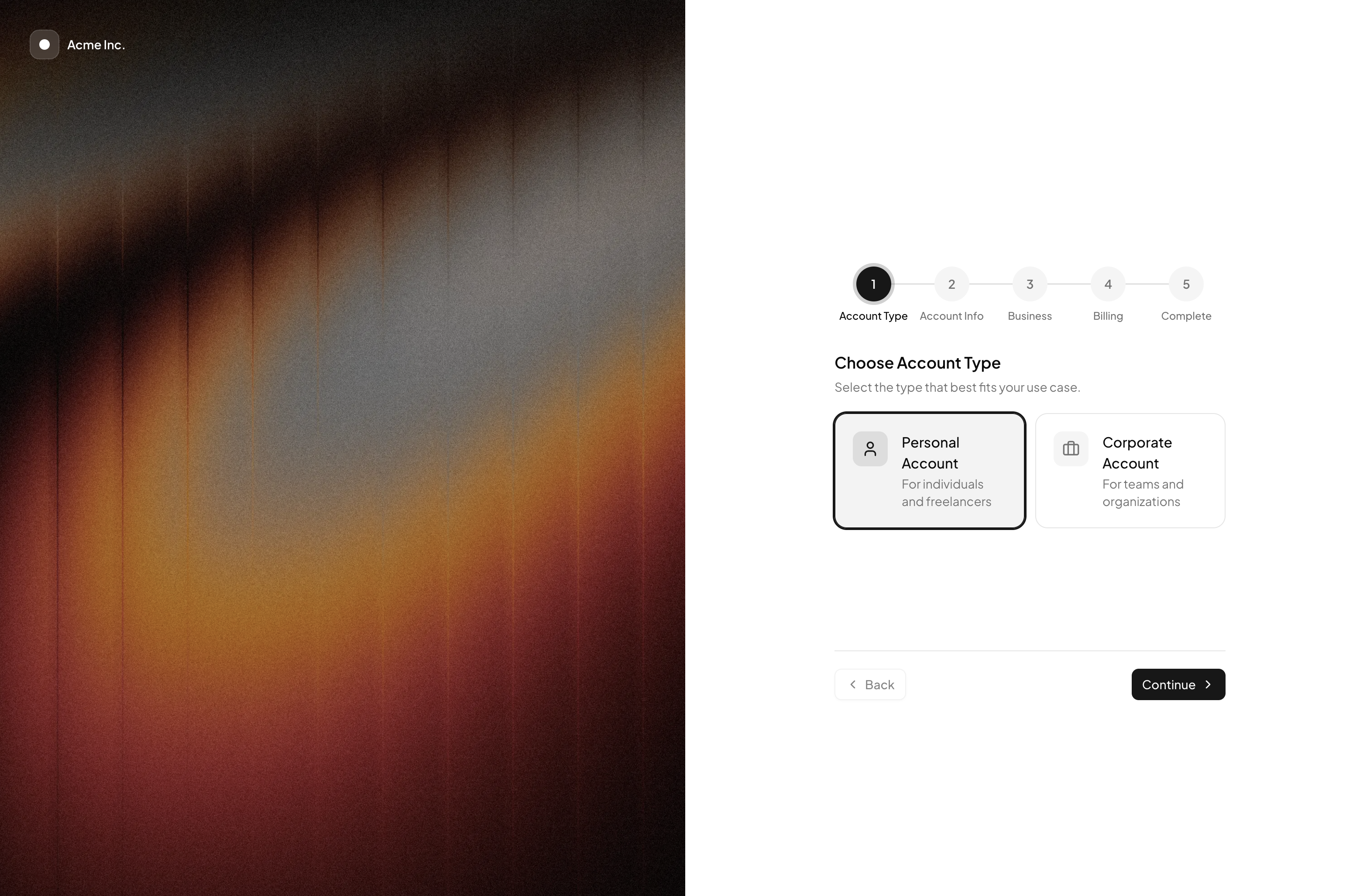
Onboarding Flow with Cover turns account setup into a split screen experience: a five step wizard occupies one column while a full height photograph fills the other. The block reads like the polished activation screens of modern SaaS products, and it shares its visual DNA with split layout login pages, which makes the two easy to pair for a consistent signup to onboarding journey. Everything is written in React with Tailwind classes and Shadcn UI form components.
Anatomy of the Cover Panel
The CoverPanel component is deliberately small but dense with technique. A next/image element with the fill and priority props stretches the photo across the entire column, a bg-black/30 overlay dims it so foreground elements stay readable, and a floating brand badge sits in the corner: a frosted square built from bg-white/15, a ring-white/25 outline, and backdrop-blur, next to an Acme Inc. wordmark with a drop shadow.
The whole panel is wrapped in hidden md:block, so phones skip the artwork entirely and get a distraction free form. That single class is the block's responsive strategy, no JavaScript media queries involved.
The Wizard Column: Components and State
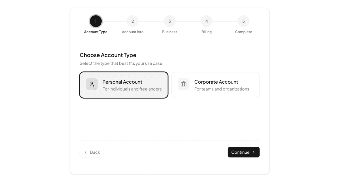
The form side runs the complete onboarding sequence: selectable account type tiles, a team size grid, a RadioGroup of plans, business inputs with an industry Select, a card payment step with auto formatted numbers, and a summary finale. It is assembled from the Shadcn UI Button, Input, Label, RadioGroup, Select, Switch, and Separator components plus a custom StepIndicator. A Zustand store holds currentStep and the typed form data with next, prev, update, and reset actions, while per step validation surfaces problems in a destructive colored message before letting the user advance.
Branding the Panel and Theming the Form
Making the block yours takes two edits: point the Image src at your own photograph or illustration, and swap the badge contents for your logo. The form column needs no retouching at all, because it draws every color from Shadcn UI tokens like primary, muted, border, and destructive, which resolve correctly whether the surrounding app runs Tailwind's light palette or its dark mode. The photo side is theme neutral by design, since the dark overlay keeps white text readable over any image in either mode.
Where to Use It and How to Get It
Reach for this variant when onboarding is a moment worth dressing up: post signup activation in a SaaS product, workspace creation, or paid plan setup where the extra column carries brand photography or social proof. As a Pro block, its full source opens after an All Access upgrade, and once open you have two routes in: run the shadcn CLI command shown above the preview, switchable between npm, pnpm, yarn, and bun, or copy the four source files by hand from the code tab.