

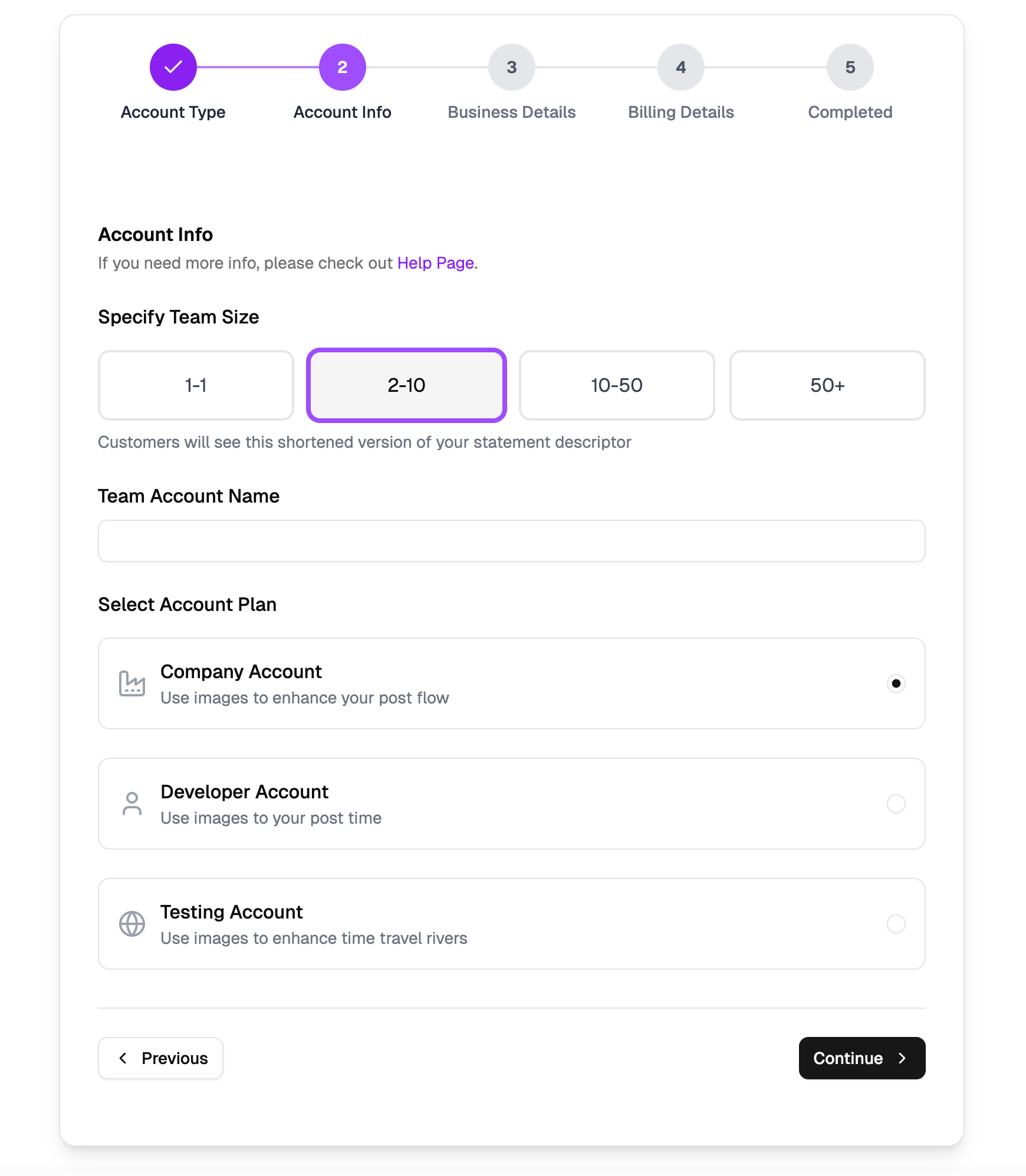

A Five Step Signup Wizard in a Single Card
Onboarding Flow is a self contained signup wizard block that lives inside one centered Shadcn UI Card, capped at max-w-2xl and rendered with React and Tailwind utilities. Five stages take a new user from choosing an account type all the way to a confirmation screen, and every stage swaps in and out of the same CardContent area, so the page never navigates away. If you are collecting anything from plan choices to payment details during activation, this block gives you the full skeleton instead of a bare stepper, and it pairs naturally with the broader wizard patterns in the multi step forms collection.
What Each Step Collects, From Account Type to Billing
Step one presents two selectable tiles, Personal and Corporate, built as plain buttons that light up with border-primary and a ring when active. Step two mixes a team size button grid, a required team name Input, and a RadioGroup of three account plans, each with its own lucide icon and description. Step three gathers business details through Inputs and an industry Select, step four is a complete billing form with card number, expiry month and year Selects, CVV, and a save card Switch, and step five closes with an emerald check circle plus an Account Summary panel that echoes back everything the user picked before a Start Over button resets the whole flow.
Zustand Keeps the Answers, useState Keeps the Errors
The wizard's memory lives in a small Zustand store defined in store.ts. It tracks currentStep and a typed FormData object, exposes next and prev actions clamped between steps one and five, a generic update helper for any field, and a reset action. Because the store sits outside the component tree, answers survive as the user moves back and forth between steps.
Validation stays local and honest: a validateStep function checks the rules for the current stage, requiring a team name, a company name and industry, a full sixteen digit card number, expiry selections, and a three digit CVV. Failures land in a useState error string rendered in text-destructive above the navigation row, and a formatCardNumber helper groups typed digits into blocks of four as the user types.
The Responsive Step Indicator
StepIndicator is its own component with two renderings. On desktop it draws five numbered circles joined by connector lines, where finished steps collapse into check marks on a bg-primary disc and the active step gains a soft ring-primary/20 halo. On mobile the circles give way to the current step title, a Step X of 5 counter, and a slim segmented progress bar, so the wizard stays legible on narrow screens without horizontal cramming.
Styling With Shadcn UI Tokens
Every color in the block resolves through Shadcn UI CSS variables: primary for selection states, muted and muted-foreground for secondary text and idle circles, destructive for validation messages, and border for dividers. Change those tokens in globals.css and the entire wizard follows, in light and dark mode alike, with zero hardcoded hex values to hunt down. The components involved are Button, Card, Input, Label, Radio Group, Select, Switch, and Separator. The wizard is not limited to React either: identical Vuejs and Svelte builds exist, created on top of the shadcn-vue and shadcn-svelte ports, so the same design drops into any of the three ecosystems.
Unlocking and Installing the Flow
Onboarding Flow sits on the Pro tier, so the code tab and the registry install unlock once you hold an All Access license. After that, a shadcn CLI snippet waits at the top of the example page with tabs for npm, pnpm, yarn, and bun, and if you prefer manual control you can copy page.tsx, the onboarding component, the step indicator, and the store straight from the code tab into your project.