

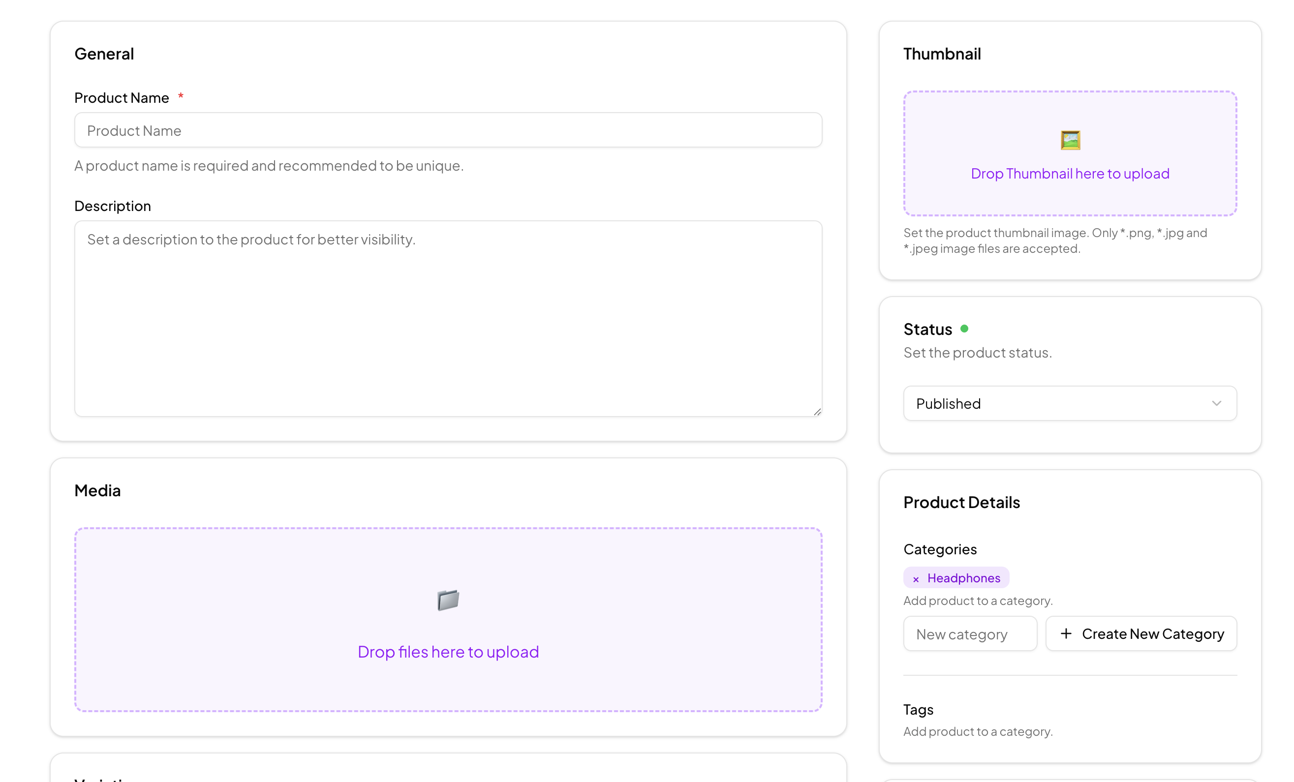
Defining the Add Product Form
An add product form is the screen where store operators turn a product idea into a listing: name and description, images, variations, price, discount, and tax settings. This block implements the full screen as a two-column React layout of Shadcn UI cards, with General, Media, Variations, and Pricing sections in the main column and status, categories, tags, and template controls alongside.
It is deliberately opinionated about e-commerce details. Product status covers published, draft, and archived, discounts support none, percentage, or fixed-price modes with conditional inputs, and tax handling includes a tax class select with standard, reduced, and zero rates plus a required VAT amount field.
Admin Panels and Seller Dashboards
The natural home for this block is the product creation screen of a store admin, whether that is a custom storefront backend, a multi-vendor marketplace where sellers manage their own catalog, or an internal tool syncing products into a commerce API. It pairs directly with a product list view, which is where newly created items land.
Because the form is sectioned into independent cards, teams also strip it for parts: the media uploader alone makes a strong base for other file upload forms, and the variation rows adapt to any type-and-value attribute editor.
Validation With React Hook Form and Zod
Form state runs through React Hook Form's useForm with a zodResolver, backed by a Zod schema in a dedicated validation file. The schema types every field, from the required product name and base price to enums for status, discount type, template, and tax class, and arrays for categories, tags, and variation objects.
This gives the form instant, field-level feedback without hand-rolled checks, and it exports an inferred ProductFormData type, so the submit handler, your API payload, and the form inputs all share one source of truth. Conditional fields follow the same system: choosing a percentage discount reveals a percent input, while a fixed discount reveals a discounted price field.
Media Uploads and Sortable Previews
The Media card is driven by a custom useFileUpload hook that handles drag-and-drop and click-to-browse selection, enforces a limit of eight files with size and type checks, generates preview URLs, and reports errors back to the interface. Selected images render as preview tiles with remove buttons and a live file counter.
Ordering matters for product galleries, so the previews sit inside the Sortable primitives shared with the sortable cards example. Each tile gets a grip handle, and dragging reorders the media list, letting merchants choose the lead image without a separate control.
Design Tokens and Dark Mode Support
Every card, input, and label in the form reads from the Shadcn UI token system, CSS variables defined in globals.css for background, card, border, and muted-foreground. Restyling the form for your admin theme is a variable edit rather than a component rewrite, and the layout holds up in both light and dark mode because no surface color is hardcoded.
The two-column structure is plain Tailwind grid work, so reflowing it, for example collapsing to a single column earlier or moving the organization column to the left, is a matter of adjusting utility classes on the wrapper.
Included Primitives and Install Options
The block composes Card, Input, Textarea, Select, Label, Badge, Button, Radio Group for discount modes, and the Field family for labels, descriptions, and error slots. React, Vuejs, and Svelte versions are all available, with the Vuejs and Svelte editions building on the shadcn-vue and shadcn-svelte ports.
To integrate it, use the shadcn CLI command shown at the top of the example page, with tabs for npm, pnpm, yarn, and bun, or copy the page, validation, and hook files from the code tab. This pro block unlocks with the All Access plan on the pricing page. From there, point the submit handler at your products endpoint and upload the media files to your storage provider, keeping the Zod schema as the contract between form and API.