

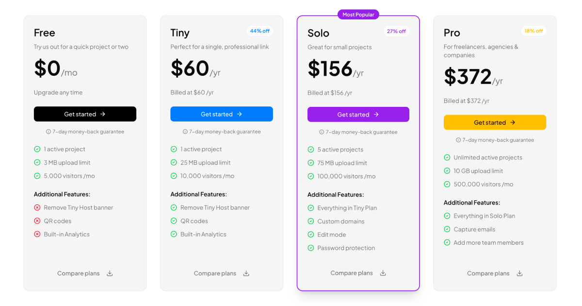
Anatomy of the Column Pricing Table
A pricing table is where a visitor decides whether your product is worth paying for, so its job is comparison at a glance. The Column Pricing Table block arranges four subscription tiers as side by side columns, each with its name, price, a call to action, and a feature checklist where included items get a check icon and excluded ones a cross. A billing switch flips every column between monthly and yearly prices, showing discount badges and billed monthly or billed yearly captions, and the recommended tier carries a popular highlight so the eye lands where you want it.
Technically the block is a React client component with TypeScript. A single useState hook drives the yearly toggle, the Shadcn UI Button powers the calls to action, icons come from Lucide, and the columns are laid out with Tailwind grid utilities plus the cn class helper for conditional styling. Plan data is a plain array, so adding or removing a tier means editing one object, not restructuring markup.
Where Pricing Sections Earn Their Keep
The obvious home is a SaaS landing page, where the pricing section usually sits between the feature story and the signup form. It works equally well as a standalone pricing page, inside an in-app upgrade screen, or on marketplaces and agencies selling packaged service tiers.
Because the block is self contained, you can also drop it mid funnel: right before a checkout page, inside onboarding when a trial expires, or in an account settings area where users manage their plan.
Colors, Tokens, and Brand Fit
The block reads its palette from the Shadcn UI design tokens defined in globals.css. Column surfaces, borders, muted captions, and the primary action color are all CSS variables, so a brand refresh is a variable edit rather than a component rewrite. Each tier's call to action can carry its own accent to visually rank the plans, and those accents are Tailwind classes you can retune in seconds.
Dark and light modes come from the same token system. Switch the theme class and prices, badges, and check icons stay legible without any per component overrides, which matters for pricing UIs embedded inside dashboards that default to dark.
Shipping It to Production
Install the block with the shadcn CLI command shown at the top of its page, with tabs for npm, pnpm, yarn, and bun, or copy the component from the code tab into your project. The Column Pricing Table is a pro block, so the source and CLI install are part of the All Access plan.
It ships in React, Vuejs, and Svelte versions, the latter two built on the shadcn-vue and shadcn-svelte ports. Going live is mostly data work: replace the tier array with your real plans, point each button at your billing provider's checkout link, and optionally pull prices from your payment platform's API so the table never drifts out of sync with what you actually charge.