

A Freelancer Profile Card With a Meeting Slot
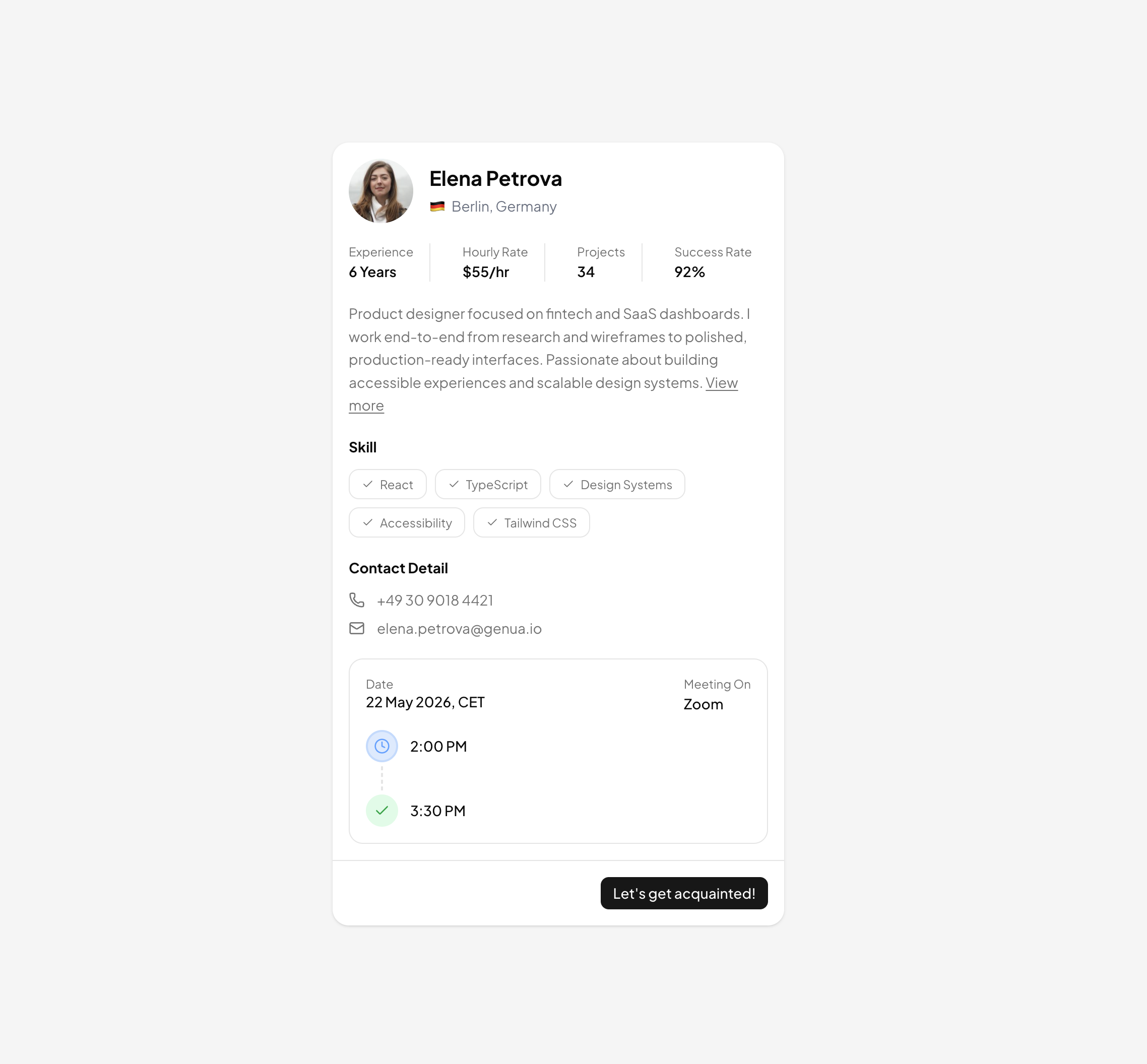
This block condenses a freelancer's pitch into one max-w-md card: identity, track record, skills, contact channels, and even an upcoming meeting, all stacked in a single scannable column. The demo persona, a Berlin based product designer, shows how much hiring context fits without a full profile page. Drop it into talent marketplaces, agency rosters, booking confirmations, or anywhere a compact person summary earns its place; for lighter weight introductions the related user cards blocks cover the minimal end of the spectrum.
Stat Strip, Skill Badges, and Contact Rows
Under the Avatar and name header with its flag and location line, a divide-x separated strip surfaces four numbers: experience, hourly rate, completed projects, and success rate, each mapped from a plain stats array. The skills section renders a second array as outline variant Badge components, each prefixed with a small check icon, and the contact block pairs lucide phone and mail icons with muted text rows. Editing the card means editing those arrays, not the markup.
The Mini Meeting Timeline
The card's signature detail is a bordered sub panel that sketches a scheduled call: date and platform labels up top, then a tiny two node vertical timeline. A clock icon in a blue circle marks the 2:00 PM start, a dashed connector line drops down, and a green circled check marks the 3:30 PM end. Both node colors are declared as light and dark pairs, blue-100 with dark:bg-blue-950 and green-100 with dark:bg-green-950, so the vignette stays balanced in both themes. A Let's get acquainted Button in the footer turns the whole card into a call to action.
No State, No Effects: A Server Friendly Component
There is no use client directive, no store, and no event handler beyond the links. The entire block is presentational React that can render as a server component, which makes it cheap to repeat dozens of times in a search result grid. Layout falls entirely to Tailwind utilities, spacing through space-y scales, the stat strip through flex and divide-x, and the card surface through bg-background over a bg-muted page, so restyling is a class level exercise.
Tokens, Frameworks, and Getting the Code
The Shadcn UI pieces involved are Avatar with image and fallback, Badge, Button, and Separator, and nearly every color routes through muted-foreground and background tokens, so the card inherits your theme from globals.css without edits. React is only one of three delivery targets: the card also ships for Vuejs via the shadcn-vue port and for Svelte via shadcn-svelte, all matching the same design. As a Pro tier component, its source opens after an All Access upgrade, and once unlocked you can either run the registry command printed at the top of the page with npm, pnpm, yarn, or bun, or lift the JSX straight from the code tab.