

Catalog Browsing Done as a Block
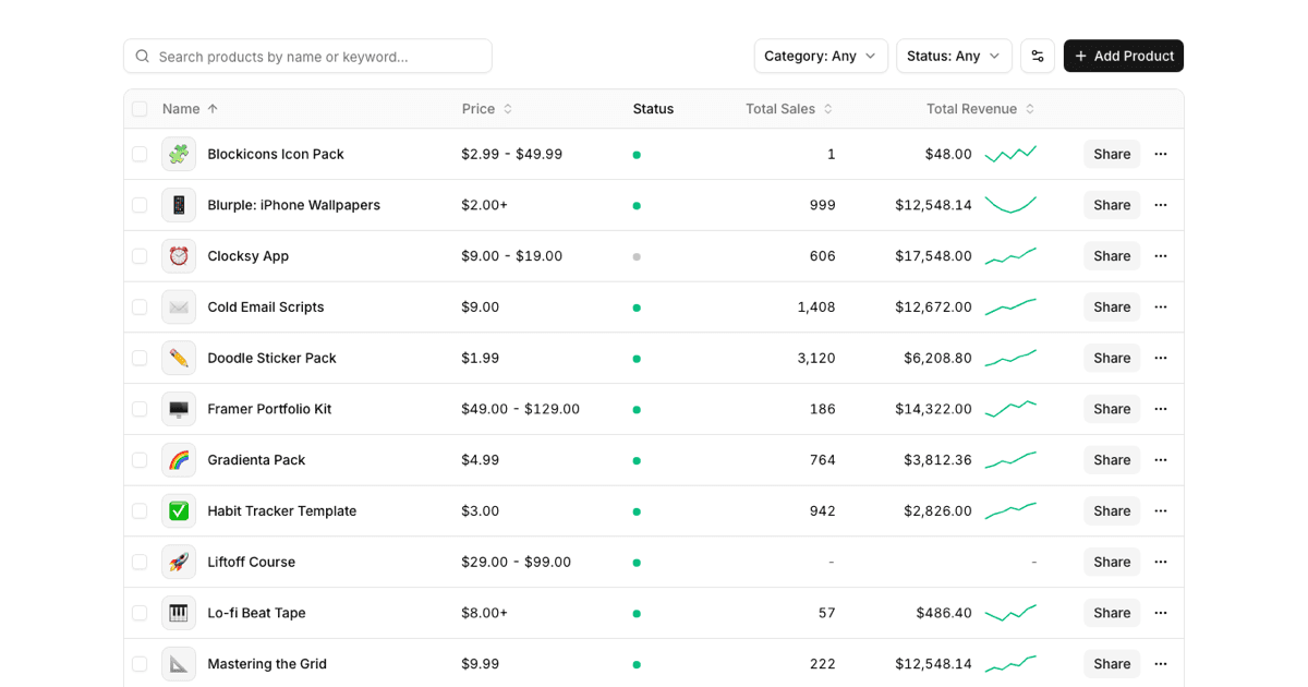
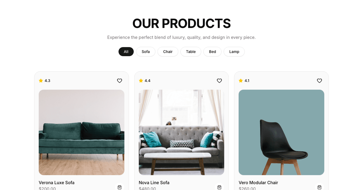
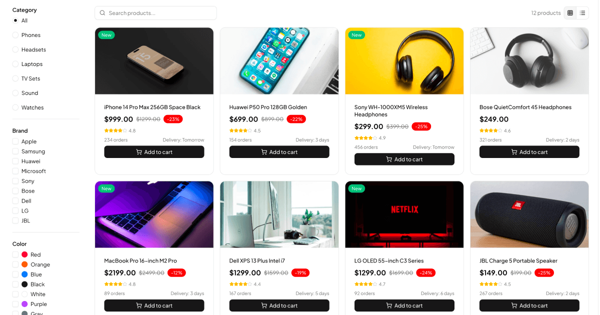
A product list is the category page of a store: a filterable, searchable grid where shoppers narrow a catalog down to the item they want. This block ships that page complete. A filter sidebar covers category, brand, color, delivery date, and a price range slider, while the main area offers text search, a results count, switchable grid and list card views, and wishlist and cart actions on every product.
Filters behave like a real storefront, not a mockup. An active filter counter appears as you refine, a clear all action resets everything, and the product grid re-derives instantly from the current filter state.
Filter State Managed With Zustand
All filtering logic lives in a dedicated Zustand store. Selected categories, brands, colors, delivery windows, the price range, the search query, and the view mode are store state, and the visible product list is computed from them in one place. That separation keeps the React components thin: cards and filter controls just read state and dispatch actions.
It also makes the block unusually easy to hook to a backend. Because every filter change flows through store actions, you can swap the local product array for an API query driven by the same state without rewriting the UI.
Grid View, List View, and Mobile Filters
Shoppers can toggle between a card grid and a horizontal list layout, each with its own card component tuned for that density. On mobile, the sidebar disappears into a Shadcn UI Sheet that slides in from the side with the full filter stack, so small screens keep the entire filtering feature set.
The component inventory is broad: Checkbox and RadioGroup for filter options, Slider for price range, Toggle for the view switch, Input for search, plus Card, Badge, Button, Label, ScrollArea, Separator, and Sheet. Icons come from Lucide, and the layout is responsive Tailwind throughout.
Matching Your Storefront's Palette
The block stays inside the Shadcn UI token system: bg-background and bg-card for surfaces, text-muted-foreground for secondary copy, and the primary variable for active states and calls to action. Restyling for your brand happens in globals.css, and dark mode arrives for free since every color resolves through CSS variables when the theme class changes.
Card composition is deliberately modular. Grid card, list card, and filter content are separate files, so redesigning one presentation, for instance adding sale ribbons to grid cards, does not disturb the rest.
Dropping the Catalog Into Your Store
The block installs through the shadcn CLI command at the top of its page, in npm, pnpm, yarn, and bun flavors, or by copying the component files and the store from the code tab. It is a pro block, so source access ships with the All Access plan.
Versions for React, Vuejs, and Svelte are all available, with the Vuejs and Svelte editions built on the shadcn-svelte and shadcn-vue ports respectively. Once installed, feed the store your real catalog, wire the cart and wishlist buttons to your commerce APIs, and link each card to its product detail page. The filtering engine and responsive shell are done.