


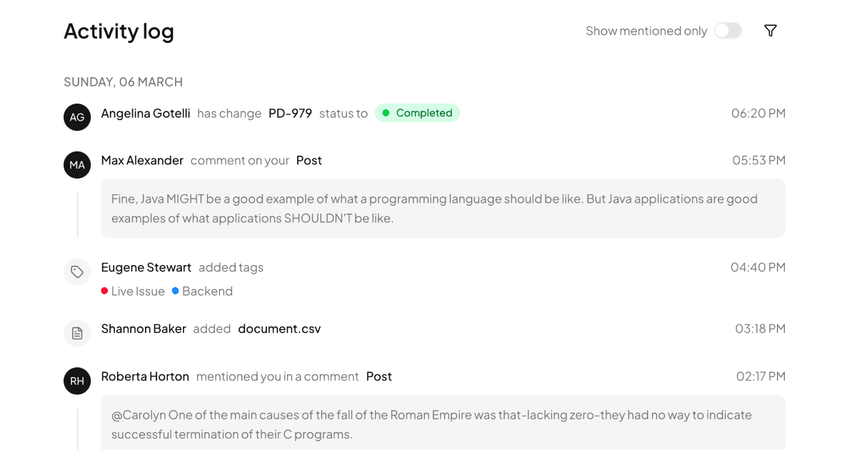
One Page, Two Vertical Rails: Milestones Plus Activity
The Timeline block stacks two complementary React components in a single max-w-xl column: MilestoneTimeline, which plots six dated project milestones from kickoff to production release, and ActivityTimeline, which lists recent team events like comments, merges, and status changes. Together they read as a project detail sidebar you can lift wholesale, or split apart, since each component is self contained with its own data array and rail line.
Milestone States and Their Markers
Each milestone carries a status of done, active, or upcoming, and the marker changes accordingly: completed items get a filled emerald disc with a white check, the active item gets a primary colored dot wrapped in a soft ring-primary/15 halo, and future items get a hollow border circle while their text drops to half opacity. A matching Badge, secondary for Done, solid for In Progress, outline for Upcoming, sits beside each title, and the connecting rail is one absolutely positioned w-0.5 bg-border line running behind the markers.
A Config Object per Event Type
ActivityTimeline is driven by an ACTIVITY_CONFIG map that assigns each of six event types, status, comment, tag, assignment, file, and merge, an icon from lucide, a tinted background such as bg-violet-50 with a dark:bg-violet-950 twin, an accent color, and a verb phrase like left a comment. Rendering a row is just a lookup plus interpolation, so introducing a new event type means adding one key to the map and one object to the data array, with no changes to the JSX.
Roadmap, Release, and Project Detail Views
Use the milestone half wherever phased progress needs a glanceable answer to where are we: project overviews, client status reports, or delivery dashboards. It also works as a compact cousin to the fuller planning layouts in the roadmaps blocks. The activity half suits ticket detail panes and audit trails, and because both share visual language, mixing them on one screen feels intentional rather than stitched.
Two Shadcn UI Components, Lots of Tailwind
Structurally this block is lean: Badge and the cn class merger are the only Shadcn UI imports, and everything else is Tailwind utility composition over theme tokens, border for rails, muted-foreground for secondary text, primary for the active pulse. That token diet means dark mode needs no dedicated styling beyond the few tinted icon backgrounds, which already declare dark variants. Framework choice is open too: pick the React source, the Vuejs edition built on shadcn-vue, or the Svelte edition built on shadcn-svelte, and the markup translates one to one.
Copy or CLI: Getting the Timeline
Timeline is a Pro example, meaning an All Access license is what turns the code tab from locked to copyable. To bring it in, use the command at the head of the example page, where tabs let you pick npm, pnpm, yarn, or bun for the shadcn CLI, or copy the single page.tsx by hand, since the whole block, data included, lives in one file.