

Shadcn UI Blocks & Examples
A library of 83 ready to use Shadcn UI blocks and examples: admin dashboards, landing pages, e-commerce layouts, forms, and full page templates. Every block is built with Shadcn UI components and Tailwind CSS, ships in React, Vuejs, and Svelte versions, and supports dark and light themes. Preview any block live, copy the source code, or install it with the shadcn CLI.
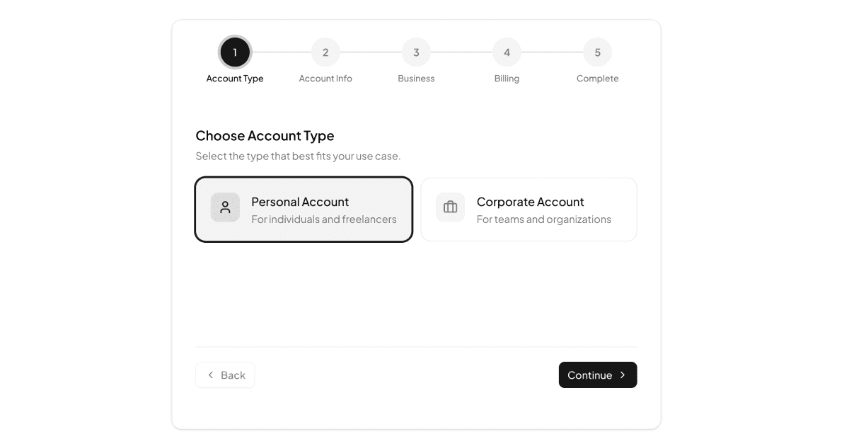
Onboarding Flows
2 examplesOnboarding Flows is a collection of multi-step signup blocks that guide new users through account setup one screen at a time. Each flow combines Shadcn UI inputs, radio groups, selects, and switches with Tailwind layouts, plus per-step validation and a clear step indicator. State is managed with Zustand in React, and the flow also ships in Vuejs and Svelte versions.
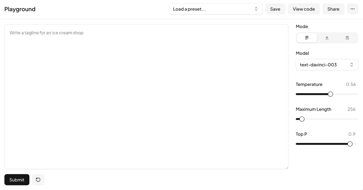
Playgrounds
2 examplesPlaygrounds is a collection of interactive workspace blocks for building AI prompt tools, code sandboxes, and configuration interfaces. Each block combines Shadcn UI components with Tailwind layouts to pair input controls with a live output area. The collection covers both an AI-style prompt playground and a web code playground with live preview. Each block ships in React, Vuejs, and Svelte versions built on the same design.
Podcast Apps
1 examplePodcast Apps is a collection of audio streaming interface blocks for browsing shows and playing episodes. Each block builds on Shadcn UI components and Tailwind styling to cover player controls, episode lists, and show details. A practical starting point for audio platforms, available in React, Vuejs, and Svelte versions.
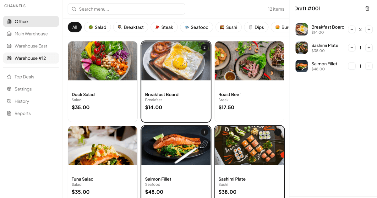
Point of Sale (POS) Apps
1 examplePoint of Sale (POS) Apps is a collection of sales terminal blocks for processing orders, payments, and transactions. Each block arranges Shadcn UI components in touch-friendly Tailwind layouts with product grids, order carts, and checkout flows. Suited to restaurant and retail interfaces, with React, Vuejs, and Svelte versions all available.
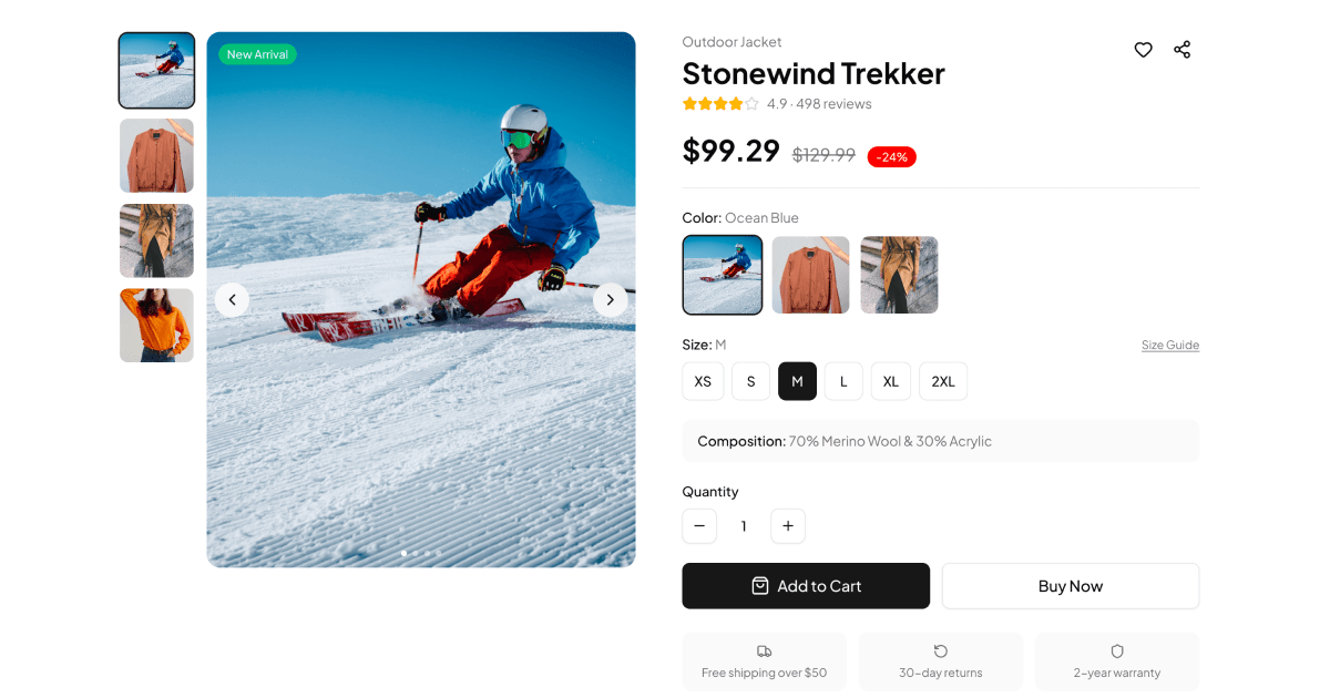
Product Detail Pages
1 exampleProduct Detail Pages is a collection of e-commerce blocks for presenting a single product with everything a shopper needs to buy. Each block uses Shadcn UI components and Tailwind layouts to combine image galleries, variant selectors, reviews, and specifications. Designed for online storefronts, with React, Vuejs, and Svelte versions of every block.
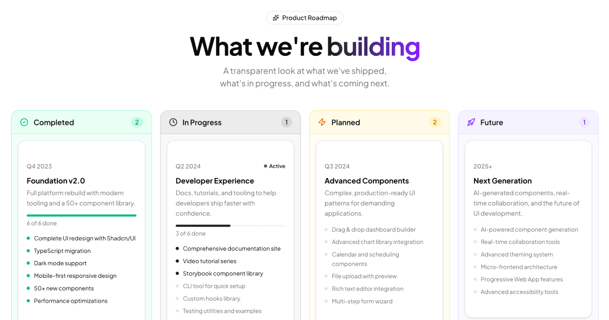
Roadmaps
1 exampleRoadmaps is a collection of product planning blocks for communicating goals, milestones, and release timelines. Each block organizes work by status using Shadcn UI cards and badges in responsive Tailwind layouts. A clear way to share plans on product sites and dashboards, with React, Vuejs, and Svelte versions included.
Roles & Permissions
1 exampleRoles & Permissions is a collection of access control blocks for managing user roles, permission sets, and authorization levels in an admin dashboard. Each block combines Shadcn UI components with Tailwind styling to keep role tables, permission toggles, and member lists consistent with the rest of your app. The blocks ship in React, Vuejs, and Svelte versions.
SaaS Landing Pages
1 exampleSaaS Landing Pages is a collection of marketing page blocks for presenting a software product, from hero and features down to pricing and call to action. Every section is assembled from Shadcn UI components and Tailwind utilities, so the whole page stays consistent and theme friendly. Use the blocks as-is in React, or choose the matching Vuejs or Svelte editions.
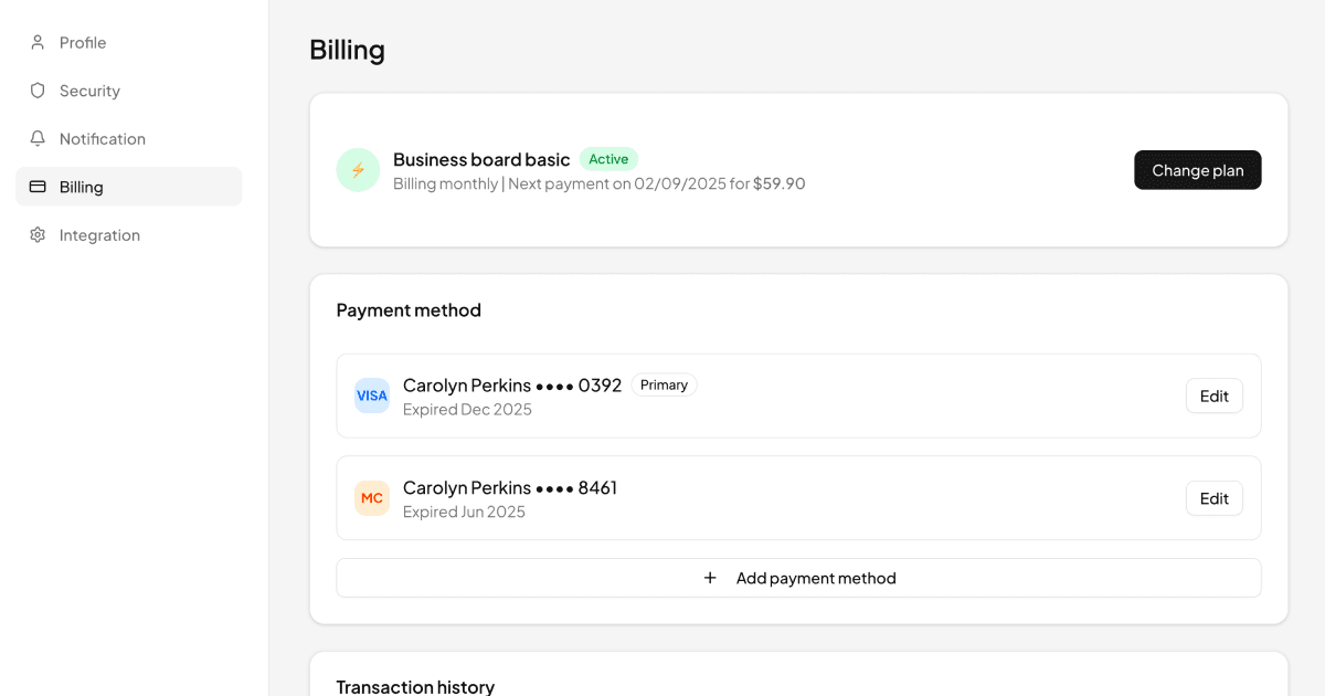
Settings Pages
1 exampleSettings Pages is a collection of account settings blocks for user profile, security, notifications, billing, and integrations screens. Each block arranges Shadcn UI components such as cards, switches, selects, and inputs in a sidebar-driven Tailwind layout. Ready to use, with React, Vuejs, and Svelte versions of every block.
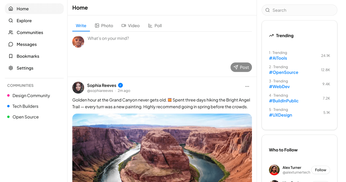
Social Media Apps
1 exampleSocial Medias is a collection of social feed blocks for building timeline and community style interfaces. The blocks use Shadcn UI avatars, cards, dropdown menus, and buttons with Tailwind to handle posts, reactions, polls, and media content. Built in React, with Vuejs and Svelte versions shipped alongside.
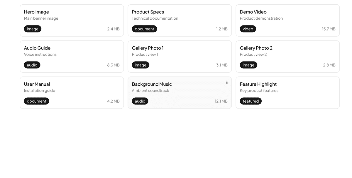
Sortable Cards
1 exampleSortable Cards is a collection of drag and drop blocks for reordering cards, lists, and grid items. The blocks wire dnd-kit into Shadcn UI cards and badges with Tailwind styling, so reordering feels smooth and accessible. Available in React, Vuejs, and Svelte versions, each wired to a matching drag and drop setup.
Survey Forms
1 exampleSurvey Forms is a collection of form blocks for collecting feedback, opinions, and structured data from users. Each block leans on Shadcn UI inputs, radio groups, and selects with Tailwind layouts to keep multi-question surveys readable. Every block ships in React, Vuejs, and Svelte versions.
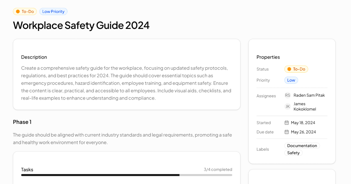
Task Detail Pages
1 exampleTask Details is a collection of project management blocks for viewing a single task with its subtasks, files, and discussion. The blocks compose Shadcn UI cards, checkboxes, progress bars, and dropdown menus with Tailwind to mirror real tools like Asana or Jira. All blocks ship in React, Vuejs, and Svelte versions.
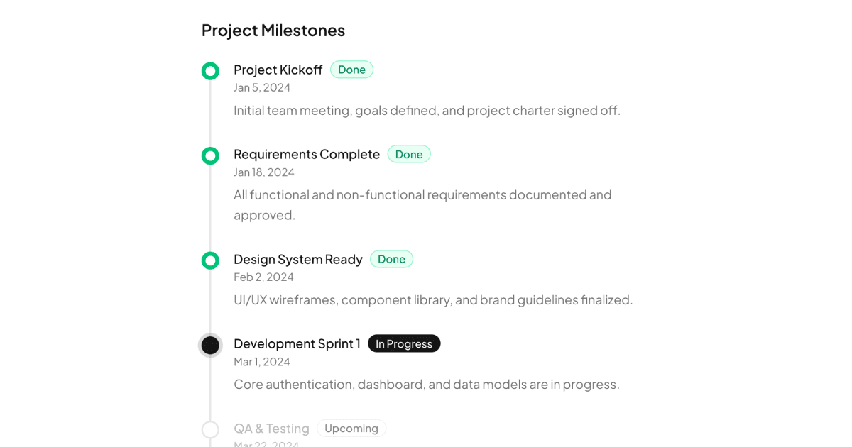
Timelines
2 examplesTimelines is a collection of chronological display blocks for project milestones, activity histories, and event streams. Each block uses Shadcn UI badges, avatars, and icons on a Tailwind spine layout to keep events scannable in order. Offered in React, Vuejs, and Svelte versions.
Notifications Pages
1 exampleNotifications is a collection of alert and update blocks for showing user activity, mentions, and system messages in one place. The blocks use Shadcn UI avatars, badges, and tabs with Tailwind styling to separate read and unread items clearly. The whole collection comes in React, Vuejs, and Svelte versions.