

A Contact Page Built on Shadcn UI
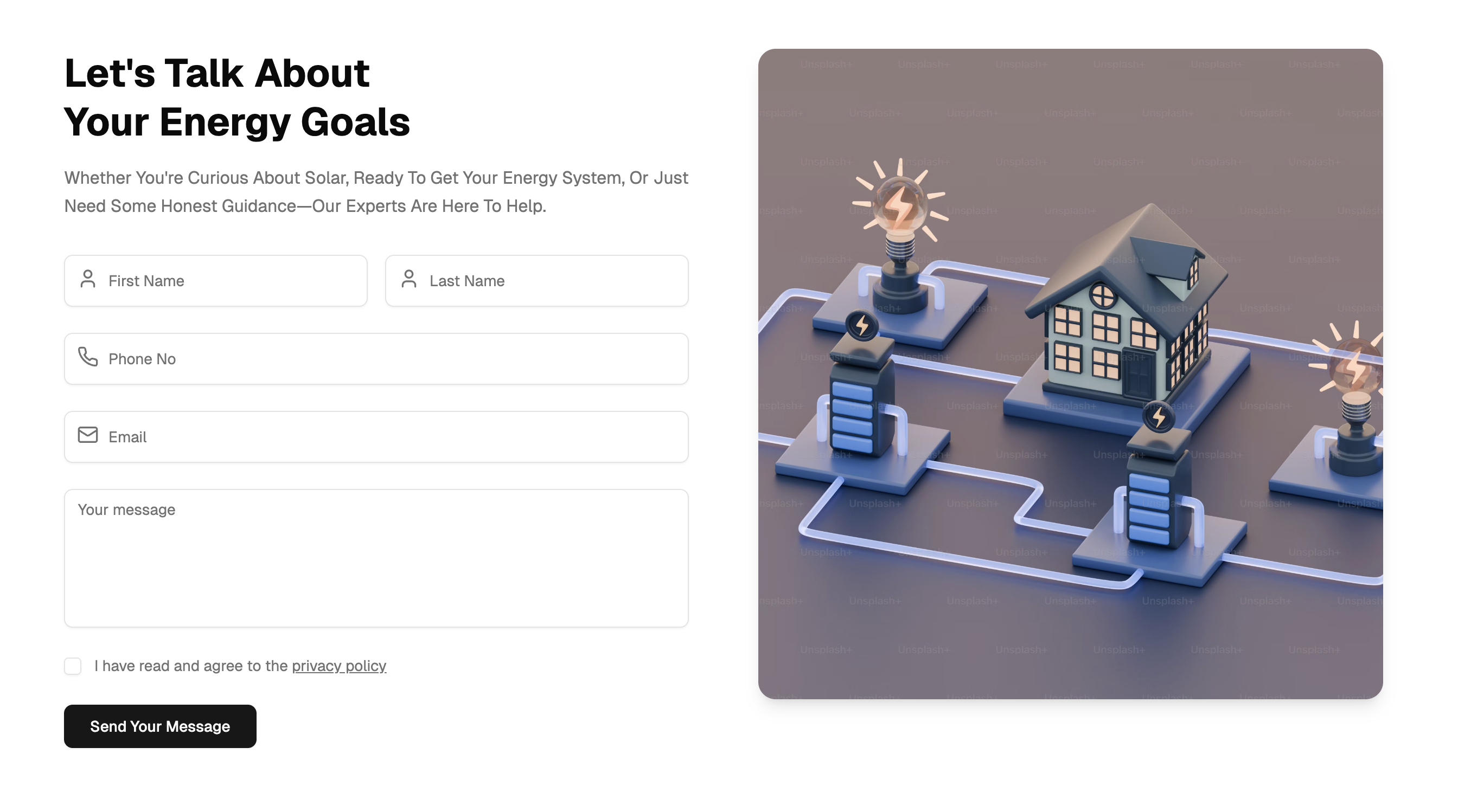
A contact page is the part of a website where visitors stop browsing and start a conversation, whether that means asking about pricing, requesting a quote, or reporting a problem. This block implements that page as a complete, ready to use layout: a two-column grid places a message form on the left and a large rounded hero image on the right, so the page feels like a designed landing section rather than a bare form.
The form itself collects first name, last name, phone, and email through Shadcn UI inputs that carry lucide icon prefixes inside the field, followed by a message textarea and a privacy policy checkbox. A single primary button submits the message, and the whole composition sits on background and card tokens so it blends into any Shadcn UI project without extra styling work.
Where a Contact Block Earns Its Place
Contact pages show up in almost every kind of site. Marketing sites for agencies, consultancies, and local businesses use them as the main conversion point. SaaS products link to them from pricing and support menus. The demo content is themed around a solar energy company, which shows how naturally the layout adapts to service businesses that want a photo of their work next to the form.
Because the block is a self-contained page, it also works as a template for adjacent flows: a request-a-demo page, a partnership inquiry form, or a careers contact screen. Teams browsing the wider blocks collection often pair it with a hero section and a pricing table to assemble a full marketing site in an afternoon.
The Stack Behind the Form
The block is written as a React client component. Form state lives in a single useState object that tracks every field plus the privacy checkbox, and the submit handler resets the state cleanly, so there are no form libraries or external dependencies to install. Validation relies on native required attributes on the inputs, which keeps the bundle small and the code easy to read.
Layout and spacing come entirely from Tailwind utility classes: a responsive grid that stacks on mobile and splits into two columns on large screens, consistent gap utilities, and rounded corners with a soft shadow on the image panel. Icons are drawn from lucide-react and positioned absolutely inside each input for the prefix effect.
Restyling the Form With Your Palette
Every color in the block references a Shadcn UI design token rather than a hard-coded value: the page uses bg-background, headings use text-foreground, helper text uses text-muted-foreground, and the input fields sit on bg-card with border-border. That means the block responds instantly when you change the CSS variables in globals.css.
Dark mode works with zero extra effort. Because the tokens flip automatically when the dark class is applied to the document, the form, the checkbox, and the surrounding text all stay readable in both themes. If you want a different accent, adjust the primary variable once and the submit button follows.
Components Inside, Frameworks Supported
The block composes four Shadcn UI components: Input for the text fields, Textarea for the message, Checkbox for the privacy consent, and Button for the submit action. Each one is the standard registry version, so anything you have already customized in components/ui carries over automatically.
The contact page ships in React, Vuejs, and Svelte versions. The Vuejs edition builds on the shadcn-vue port and the Svelte edition on shadcn-svelte, so the markup, tokens, and behavior stay consistent no matter which framework your project uses.
Adding the Block to Your Project
The fastest route is the shadcn CLI command displayed at the top of the example page, available in npm, pnpm, yarn, and bun variants. Running it installs the page file plus its Shadcn UI dependencies straight into your project structure. Alternatively, open the code tab and copy the single page.tsx file by hand, since the block has no supporting files.
This is a pro example, so the code tab and CLI install unlock with an All Access plan, which you can compare on the pricing page. After installing, wire the submit handler to your backend: post the form state to an API route, a serverless function, or a form service, and swap the stock photo for your own imagery.