

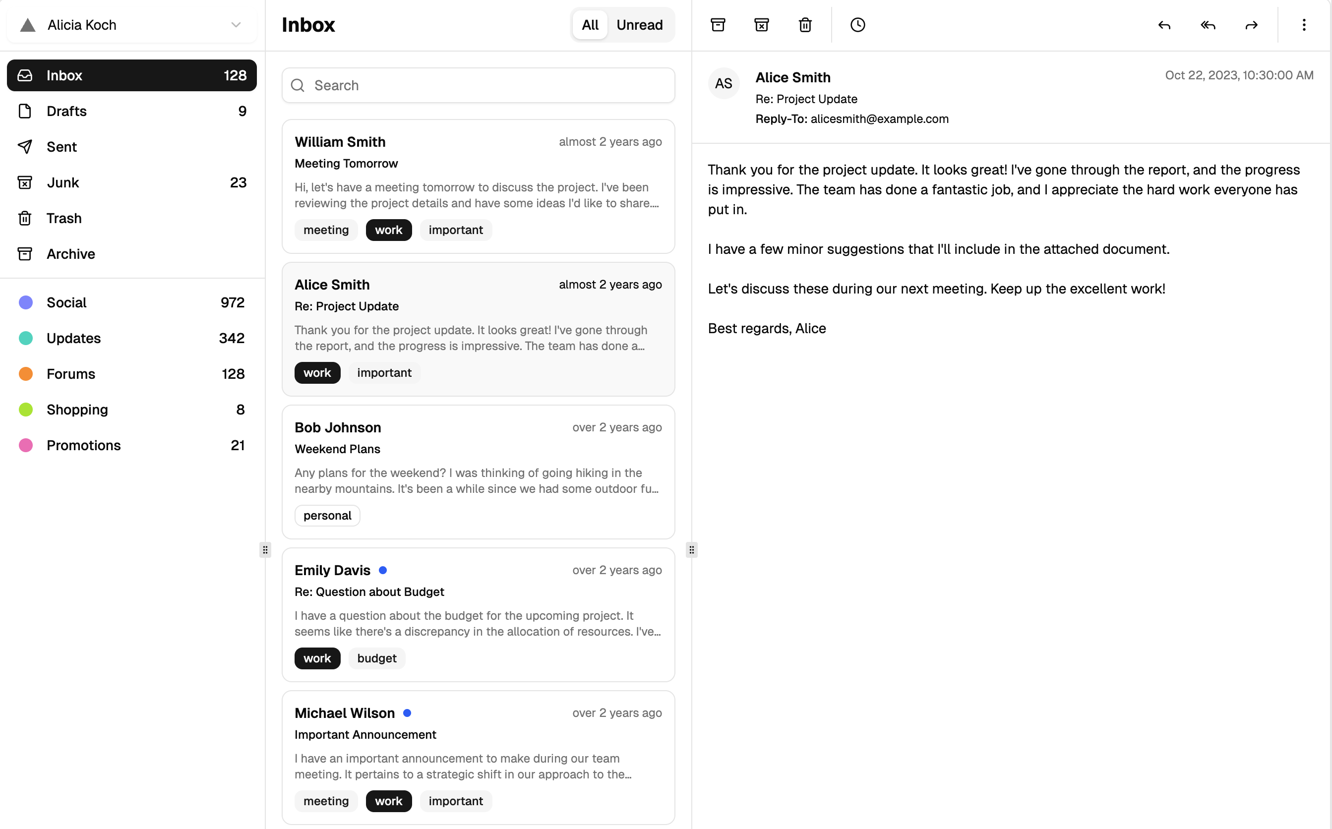
What Makes a Mail App Block
A mail app is the classic three-pane interface: navigation on the left, a message list in the middle, and the open conversation on the right. This block delivers that entire shell as a working Shadcn UI layout with an account switcher, folder navigation with unread counts, a searchable message list with All and Unread tabs, and a reading pane with reply tools.
It behaves like a real client, not a screenshot. The three panes are independently resizable, the sidebar collapses to an icon rail, and selecting a message updates the reading pane instantly.
Beyond Email: Places to Use a Three-Pane Layout
The obvious use is an email client inside a SaaS product, a support tool, or an internal communications hub. But the master-detail-navigation pattern generalizes well: ticketing systems, CRM inboxes, document review queues, and moderation dashboards all benefit from the same anatomy of list plus detail plus filters.
Teams building outbound features often pair it with email templates, using the mail app shell for reading and triage while templates handle composition and campaigns.
Resizable Panels, Cookies, and State
The layout is built on the Shadcn UI resizable primitives, which wrap react-resizable-panels. Every time you drag a divider, the new sizes are written to a cookie, and the page component reads that cookie on the server so your layout is restored on the next visit with no flash of default sizes. The sidebar's collapsed state persists the same way.
Selection state lives in a compact Zustand store: one selected mail and one setter. That keeps the list and reading pane in sync without prop drilling, and it gives you an obvious place to hook in routing or data fetching later. A dedicated mobile path swaps the panes for a phone-friendly list and full-screen message view, driven by a media query hook.
Theming the Inbox
All surfaces reference Shadcn UI design tokens, so the pane backgrounds, borders, muted timestamps, and unread badges are controlled by the CSS variables in globals.css. Change your primary color or radius there and the whole client updates, and dark mode arrives free of charge through the theme class on your document.
Density and spacing are Tailwind utilities on the list items and toolbar, easy to tighten for power users or relax for a consumer feel. The default panel sizes and the collapse threshold are plain props on the layout component.
Component Breakdown of the Mail Client
This is one of the most component-rich blocks in the collection. It composes resizable panels, tabs for the All and Unread filter, tooltips on every toolbar action, a select-based account switcher, scroll areas, badges, avatars, separators, dropdown menus, a popover with a calendar for snoozing messages, a switch, and a textarea for quick replies, with a sheet and drawer serving the mobile navigation and message view.
The block ships in React, Vuejs, and Svelte versions. The Vuejs and Svelte editions build on the shadcn-vue and shadcn-svelte ports, so the same three-pane behavior is available whichever framework renders your app.
Installation and Real Data
Use the shadcn CLI command at the top of the example page, offered for npm, pnpm, yarn, and bun, to pull the block and its dependencies into your project, or copy the files from the code tab. As a pro block, both paths unlock with an All Access plan, described on the pricing page.
The sample messages live in a typed data file, so integration means replacing that module with your API: fetch messages into the same Mail shape, pass them to the layout as props, and extend the Zustand store with any actions your backend needs, such as marking read or archiving. The cookie-based layout persistence assumes a server-rendered page, which Next.js provides out of the box.