

Understanding the Profile Page Block
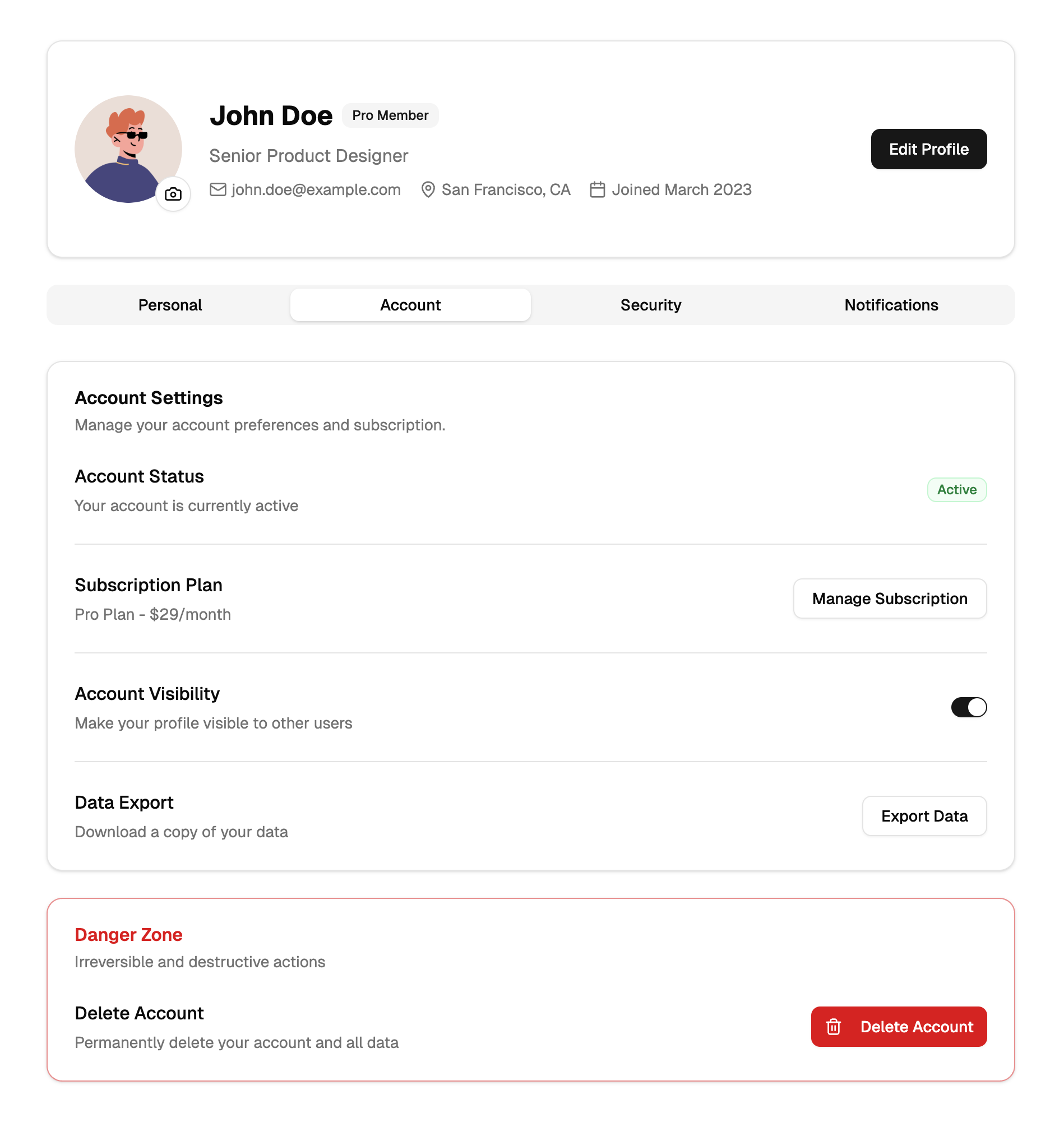
A profile page is where an application shows a user who they are in the system and lets them manage the details: identity, contact information, credentials, and preferences. This block implements the pattern as a centered account layout in two parts, a profile header card and a tabbed settings area beneath it.
The header presents an Avatar with a camera button for photo uploads, the user's name, role and status badges, and contact rows with mail, location, and joined date icons. It is the kind of page every SaaS dashboard, community platform, and internal tool eventually needs, and it complements smaller identity pieces like profile cards and full settings pages.
Four Settings Tabs in One Layout
The lower card uses Shadcn UI Tabs to organize four sections. Personal covers name, bio textarea, and contact fields. Account handles email and regional preferences. Security groups password fields with a key icon, protective options behind a shield, and a destructive delete account zone. Notifications is a stack of labeled Switch toggles for email and activity alerts.
The component list reads like a Shadcn UI form tour: Card, Tabs, Input, Textarea, Label, Switch, Button, Badge, Avatar, and Separator, with Lucide supplying the icons. Because the sections are ordinary form controls, binding them to react-hook-form or your own submission logic is straightforward.
Tokens Over Hardcoded Colors
Everything on the page draws from the design tokens in globals.css: card surfaces on bg-card, secondary text on text-muted-foreground, destructive actions on the destructive variable. Reskinning the page for your product means adjusting those variables, and the layout, built with responsive Tailwind utilities, keeps its centered column on desktop and stacks cleanly on mobile.
Dark mode requires zero extra work. Since colors are CSS variables switched by the theme class, the header card, tab bar, inputs, and switches all restyle together, which is exactly what users expect from an account area inside a dark dashboard.
Setup With the CLI or the Code Tab
The quickest path is the shadcn CLI command displayed at the top of the block page, with npm, pnpm, yarn, and bun variants that install the page, the header, and the tabbed content components into your project. Copying the files from the code tab works too. This is a pro block, so both options are part of the All Access plan.
The block is available in React, Vuejs, and Svelte versions, the Vuejs and Svelte editions building on the shadcn-vue and shadcn-svelte ports. Integration afterwards is standard form work: load the signed in user's data into the fields, submit changes to your API, and connect the camera button to your upload endpoint. The information architecture and visual design are already settled.