

Understanding the Search Results Block
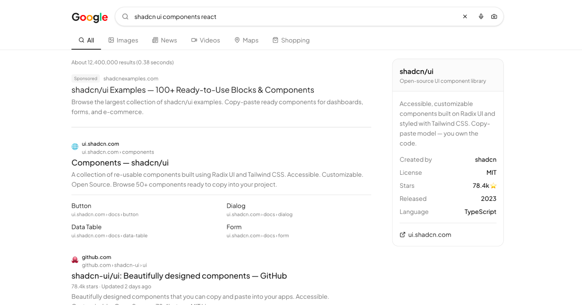
This block recreates a modern web search results page, the kind of layout users already know by muscle memory. A live search input sits above a row of tab filters for All, Images, News, Videos, Maps, and Shopping, followed by a list of organic results with titles, URLs, descriptions, and sitelinks. A People also ask section expands questions inline, related searches invite the next query, and a knowledge panel in the sidebar summarizes the topic at a glance.
It is a complete page rather than a lone component, which is what makes it useful as a starting point. All the familiar search engine furniture is already positioned, styled, and responsive.
Use Cases for a Results Page Layout
The layout fits anywhere a query returns a ranked list. Internal site search is the most common case: documentation portals, knowledge bases, and e-commerce catalogs all need a page that presents matches with context. It also works for directory style listings, app marketplaces, and admin tools where users search across records.
Because the tab filter row is generic, you can repurpose the categories for your own content types, swapping Images and News for Products, Articles, or People with a few label changes.
The Stack Behind the Results
The implementation is deliberately light. Query text and the active tab live in plain React useState, results render from a static data array, and there are no external data dependencies or fetch calls to untangle before you can adapt it. Icons come from lucide-react, and the layout is pure Tailwind: a constrained content column with a sidebar that collapses on smaller screens.
The People also ask section is built on the Shadcn UI Accordion, giving you keyboard accessible expand and collapse behavior for free. That is the kind of detail that is tedious to build correctly by hand and trivial to inherit from a well tested primitive.
Inside the Layout: Shadcn UI Pieces
Beyond the Accordion, the block uses Shadcn UI Badge components for result metadata, Button for actions and filters, and Separator to divide the sidebar panel into readable groups. Everything else is composed from semantic markup and Tailwind utilities.
The block is offered in React, Vuejs, and Svelte versions. The Vuejs edition builds on the shadcn-vue port and the Svelte edition on shadcn-svelte, so teams outside the React ecosystem get the exact same results page with idiomatic code for their framework.
Theming the Results Page
No color is hardcoded in the block. Result titles, visited-link hues, muted descriptions, and panel surfaces all reference the CSS variables declared in globals.css, tokens like foreground, muted-foreground, card, and border. Adjusting those variables re-skins the whole page, and because the tokens are redefined for the dark class, the block supports dark and light mode automatically.
If you want a search page that looks less like a search engine and more like your product, start with the radius and primary tokens. Rounding and accent color do most of the perceptual work.
Shipping It in Your App
This is a free block: the entire source is viewable in the code tab and copyable by anyone, and the shadcn CLI command at the top of the page, shown for npm, pnpm, yarn, and bun, installs it without a paid plan.
To make it real, replace the static results array with the response from your search backend, whether that is a database query, Algolia, Meilisearch, or a custom endpoint. The result item shape is a simple object, so mapping your API response into it is usually a few lines. Browse the rest of the blocks library if you need surrounding pages for the same product.