

Search Results with a Live Map Beside Them
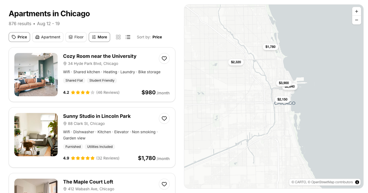
This block recreates the split screen every listing platform converges on: a scrollable column of result cards on the left and a real, interactive map on the right. The header states the search in plain words, city, result count, and date range, and a row of filter chips sits directly under it. Each card packs a photo, the listing name, an address line with a pin icon, an amenities string, small tag badges, a star rating with a review count, and a bold monthly price in the default Shadcn UI theme.
The two panes are genuinely connected. Every result is placed on the map at its real coordinates as a photo and price marker, filtering the list hides the matching markers, and selecting a card or a marker highlights its twin on the other side.
Where a Map Backed Results Page Fits
Apartment and house rentals are the obvious fit, but the layout serves any search where results carry both attributes and a location: hotel booking, coworking spaces, restaurant discovery, or a job board filtered by office. It also slots in next to the other blocks in the search results category when your product needs a geographic view instead of a ranked text list.
Because every listing is a plain object with a title, price, amenities, and longitude and latitude, repurposing the block mostly means renaming fields. Swap apartments for venues or clinics and the cards, filters, and markers keep working unchanged.
A Real Map, the Shadcn Way
The map panel is built with mapcn, a registry of map components for React that wraps MapLibre in Shadcn UI style primitives. The block composes its Map, MapControls, MapMarker, MarkerContent, and MarkerPopup components: markers are ordinary JSX, so the photo and price pills are plain Tailwind markup, and the popup that opens on click is a small card with the listing image, rating, and price.
No API key or paid tile service is required, and the basemap automatically follows your theme, switching between light and dark map styles together with the rest of the page. Zoom controls sit in the corner, and panning, scrolling, and touch gestures all work as users expect from a real map.
Working Controls, Not Painted Ones
The interactive parts are real. The Price chip opens a Shadcn UI Dropdown Menu with radio ranges that filter the cards and their markers at the same time, the Sort by menu reorders results by price, rating, or review count, and the two view icons flip the column between a stacked list and a two column grid. Every heart button toggles a favorite, and the active listing is mirrored with a ring on its card and a filled marker on the map.
All of that runs on plain React useState and a single useMemo, with no store or fetch layer to untangle. When a filter leaves nothing to show, a small empty state card offers a one click way to clear it, so the page never dead ends.
Included Pieces and Framework Editions
Beyond the map components, the block leans on a small set of Shadcn UI components, Button for chips, hearts, and toggles, Badge for listing tags, and Dropdown Menu for the price and sort controls, with icons from lucide-react and layout handled by Tailwind flex and grid utilities. Cards, the map panel, the filter bar, and the data file are separate components, so each piece can be lifted out on its own. On phones the map hides behind a floating Show map button that flips the whole view.
It is offered in React, Vuejs, and Svelte versions of the same design. The Vuejs edition builds on the shadcn-vue port and the Svelte edition on shadcn-svelte, so mixed stack teams can keep one search layout everywhere. Install it from the code tab or with the shadcn CLI command on the example page.