

A Calendar That Lives in Day Mode
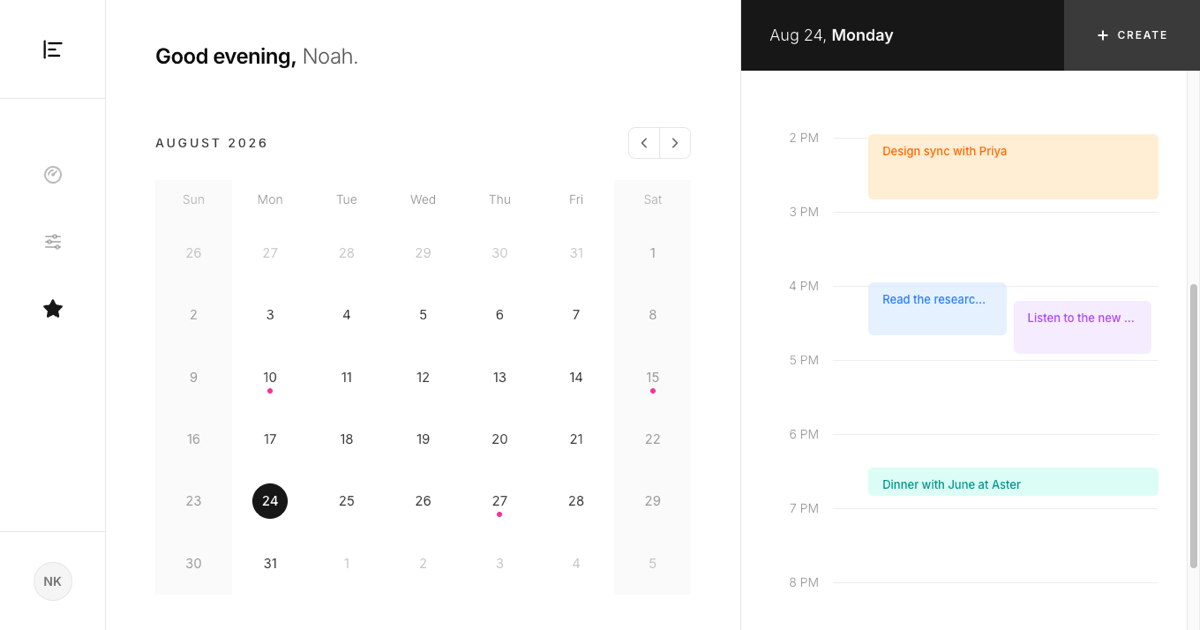
Where most calendar blocks juggle month, week, and day views, this one commits to a single mode: the day. The right panel is a vertical timeline from morning to night with hour labels, faint rule lines, and pastel event blocks, and everything else on the screen exists to feed it. There is no view switcher to configure because the day view is the product.
The layout reads left to right as rail, month, day. A slim icon rail holds the logo, three navigation icons, and the avatar. The middle column greets the user by name, then offers a mini month grid. The right column answers with the selected date in an indigo header and the schedule below it.
The Mini Month as a Remote Control
The month grid here is not the main event, it is the navigation. Clicking a day flips the timeline to that date instantly, the paired arrow buttons page through months, and pink dots under day numbers mark the dates that already hold events, so you can see where your schedule clusters before you click.
The grid keeps the reference design's quiet details: weekend columns tinted in a soft indigo wash from header to last row, outside days faded, and the selected day sitting in a filled indigo circle.
Timeline Mechanics: Lanes and the Now Line
Events are absolutely positioned against the hour scale, so a fifty minute block is visibly shorter than a two hour one. When two events overlap, a small lane algorithm splits them into side by side columns, which is how a reading session and a listening session can share the four o'clock hour without colliding.
When the selected day is actually today, a pink line with an arrowhead crosses the timeline at the current minute and keeps itself updated. On any other day the line stays out of the way, which is exactly how a real calendar behaves.
Creating Events Without Leaving the Page
The CREATE segment of the indigo header opens a Shadcn UI Dialog with a title field, native time inputs for start and end, and four color chips that preview the block styles. Saving pushes the event into state for the selected day, and it materializes on the timeline at the right position and height immediately.
Validation is minimal but real: the button stays disabled until there is a title and the end time is after the start time, so the timeline never receives a malformed block.
Adapting the Block to Your App
Take the code from the Code tab or pull the block with the shadcn CLI. Events live in a small JSON file as day, start, end, title, and color, so binding the timeline to your API is a mapping exercise. Surfaces use theme tokens throughout, and the pastel event palette carries dark mode variants, so the block works in both themes untouched.
On phones the rail gives way to a compact top bar, the columns stack, and the timeline keeps its own scroll. If you want month grids or sidebar filters instead of a single day focus, the other blocks in event calendars cover those layouts, and this one also ships for Vuejs on shadcn-vue and for Svelte on shadcn-svelte.