

Two Calendars, One Screen
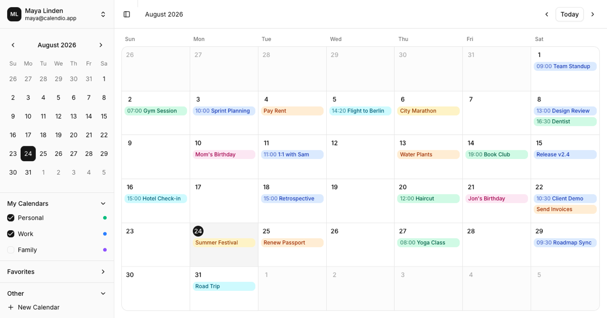
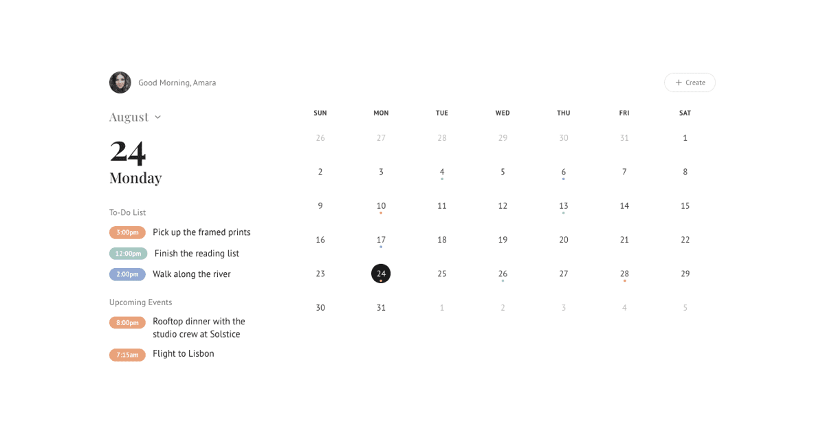
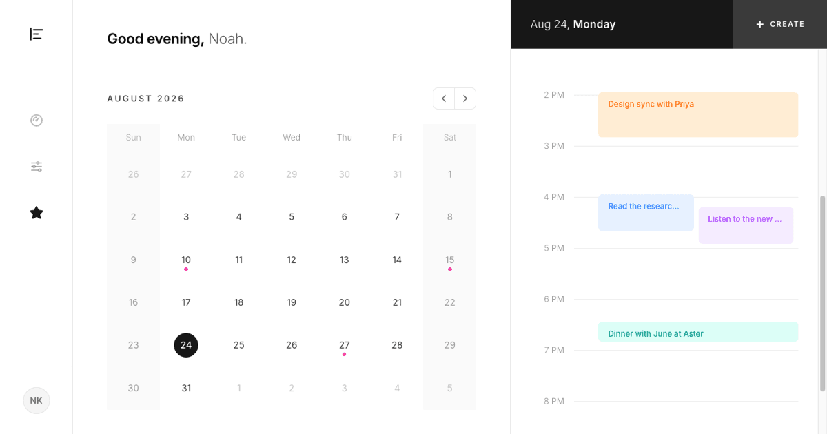
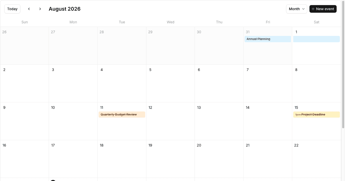
This block combines two calendar surfaces that stay in sync. The content area renders a classic month grid: seven columns, six rows, a highlighted today marker, and colored event chips with times and titles. The sidebar carries a compact date picker plus grouped calendar lists, following the structure of the official sidebar-12 block from the Shadcn UI examples, with a user menu on top and a New Calendar button pinned to the footer.
Because both surfaces share the same state, moving around feels like a real calendar app. Change the month in the sidebar picker and the grid follows, page through months with the header arrows and the picker follows back, and click any day in either place to select it everywhere.
Checkboxes That Actually Filter
The sidebar lists calendars in three collapsible groups, My Calendars, Favorites, and Other, each row with a checkbox and a color dot. These are not decorative: unchecking Work instantly removes every Work event chip from the month grid, and checking Family brings its events back. The active set lives in React state, so the filter logic is a single array filter you can trace in seconds.
Colors travel with the data. Each calendar carries a color key, emerald for Personal, blue for Work, amber for Holidays and so on, and both the sidebar dots and the event chips read from one shared map of Tailwind classes with dark mode variants baked in.
The New Calendar Dialog
The New Calendar button in the sidebar footer opens a small dialog with a name input and a row of selectable color swatches. Creating a calendar appends it to the My Calendars group, already checked, and any events assigned to it would immediately render in its color. It is a compact pattern for list plus create flows that you can reuse far beyond calendars.
The dialog is a stock Shadcn UI Dialog with an Input, Labels, and two Buttons, so restyling it or swapping the color picker for your own component is straightforward.
Responsive Behavior and Theming
On wide screens each day cell shows up to three labeled chips plus a +N more line. The grid watches its own width with container queries, so when space runs out the chips collapse into small colored dots and the day numbers center themselves, keeping the month readable on a phone. The sidebar itself is the collapsible Shadcn UI sidebar, sliding over the content on mobile behind the trigger button in the header.
Styling stays inside the design token system: sidebar surfaces use the sidebar tokens, the grid uses border, muted, and accent, and only the per-calendar colors reach for the Tailwind palette. Dark mode works out of the box in both the grid and the chips.
Using the Block in Your Project
Copy the code from the Code tab or install the block with the shadcn CLI, then feed it your own events. The demo keeps events, calendar groups, and the user in one JSON file, where each event is a day of month, a calendar name, a title, and an optional time, which makes swapping in an API response trivial.
If you need drag and drop scheduling, week and day views, or an event editing dialog, the fuller event calendar block covers that scope. The same sidebar calendar block also exists for Vuejs on shadcn-vue and for Svelte on shadcn-svelte, sharing the layout and interactions across all three frameworks.