

A Topbar Dashboard Instead of a Sidebar
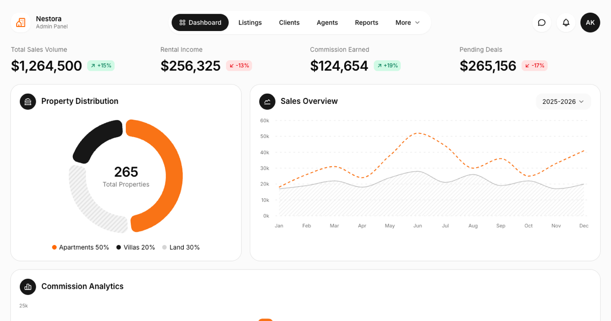
Most admin blocks in this collection lean on a collapsible sidebar, but this real estate dashboard block takes the other route: a horizontal topbar with the brand on the left, a pill shaped navigation in the center, and quick actions on the right. The active page sits in a dark rounded pill, messages and notifications open as popovers with real content, and the avatar menu carries profile entries plus a dark and light mode toggle powered by next-themes.
That single decision changes what the block is good for. Without a sidebar eating 250 pixels, the content area spans the full width of the screen, which is exactly what a listings heavy interface wants. On smaller screens the center navigation folds into a menu button so nothing is lost on mobile.
Reading the Numbers: Stats, Donut, and Charts
The metrics row renders four property KPIs, total sales volume, rental income, commission earned, and pending deals, each with a soft green or red trend badge. Below it, a property distribution donut splits the portfolio into apartments, villas, and land, with the land share drawn as a hatched pattern segment and the total floating in the donut center.
Two more charts complete the row, both drawn with the Shadcn UI chart wrapper around Recharts. Sales Overview plots a dashed sales line against a hatched rentals area across twelve months, and its year selector actually swaps the series between three periods of data. Commission Analytics renders six monthly bars with the strongest month highlighted in orange, and hovering any bar reveals the exact figure in a tooltip.
The Listings Table and Its Controls
Top Performing Listings is where the block earns its name. Each row pairs an icon tile with the property name, then type, location, date, price, a colored status pill for Available, Rented, and Sold, and a kebab menu with view, edit, share, and archive actions. Rows are drawn as separated soft strips rather than bordered lines, matching the airy look of the rest of the page.
The two controls in the card header are live. The time range menu filters rows to the last 24 hours, week, or month based on a recency field in the data, and the See All button expands the table to the full dataset and flips into a Show Less state. On narrow screens the table scrolls horizontally inside its card so the page itself never overflows.
Styling Choices You Can Keep or Swap
The block stays on the default neutral Shadcn UI theme and reserves color for data: one orange accent for the primary series, plus soft emerald, blue, and red pills for statuses and trends. Cards are borderless white panels with large radii sitting on a muted page background, all expressed through Tailwind utility classes and theme tokens, so switching your project palette restyles the whole page at once.
Dark mode needs no extra work. Because surfaces read tokens like card and muted instead of hardcoded grays, the topbar pills, hatched chart patterns, and table strips all invert cleanly when the toggle in the user menu flips the theme.
Install It, Then Point It at Your Data
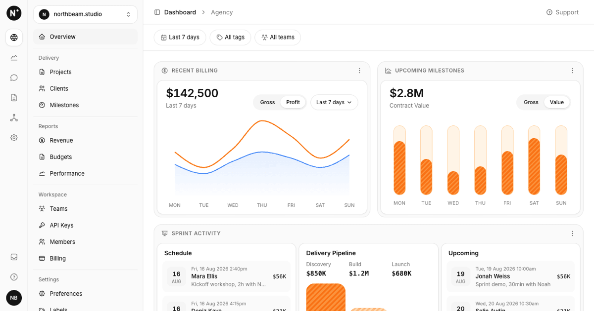
Grab the code from the Code tab or pull the block into your project with the shadcn CLI, then replace the bundled JSON with your own listings and revenue figures. Stats, chart series, table rows, messages, and notifications all live in one data file, so wiring the dashboard to an API is mostly a matter of matching its shape.
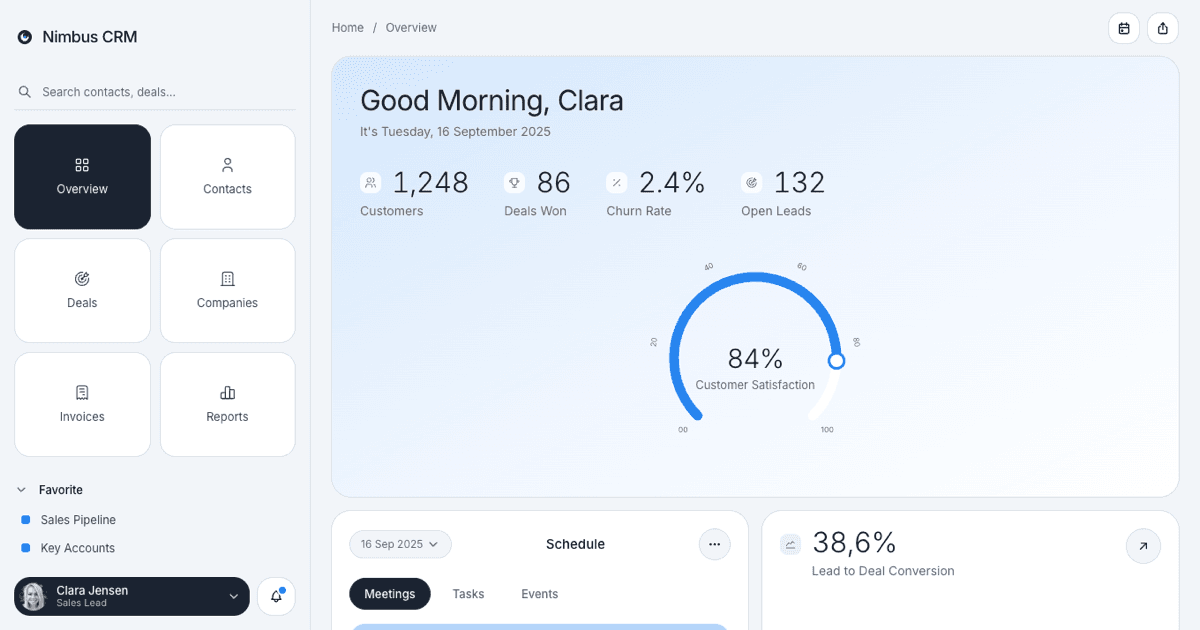
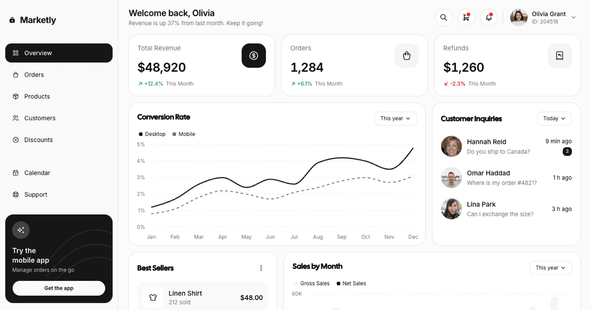
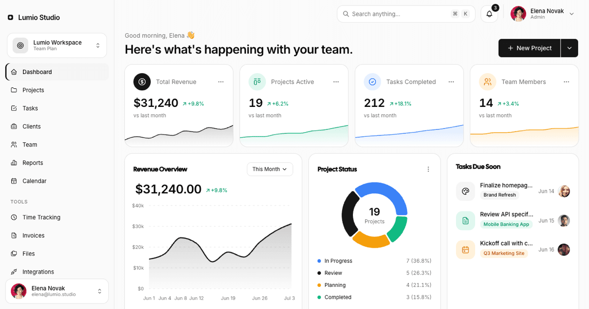
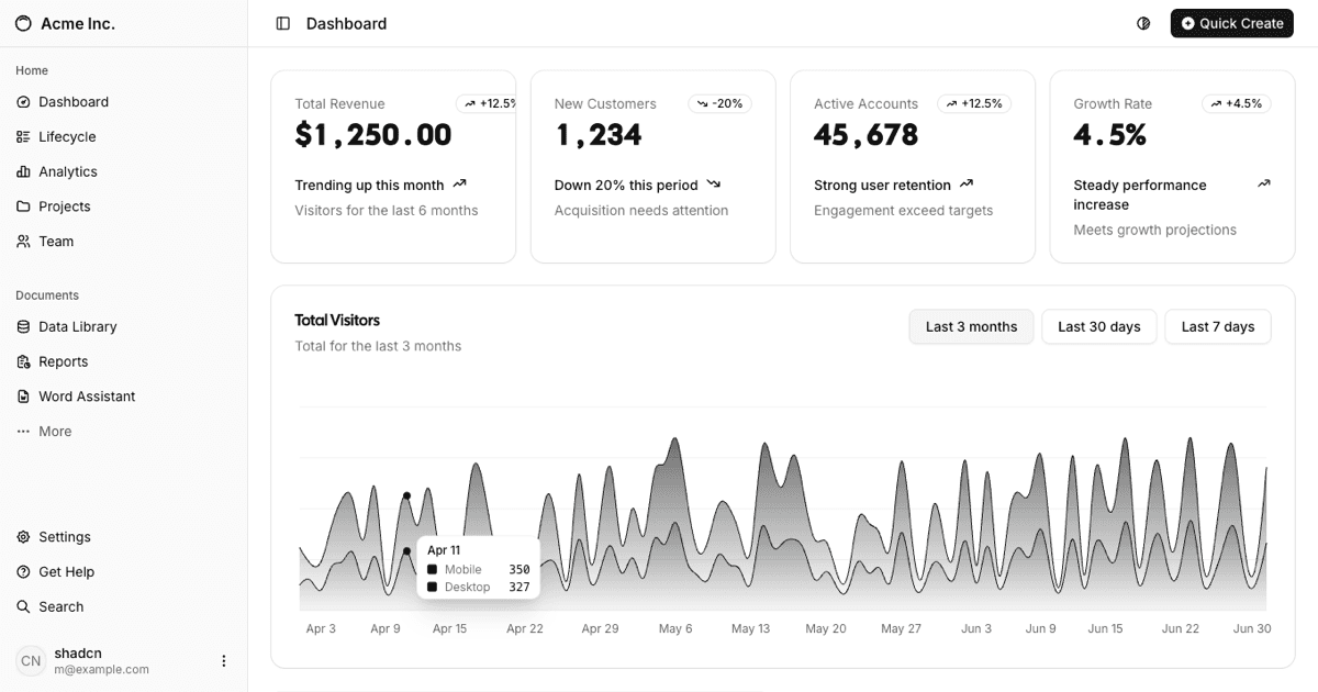
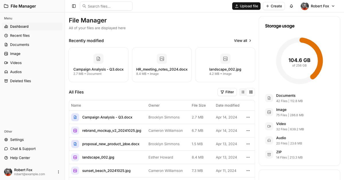
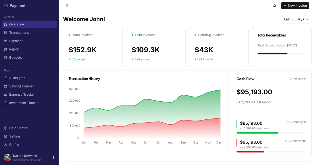
The same block also exists for Vuejs on shadcn-vue and for Svelte on shadcn-svelte, so mixed stack teams can share one design. If you need a different starting point for an internal tool, the rest of the admin dashboards category covers sidebar based variants for analytics, files, payments, ecommerce, and project work.