

An Agency Cockpit With a Double Sidebar
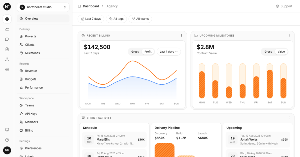
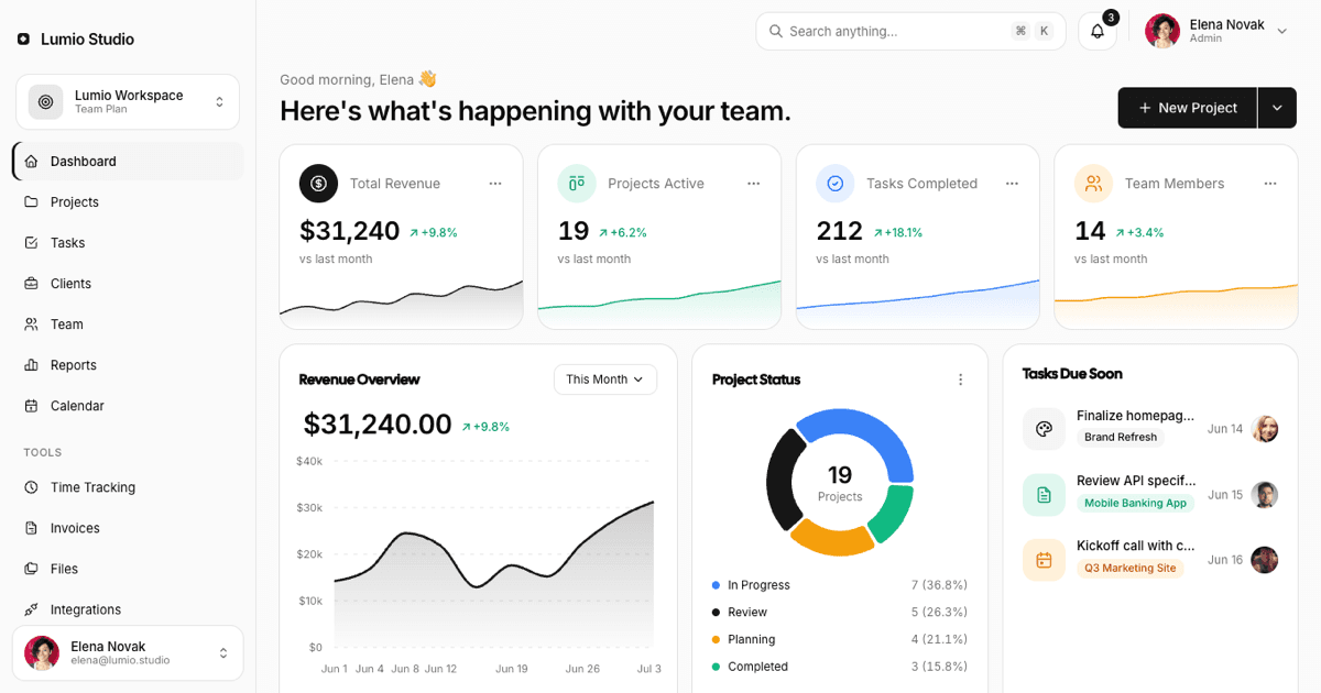
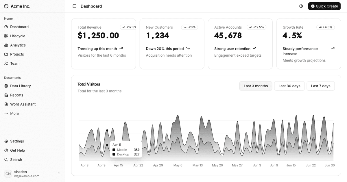
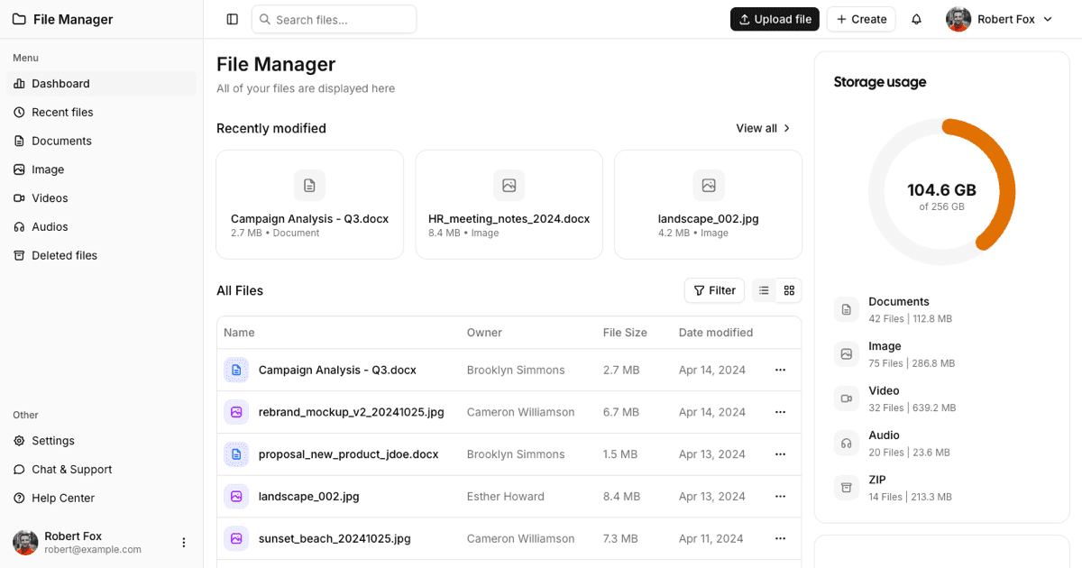
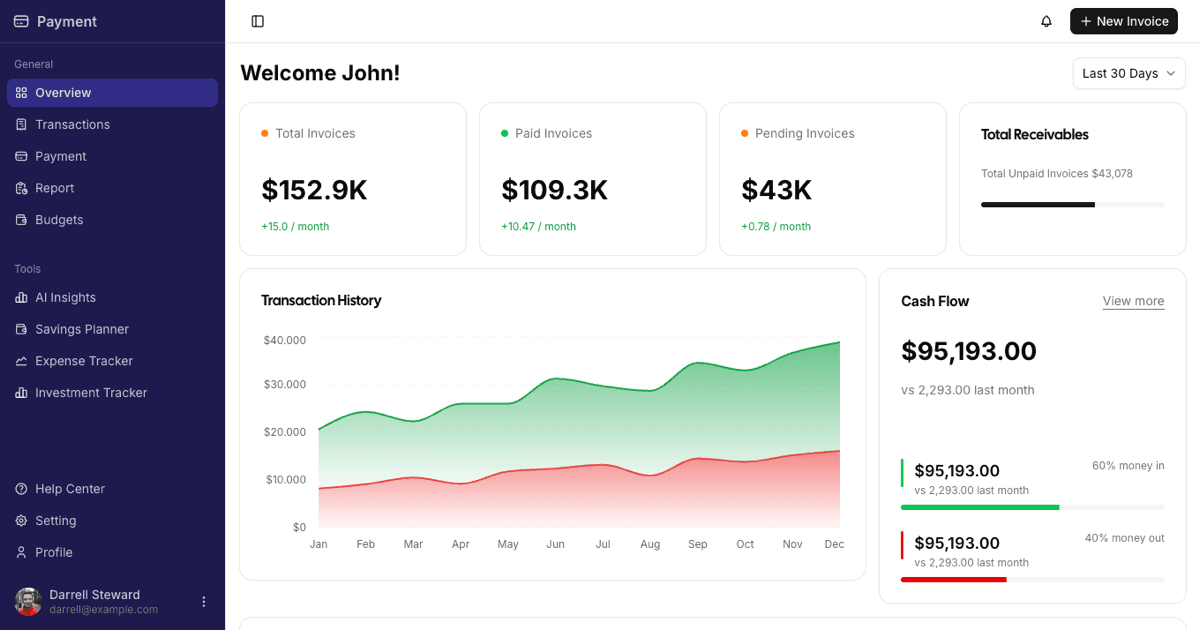
The Project Management Admin Dashboard is a full-page Shadcn UI block for agencies and consultancies that bill by project: a recent billing chart, an upcoming milestones capacity view, a sprint activity section with schedule lists and a delivery pipeline funnel, and a selectable active projects table. It belongs to the admin dashboards collection and complements the other project blocks such as projects lists and timelines.
Its signature is the double sidebar built inside one Shadcn UI Sidebar: a narrow icon rail with tooltip navigation, the logo, inbox, help, and the user avatar, next to a panel with a workspace switcher and grouped links (Overview, Delivery, Reports, Workspace, Settings) separated by hairlines. Below the xl breakpoint the whole rail collapses into an offcanvas drawer.
Default Theme, Light First
The block uses the standard shadcn palette with no variable overrides: neutral surfaces, a black primary, and cards on a bg-muted/40 page, so it adopts whatever theme your globals.css defines and ships light by default with full dark mode support. Orange and blue appear only as data colors, declared inside the chart components where series need separating.
Type is kept small and technical: uppercase card headings with icons, 13px body text, and monospace tabular numerals for money columns, matching the reference design's utilitarian tone.
A Filter Bar That Actually Filters
Under the breadcrumb header sits a row of pill filters: a period radio menu (Last 7 days, Last 30 days, This quarter), a tags checkbox menu, and a teams checkbox menu. The period drives the billing chart, the tags filter the active projects table, and the teams filter both schedule lists; labels update to 2 tags or 1 team as you narrow them, and empty states appear when nothing matches.
Recent Billing pairs the selected period with a Gross and Profit segmented toggle: switching it swaps the headline total and the orange line series over the blue cost area, both rendered with Recharts inside the shadcn ChartContainer with a tooltip and no animation delay.
Milestones, Schedule, and the Delivery Funnel
Upcoming Milestones renders seven capsule gauges, one per weekday, as pure CSS: a rounded track with an orange striped fill whose height encodes booked capacity, a hover Tooltip with the exact percentage, and a Gross and Value toggle that swaps the dataset and the headline between contract value and gross pipeline.
Sprint Activity holds three panels: Schedule and Upcoming list sessions with a date tile, timestamp, person, description, and a monospace amount, while Delivery Pipeline shows Discovery, Build, and Launch totals above three rounded funnel bars in descending orange tones. All rows come from data.json and react to the teams filter.
Projects Table, Mobile Behaviour, and Framework Versions
Active Projects is a Shadcn UI Table with a select-all Checkbox column (the header shows how many rows are selected), project name, due date, engagement type, budget, margin badge, PM fee, an Active or On Hold status badge, and a per-row actions menu. The table scrolls horizontally inside its card on phones while the cards above stack into one column via container queries on the @container/main wrapper.
Everything is data-driven from data.json, so renaming projects or wiring an API touches no component code. The block is published for React as shown here and also for Vuejs on shadcn-vue and for Svelte on shadcn-svelte. Premium members can copy the source from the code tab or install it with the shadcn CLI command above the preview.