

What the Activation Email Template Does
The Activation Email Template is a transactional email block that closes the sign-up loop: a new user registers, receives this message, and clicks one button to confirm their address and activate their account. It is built with react-email components and styled through the react-email Tailwind wrapper, so the markup reads like a normal React component while the output is the table-based HTML that email clients expect.
It belongs to the email templates collection and pairs naturally with the sign-up screens in the authentications category. Any SaaS, marketplace, or community product that verifies email addresses can drop it in as the first message a user ever receives from the app.
Anatomy of the Layout
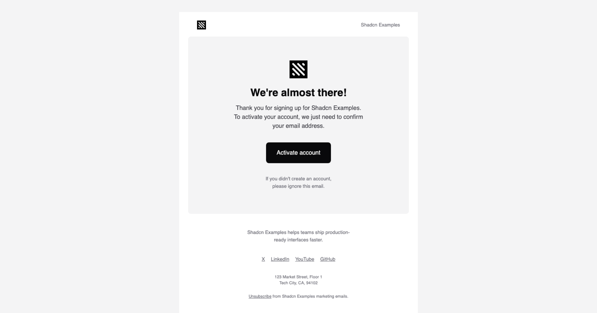
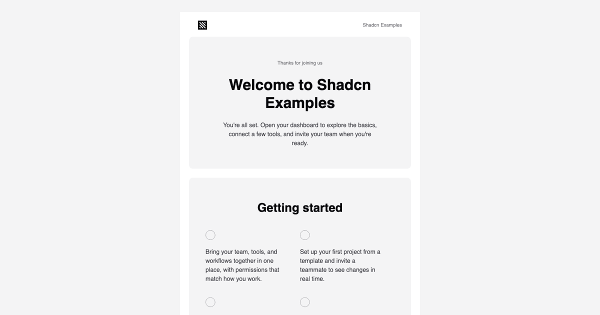
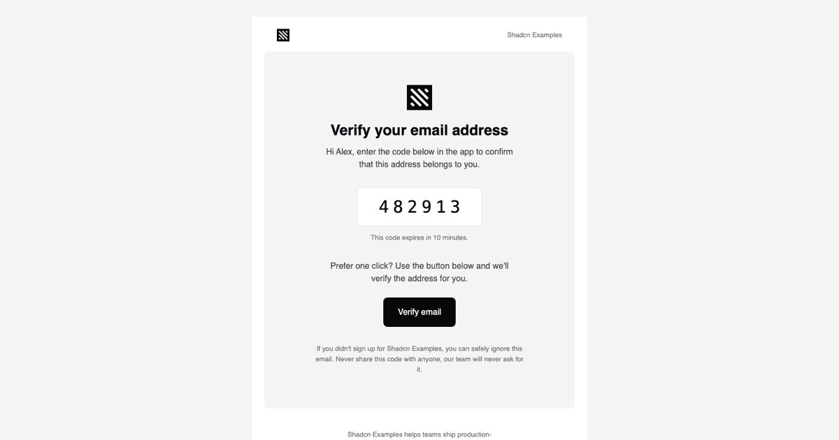
The template is a single ActivationEmail component that takes two props, companyName and url, and composes Html, Head, Body, Container, Section, Row, Column, Heading, Text, Button, Img, Link, and Preview from @react-email/components. A Container capped at 640px holds three stacked Sections: a compact header row with the logo on the left and the company name on the right, a rounded main card with a centered logo, the headline, a short explanation, and the Activate account Button, and a footer with a one-line company description, text-only social links, a postal address, and an Unsubscribe link.
Preview sets the inbox snippet to Activate your company account, and the body copy explains that the address only needs to be confirmed, followed by a note that the message can be ignored if the reader never created an account. The header and footer use Row and Column so the two-column arrangement survives clients that ignore flexbox.
Tailwind Styling That Survives Email Clients
All classes are resolved by the Tailwind component using the config in theme.ts. That file defines a small palette, bg, bg-2, fg, fg-2, fg-3, and fg-inverted, mapped to the same zinc values Shadcn UI uses, plus a sans font stack and a mobile screen that activates below 600px. Utilities such as bg-fg, text-fg-inverted, rounded-lg, and text-[16px] are inlined into style attributes at render time, while the mobile:px-6 and mobile:py-12 variants are emitted as media queries in the document head.
theme-fonts.tsx adds two Font declarations for Inter at weights 400 and 600 with Helvetica and Arial fallbacks, so clients that allow web fonts match your app typography and the rest degrade gracefully. Because every color comes from the theme object, swapping the palette to your brand means editing a handful of hex values in one place rather than touching the template markup.
Previewing and Sending
page.tsx is an async server component that calls render from @react-email/components with ActivationEmail.PreviewProps and shows the resulting HTML in an iframe through srcDoc. That is exactly what an inbox receives, which makes the live preview on this page a faithful check of spacing, colors, and the mobile breakpoint without sending a test message.
In production you use the same render call inside a route handler, server action, or job and hand the HTML to your provider. Resend accepts the React element directly, and Nodemailer or any SMTP service takes the rendered string as the html field. Pass the real user URL with its token as the url prop and your product name as companyName; the logo is loaded from NEXT_PUBLIC_BASE_URL, so point that at a public host your users can reach.
Customizing the Template and Other Frameworks
The quickest edits are copy and assets: change the headline and paragraphs in activation-email.tsx, replace the logo path, and update the social links array and the postal address in the footer. For a second call to action, duplicate the Button inside the main card; for a plain-text fallback, pass the same props to render with the plainText option. Keep the 640px Container and the Section nesting intact so the layout stays centered in Outlook and Gmail.
The block is available in React as shown here, and the same layout is published for Vuejs using vue-email on top of shadcn-vue and for Svelte using svelte-email alongside shadcn-svelte, so the activation flow can share one design across stacks. Pro members can copy the full source from the code tab or install it with the shadcn CLI command above the preview.