

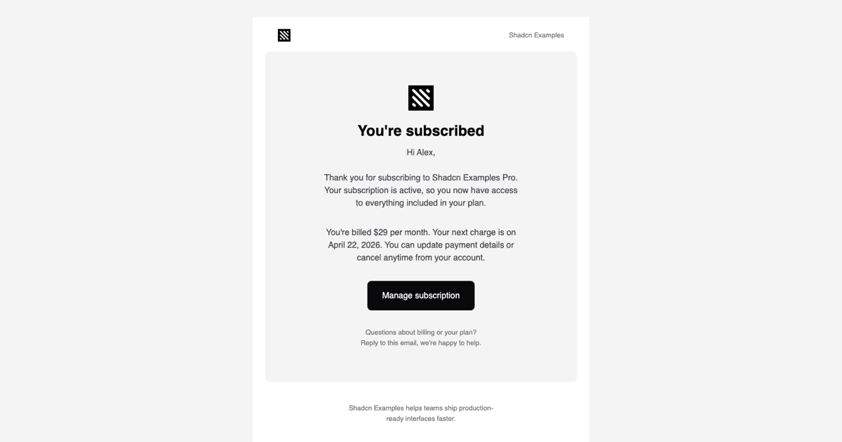
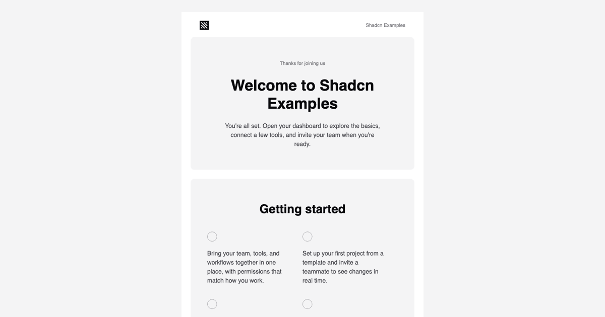
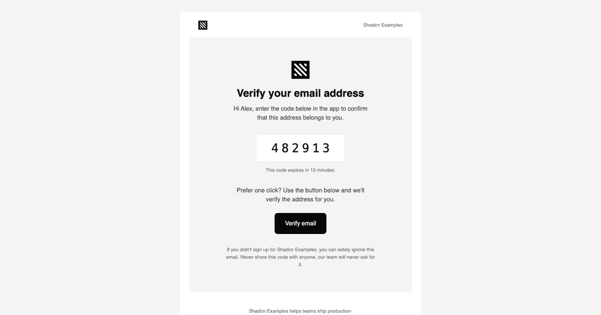
A Receipt Customers Actually Read
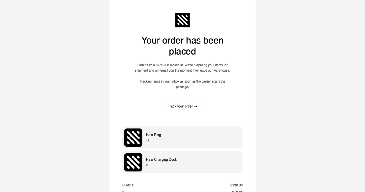
The Order Confirmation Email Template is the transactional email block that follows a successful checkout: it confirms the order number, shows each purchased item with a thumbnail and quantity, lists subtotal, tax, shipping, and total, and offers a Track your order button. It is part of the email templates collection and completes the purchase journey that starts on the product detail pages, shopping carts, and checkout pages blocks.
Confirmation emails have some of the highest open rates a store will ever see, so the layout keeps the reassuring facts at the top, the headline, the order number, and what happens next, and moves the financial breakdown below the fold where customers look for it when they need it.
Data-Driven Line Items and Totals
OrderConfirmationEmail takes companyName, url, orderNumber, items, subtotal, tax, shipping, and total. items is an array of OrderLine objects with name, quantity, and imageSrc, and the template maps over it to render one grey, rounded tile per product with an 80px image, the product name, and an x quantity label. Add or remove products in the array and the email grows or shrinks without touching JSX.
The totals are rendered by a small SummaryRow component that places a label in the left Column and a right-aligned value in the right Column, with a strong variant for the Total line that switches to the primary text color and larger padding. Prices are passed as preformatted strings, so currency and locale formatting stay in your application code.
Layout Built From react-email Primitives
The component is assembled from Html, Head, Body, Container, Section, Row, Column, Text, Button, Img, Link, and Preview out of @react-email/components. A 640px Container holds a white card with the logo, the 40px Your order has been placed headline, two short paragraphs, and a bordered white button, followed by the items and the summary, then a quieter footer section on the grey page background with a company line, text social links, a postal address, and an Unsubscribe link.
Row and Column render real table cells, which is why the thumbnail and product text line up in Outlook and the two-column price rows keep their alignment in every client. The button is an anchor with inline padding and a 1px border, a safe pattern that does not depend on background images.
The Tech Theme and Mobile Behaviour
theme.ts defines a lighter tech variant of the collection palette: bg-2 for the page, bg-3 for the card, bg-4 for the item tiles, fg, fg-2, and fg-3 for text, and button-border for the secondary button, all drawn from the Shadcn UI zinc scale, plus sans and heading font families and a mobile screen up to 600px. The react-email Tailwind wrapper inlines utilities such as rounded-[16px], text-[40px], and px-[20px] as style attributes and emits mobile:px-0 as a media query so the inner padding collapses on phones.
theme-fonts.tsx loads Inter 400 and 600 through the Font component with Helvetica and Arial fallbacks. If your brand uses a display face such as Geist for the headline, point the heading family in theme.ts at it and add a matching Font declaration.
Hooking It Up to Your Store
Render the component from the webhook or server action that fires after payment is captured, for example a Stripe checkout.session.completed event, a Paddle transaction, or your own order service. Map the order lines to the items array, format the amounts, set url to the order status or tracking page, and send the HTML with Resend, Nodemailer, or any SMTP provider. page.tsx in this example shows the render call and previews the output in an iframe through srcDoc.
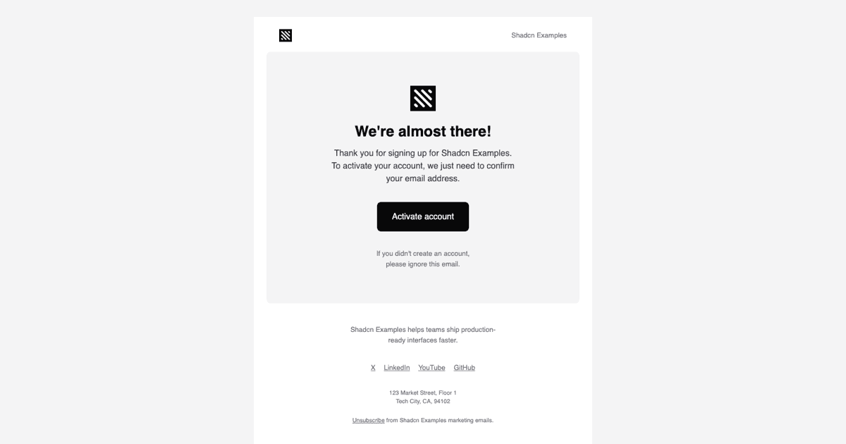
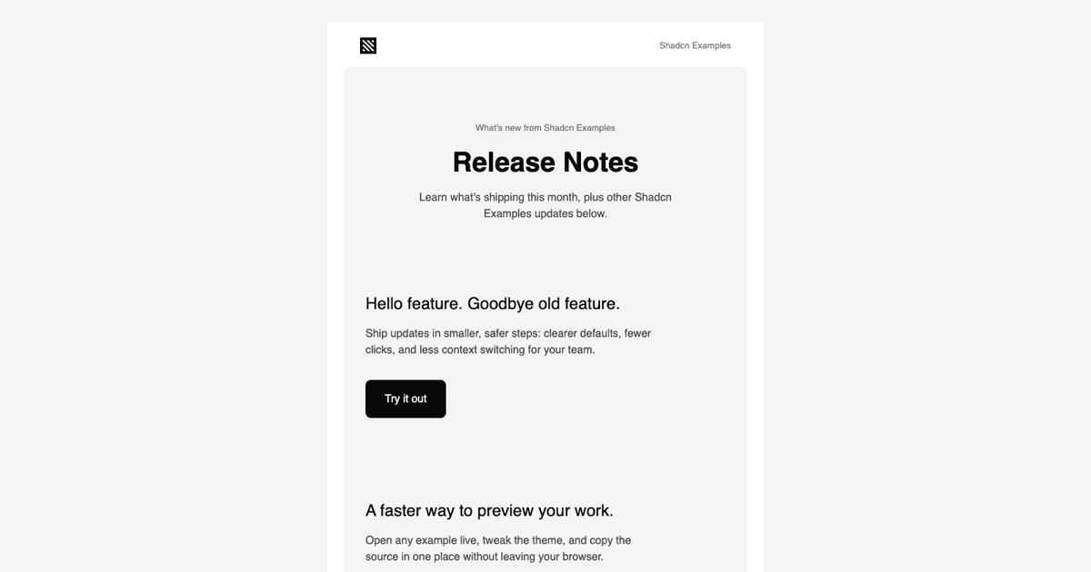
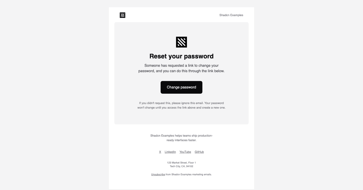
The React template is matched by a Vuejs version built with vue-email on shadcn-vue and a Svelte version built with svelte-email alongside shadcn-svelte, both with the same props and the same card, tiles, and summary structure. Pro members can copy the source from the code tab or install it with the shadcn CLI command above the preview.