

The First Email a New User Reads
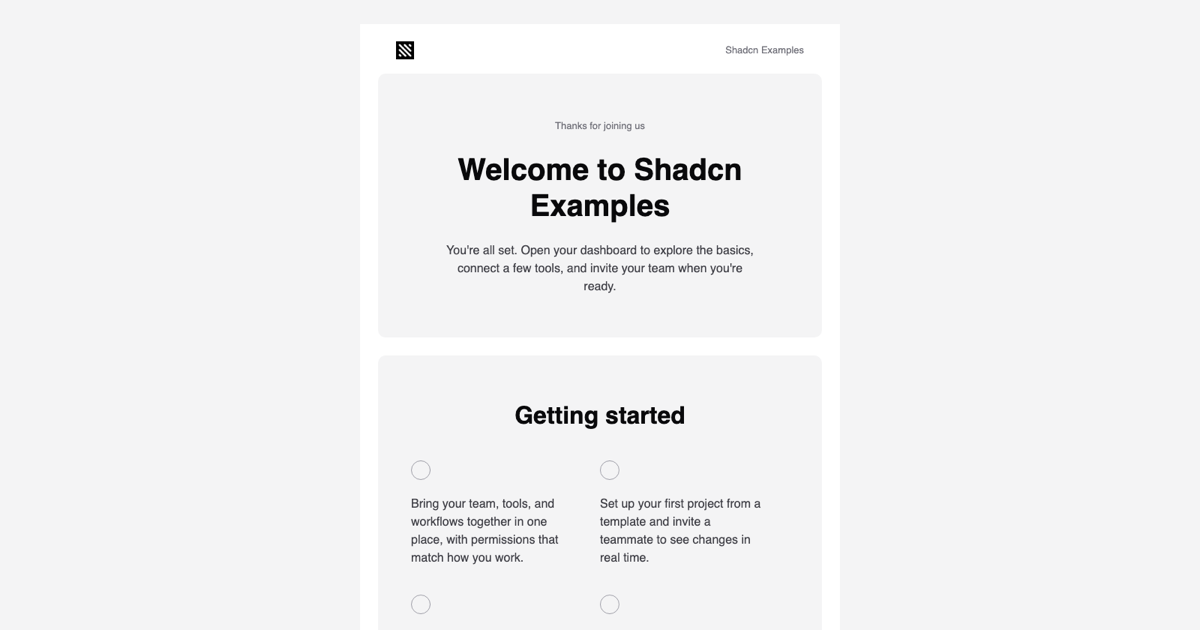
The Welcome Email Template is an onboarding email block sent right after sign-up. It opens with a hero screenshot and a Welcome to your company headline, walks the reader through four getting-started steps, highlights two features side by side, and ends with a Go to Dashboard call to action. It is part of the email templates collection and is the inbox counterpart of the onboarding flows and waitlists blocks on the site.
A welcome message sets expectations for the whole relationship, so this template keeps the tone practical: one sentence of thanks, then concrete next actions with buttons that deep-link into the product. Three separate calls to action (Open dashboard, Explore features, Go to Dashboard) all take the url prop, which makes the first-session path hard to miss.
Sections and Components
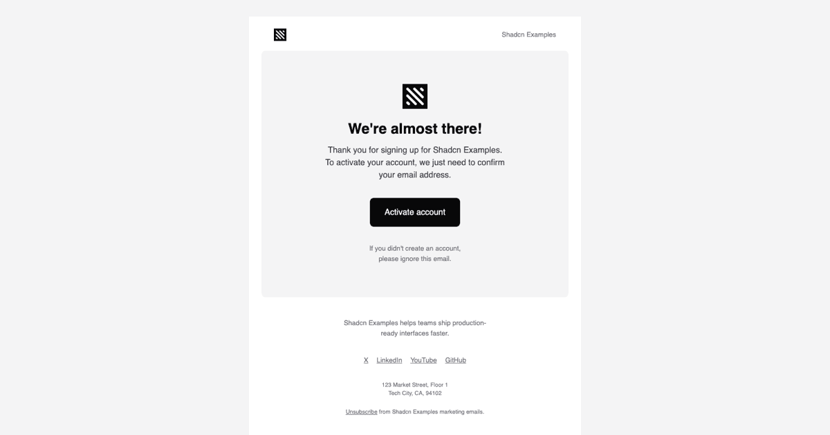
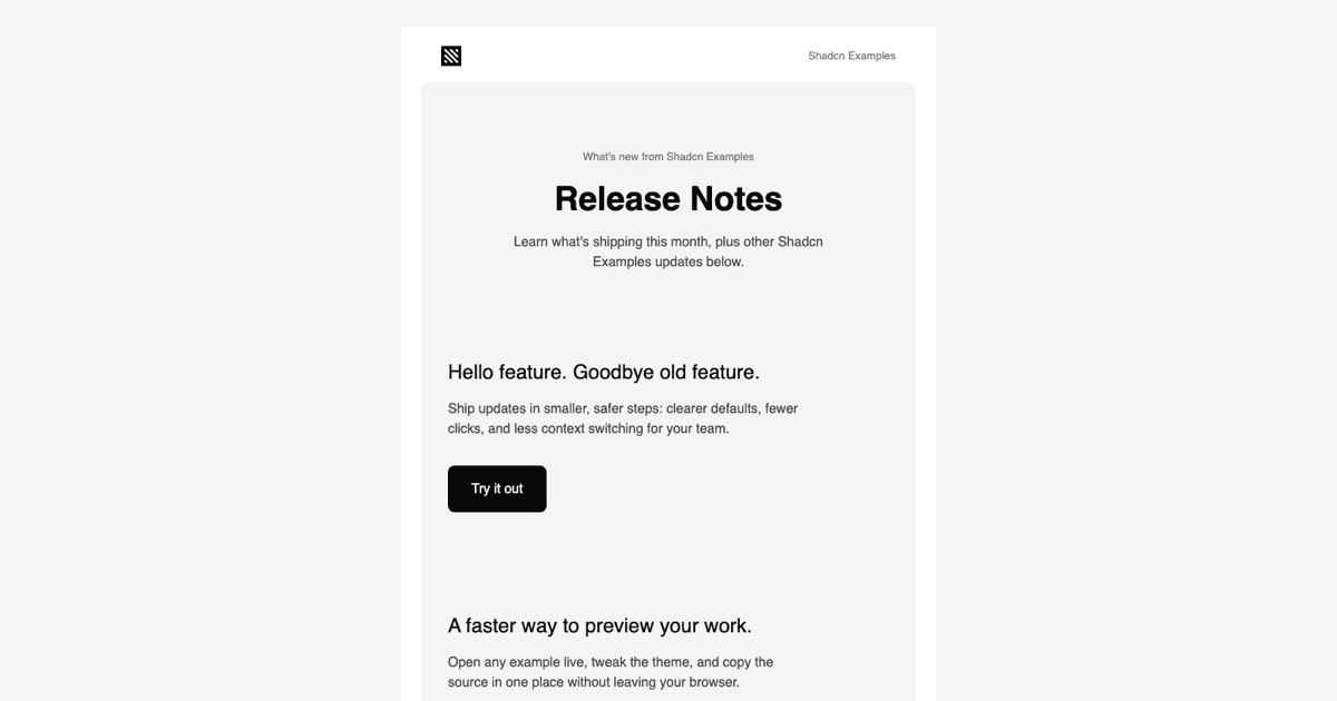
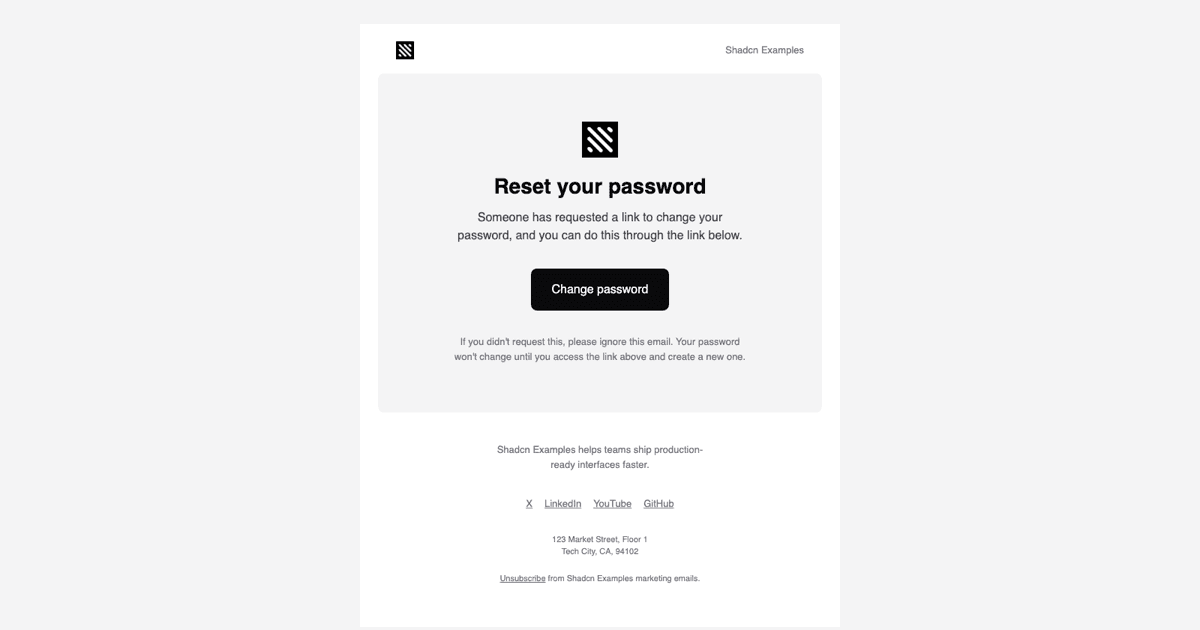
WelcomeEmail takes companyName and url and is built from Html, Head, Body, Container, Section, Row, Column, Heading, Text, Button, Img, Link, and Preview out of @react-email/components. Inside a 640px Container there are five rounded cards: the hero with a full-width image, a Getting started card with a second image and a two-by-two grid of bullets, a Some new things card with two image columns, a dark logo tile with the closing headline and button, and the shared footer with text social links, a postal address, and an Unsubscribe link.
The bullet grid is produced by a small WelcomeBulletCell component that renders a hollow circle marker and a paragraph inside a half-width Column. The four texts live in a gettingStarted array at the top of the file, so rewriting the steps is a matter of editing strings rather than JSX.
Responsive Columns Without Flexbox
Email clients do not support flexbox or grid reliably, so the two-column areas use Row and Column, which render as real table cells. On phones the mobile:!block, mobile:!w-full, and mobile:!max-w-full utilities turn each Column into a stacked block and let the 280px images grow to the full width, while mobile:pr-0 and mobile:mb-8 fix the gutters. These variants are emitted as media queries in the document head by the react-email Tailwind wrapper.
The desktop layout keeps the pairs side by side with w-1/2 and small pr-2.5 or pl-2.5 gaps, and the hero and getting-started images are capped at 600px so they never exceed the card. Because the breakpoint is defined once in theme.ts as mobile up to 600px, every card switches at the same width.
Theme, Fonts, and Brand Assets
theme.ts declares the palette the Tailwind component compiles against: bg, bg-2, fg, fg-2, fg-3, fg-inverted, and a stroke-strong border color for the bullet markers, all taken from the Shadcn UI zinc scale, plus a sans font stack. Utilities such as bg-fg, rounded-[10px], and text-[40px] become inline styles at render time, and theme-fonts.tsx loads Inter 400 and 600 through the Font component with Helvetica and Arial fallbacks.
Images are referenced from NEXT_PUBLIC_BASE_URL, so swap the sample screenshots (preview, tasks, playground, profile page) for your own product shots at the same widths, replace the logo files, and update the footer description, social links array, and address. The copy and colors then follow your brand without touching the layout.
Sending It and Using Other Frameworks
page.tsx renders WelcomeEmail with its PreviewProps on the server and previews the HTML in an iframe via srcDoc, which is what this page shows. In your app, call render after the account is created, pass the dashboard URL as url, and send the result with Resend or an SMTP transport such as Nodemailer. Because the template is one component, you can also queue it from a background job with the same props.
The React build is joined by a Vuejs version using vue-email on top of shadcn-vue and a Svelte version using svelte-email beside shadcn-svelte, each keeping the five-card structure and the responsive columns. Pro members can copy the code from the code tab or install the template, theme, and font files with the shadcn CLI command above the preview.