

Confirming a Paid Plan by Email
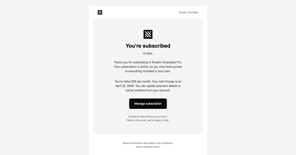
The Subscription Confirmation Email Template is the receipt-style message a customer gets right after starting a paid plan. It greets the user by name, confirms which plan is active, spells out the price, billing cycle, and next charge date, and links to a Manage subscription page. It is part of the email templates collection and closes the loop that begins on the pricing tables and checkout pages blocks.
A good confirmation reduces support tickets and chargebacks: the customer sees exactly what they will pay and when, and learns that payment details can be updated or the plan cancelled from the account area. The template keeps that information in two short paragraphs so it is easy to scan on a phone.
Seven Props Instead of Hard-Coded Copy
SubscriptionConfirmationEmail accepts companyName, url, userName, planName, planPrice, cycleLabel, and nextBillingDate. They are interpolated into the Preview line, the greeting, the plan sentence, and the billing sentence, so the same component serves monthly and yearly plans, different currencies, and any plan name without branching in the markup. PreviewProps ships sample values (Alex, Pro, $29 per month, April 22, 2026) for the live preview.
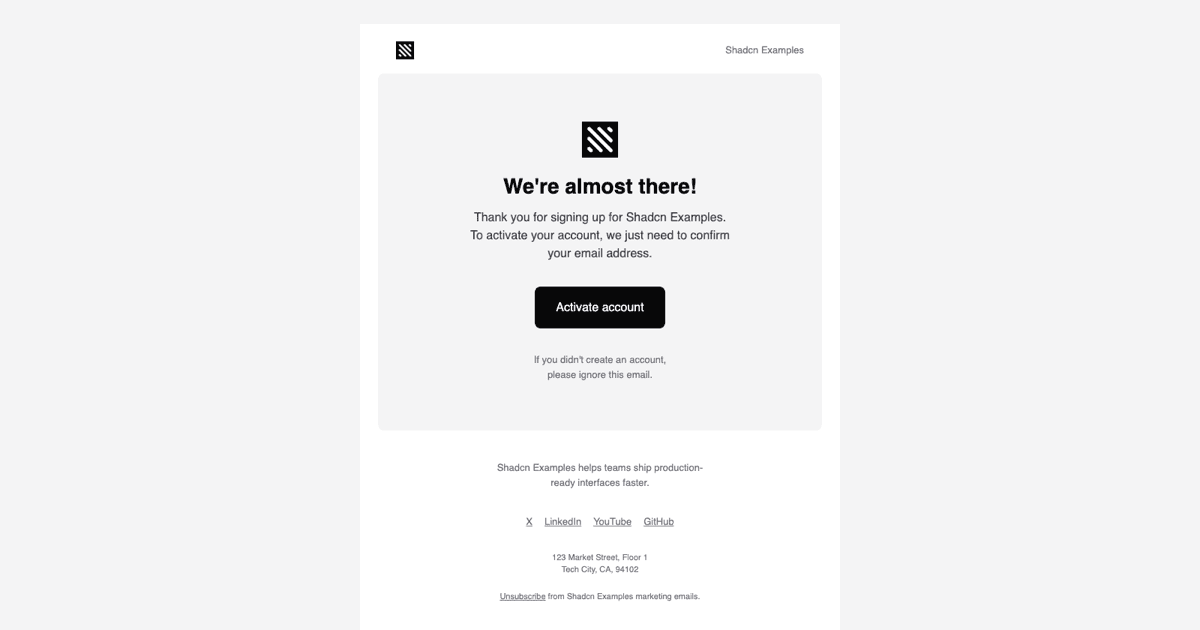
Everything else is composed from @react-email/components: Html, Head, Body, Container, Section, Row, Column, Heading, Text, Button, Img, Link, and Preview. A 640px Container holds a header row with the logo and company name, a rounded card with the You're subscribed Heading, the two paragraphs, the Button, and a support note inviting the reader to reply, followed by the shared footer with text social links, an address, and an Unsubscribe link.
Feeding Real Billing Data
In production you render this component from the webhook or server action that runs after a successful payment. With Paddle, Stripe, or Lemon Squeezy, read the plan name, unit price, billing interval, and next billing date from the subscription object, format the price and date for the customer's locale, and pass them as props. The url prop should point at your billing or account page so the Manage subscription button lands where changes can actually be made.
Send the rendered HTML through Resend, Nodemailer, or your provider of choice. page.tsx in this example shows the render call from @react-email/components and previews the result in an iframe with srcDoc, which is the same HTML your customers receive.
Tailwind Theme and Mobile Layout
Classes are compiled by the react-email Tailwind wrapper against theme.ts, which defines bg, bg-2, fg, fg-2, fg-3, and fg-inverted from the Shadcn UI zinc palette, a sans font stack, and a mobile screen for widths up to 600px. Utilities such as bg-fg, text-fg-inverted, rounded-lg, text-[28px], and max-w-[380px] are inlined as style attributes, while mobile:px-6 and mobile:py-12 are emitted as media queries so the card tightens its padding on phones.
theme-fonts.tsx loads Inter at 400 and 600 with Helvetica and Arial fallbacks through the Font component, matching the rest of the collection. Brand changes happen in the theme object and the logo path; the component itself stays untouched.
Extending the Template and Framework Versions
Typical additions are a small line-item table for taxes or discounts, a secondary Link to an invoice PDF, and a sentence about the trial end date when a trial converts. Because Row and Column render real table cells, a two-column price breakdown fits naturally under the billing paragraph without breaking in Outlook.
The React version is accompanied by a Vuejs build using vue-email with shadcn-vue and a Svelte build using svelte-email with shadcn-svelte, both exposing the same seven props and layout. Pro members can copy the source from the code tab or install it with the shadcn CLI command above the preview.