

A Newsletter Block for Release Notes
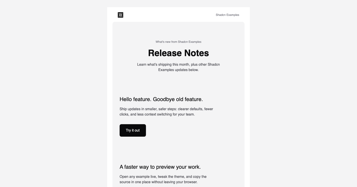
The Feature Announcement Email Template is a marketing email block for monthly release notes and product update newsletters. Where a transactional message has one job, this layout carries several stories: a Release Notes hero, full-width feature cards with screenshots, a list of smaller highlights, and a final push to the dashboard. It is written with react-email components and styled through the react-email Tailwind wrapper, so the whole message stays a typed React component.
The template sits in the email templates collection and is the email counterpart of the changelog pages and updates pages blocks, which means you can publish a release on the site and announce it with the same visual language in the inbox.
The Reusable FeatureBlock Component
Most of the body is built from a local FeatureBlock component that takes imageUrl, ctaUrl, title, and body. It renders a full-width Img capped at 592px with rounded corners, a 24px title, a short paragraph limited to 420px for comfortable line length, and a Try it out Button. Because the block is a plain function, adding a fourth or fifth feature is one more JSX element with different props rather than a copy of fifty lines of table markup.
The hero Section stacks a What's new label, the Release Notes Heading at 40px, and an intro sentence, then renders two FeatureBlocks with a large gap between them. A third FeatureBlock appears further down in its own rounded card, which shows how the same component reads well both inside a busy section and on its own.
Highlights Rows and the Dashboard CTA
The New ways to work Section uses Row and Column to place a 48px icon beside a title, a description, and a Read more Link, repeated for two highlights. Column widths are fixed with w-14 for the icon and w-full for the text so the alignment holds in clients without modern CSS support, and the mobile:pr-5 variant tightens the gutter on phones.
The closing card inverts the palette for emphasis: a small square with the light logo on a dark background, a 28px two-line headline, and a Go to Dashboard Button. The footer repeats the pattern from the other templates in the collection, a short company line, text social links from a small array, the postal address, and an Unsubscribe Link, so every message you send shares the same ending.
Theme, Fonts, and the Mobile Breakpoint
theme.ts declares the Tailwind config the wrapper compiles against: bg, bg-2, fg, fg-2, fg-3, and fg-inverted colors taken from the Shadcn UI zinc scale, a sans font family, and a mobile screen for widths up to 600px. At render time classes such as bg-bg-2, rounded-[10px], and text-[32px] become inline styles, while mobile:px-4, mobile:py-10, and mobile:mb-2 are written as media queries in the head, giving phones tighter padding and spacing without a second template.
theme-fonts.tsx registers Inter at 400 and 600 through the Font component with Helvetica and Arial fallbacks. If your brand uses another typeface, change the url and fontFamily there and update the fontFamily entry in theme.ts; the text utilities in the template do not need to change.
Plugging It Into Your Sending Pipeline
page.tsx renders FeatureAnnouncementEmail with its PreviewProps on the server and shows the HTML in an iframe via srcDoc, so the preview on this page matches what subscribers receive. For real campaigns, call render in a job or route handler, set companyName and url from your data, and pass the output to Resend or your SMTP provider. Screenshots are loaded from NEXT_PUBLIC_BASE_URL, so host the feature images on a public URL and swap the sample paths in each FeatureBlock.
The block is implemented in React here, and the same newsletter layout also ships for Vuejs with vue-email on top of shadcn-vue and for Svelte with svelte-email next to shadcn-svelte. Pro members get the full source in the code tab and a shadcn CLI install command that copies the template, theme, and font files into the project.