

Code and Link in One Verification Email
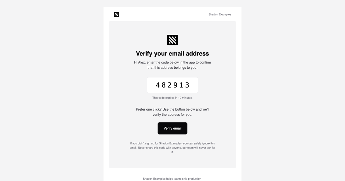
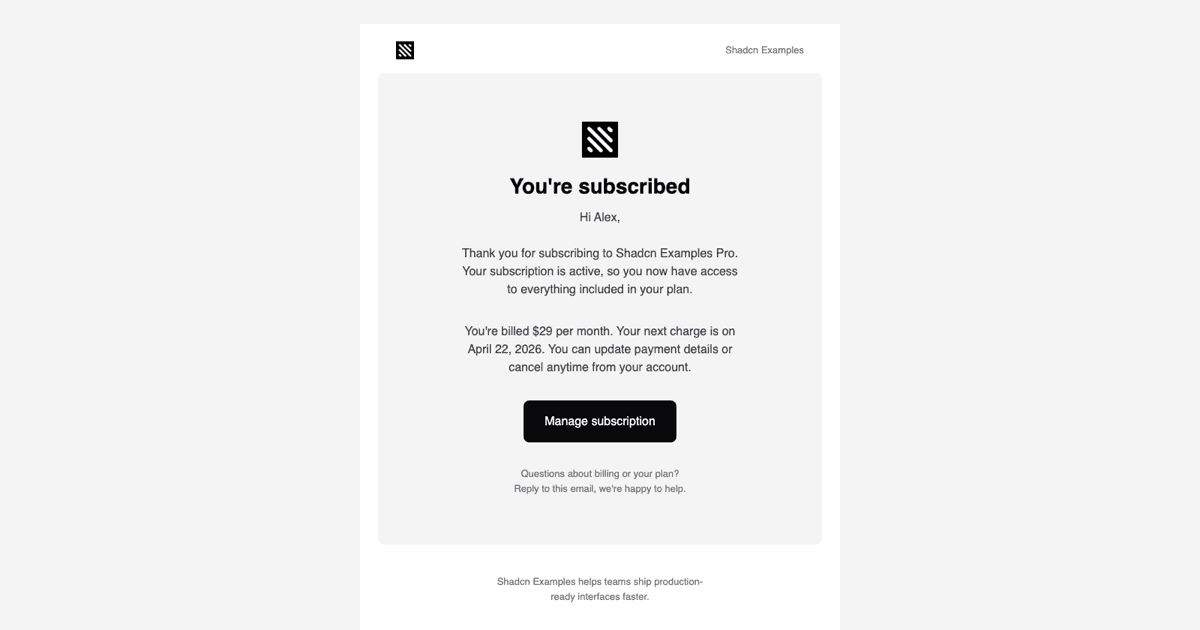
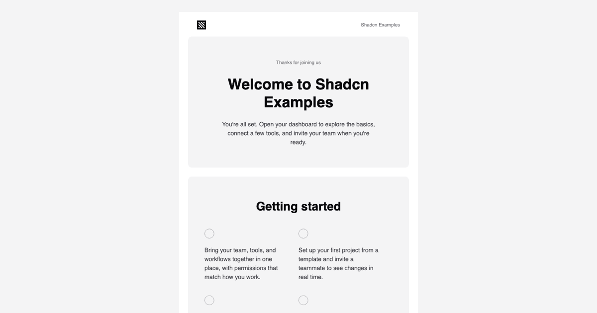
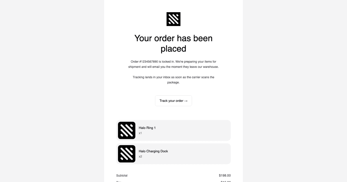
The Verify Email Template is a transactional email block for confirming that a newly entered address really belongs to the user. Unlike a plain activation message it offers two paths: a six-digit one-time code displayed in a bordered box for people who verify inside the app, and a Verify email button for people who prefer a single click. It lives in the email templates collection and is the inbox half of the two step verification screens on the site.
Showing the code prominently matters on mobile, where users often read the email on the same device they are signing up on and copy the digits back into a form. The subject preview starts with the code itself, so many clients display it in the inbox list before the message is even opened.
Props and Structure
VerifyEmail accepts companyName, userName, code, url, and expiresIn. The code is rendered in a monospace font at 32px with 8px letter spacing inside a white, zinc-bordered box, followed by a This code expires in expiresIn line, and the url prop powers the button. The component is composed from Html, Head, Body, Container, Section, Row, Column, Heading, Text, Button, Img, Link, and Preview out of @react-email/components.
The Container is capped at 640px and holds the familiar three-part layout from the rest of the collection: a header row with the logo and company name, a rounded card with the Verify your email address Heading, the greeting, the code box, the button, and a security note, and a footer with a short company line, text social links, and a postal address. Because verification is an account notification, the footer states that it cannot be unsubscribed from instead of offering an Unsubscribe link.
Security Copy That Protects Users
The closing note tells readers that they can ignore the message if they did not sign up and that the company will never ask for the code, which is the standard defense against phishing attempts that reuse legitimate emails. Keep that sentence when you adapt the template, and keep the expiry short on the backend; ten minutes is the sample value in PreviewProps.
Generate the code and the tokenized url in the same server action or route handler that creates the pending account, pass them as props, and render the component with render from @react-email/components. page.tsx in this example shows that call and previews the HTML in an iframe through srcDoc, so what you see on this page is what the user receives.
Styling With the Tailwind Wrapper
theme.ts defines the palette the react-email Tailwind component compiles against: bg, bg-2, fg, fg-2, fg-3, fg-inverted, and a stroke border color, all from the Shadcn UI zinc scale, plus sans and mono font families and a mobile screen for widths up to 600px. Utilities such as border-stroke, rounded-lg, font-mono, tracking-[8px], and text-[32px] are inlined as style attributes at render time, and mobile:px-6 and mobile:py-12 are written as media queries so the card tightens on phones.
theme-fonts.tsx loads Inter at 400 and 600 with Helvetica and Arial fallbacks through the Font component. The code box falls back to the system monospace stack, which every client has, so the digits stay aligned even where web fonts are blocked.
Sending, Customizing, and Framework Versions
Send the rendered HTML with Resend, Nodemailer, or any SMTP provider. For a code-only flow, delete the Button Section and the sentence above it; for a link-only flow, remove the code box and pass an empty string as code. You can also add the requesting device or location under the greeting if your product shows that context elsewhere.
The React template shown here is matched by a Vuejs version built with vue-email on shadcn-vue and a Svelte version built with svelte-email alongside shadcn-svelte, each exposing the same five props and the same code-plus-button layout. Pro members can copy the files from the code tab or install them with the shadcn CLI command above the preview.