

Why a Dedicated Password Reset Email Matters
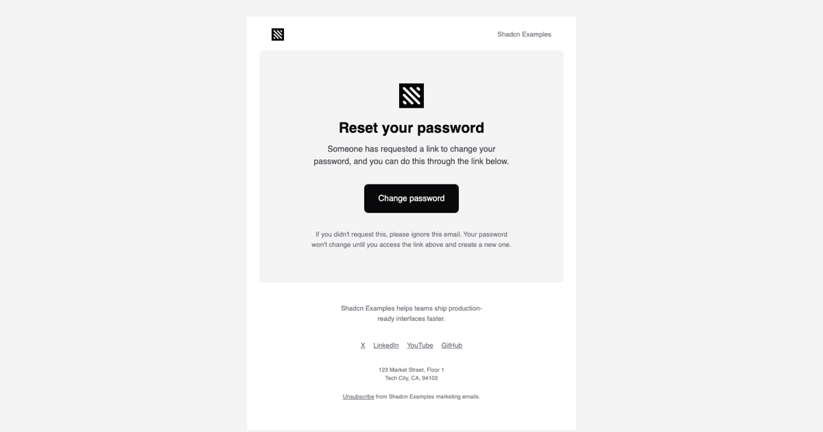
The Password Reset Email Template is the transactional block that answers a forgot-password request: it confirms that someone asked to change the password, hands over a single Change password button, and reassures the reader that nothing changes unless they follow the link. It is part of the email templates collection and is the natural partner of the login pages and two step verification blocks on the site.
Clear wording is a security feature here. The template says a link was requested rather than implying the account is at risk, and it states that the password stays the same until the reader opens the link and creates a new one, so a message triggered by a stranger does not cause panic or accidental changes.
Components and Markup
PasswordResetEmail is a single component with companyName and url props, assembled from Html, Head, Body, Container, Section, Row, Column, Heading, Text, Button, Img, Link, and Preview out of @react-email/components. The Preview text reads Reset your company password, the Container is limited to 640px, and three Sections follow: a header row with the logo and company name, a rounded card with a centered logo, the Reset your password Heading, an explanatory paragraph, the Button, and the reassurance note, then a footer with a short company line, text social links, a postal address, and an Unsubscribe link.
Row and Column produce the two-column header and the footer layout as real table cells, which is why the alignment holds in Outlook and older webmail clients that ignore flexbox and grid. Every visible string is either a prop or plain JSX text, so localizing or rewording the message is a matter of editing one file.
Sending the Reset Link Safely
The url prop should be the one-time reset link generated by your auth layer, for example the token URL produced by better-auth, Auth.js, or your own handler. Render the component on the server inside the request that issues the token, then send the HTML with Resend, Nodemailer, or any SMTP provider; page.tsx in this example shows the render call and previews the output in an iframe with srcDoc.
Keep the token short-lived and single-use on the backend, and consider adding the request time or device to the paragraph under the heading if your product needs that context. The template itself never exposes anything beyond the link, which keeps the message safe to forward or log.
Styling Through the Tailwind Wrapper
All classes are compiled by the react-email Tailwind component against theme.ts, which defines bg, bg-2, fg, fg-2, fg-3, and fg-inverted from the Shadcn UI zinc palette, a sans font stack, and a mobile screen up to 600px. Utilities like bg-fg, rounded-lg, text-[28px], and max-w-[380px] are inlined into style attributes, and mobile:px-6 and mobile:py-12 become media queries in the document head so the card gets tighter padding on phones.
theme-fonts.tsx loads Inter at weights 400 and 600 through the Font component with Helvetica and Arial fallbacks, matching the other templates in the collection. Rebranding means changing the hex values in the theme object and the logo path; the component markup does not need to be touched.
Adapting the Template and Framework Versions
Common tweaks are swapping the headline, adding an expiry sentence such as This link expires in 30 minutes, and replacing the footer description, social links array, and address with your own. If you also need a plain-text alternative for deliverability, pass the same props to render with the plainText option and send both parts.
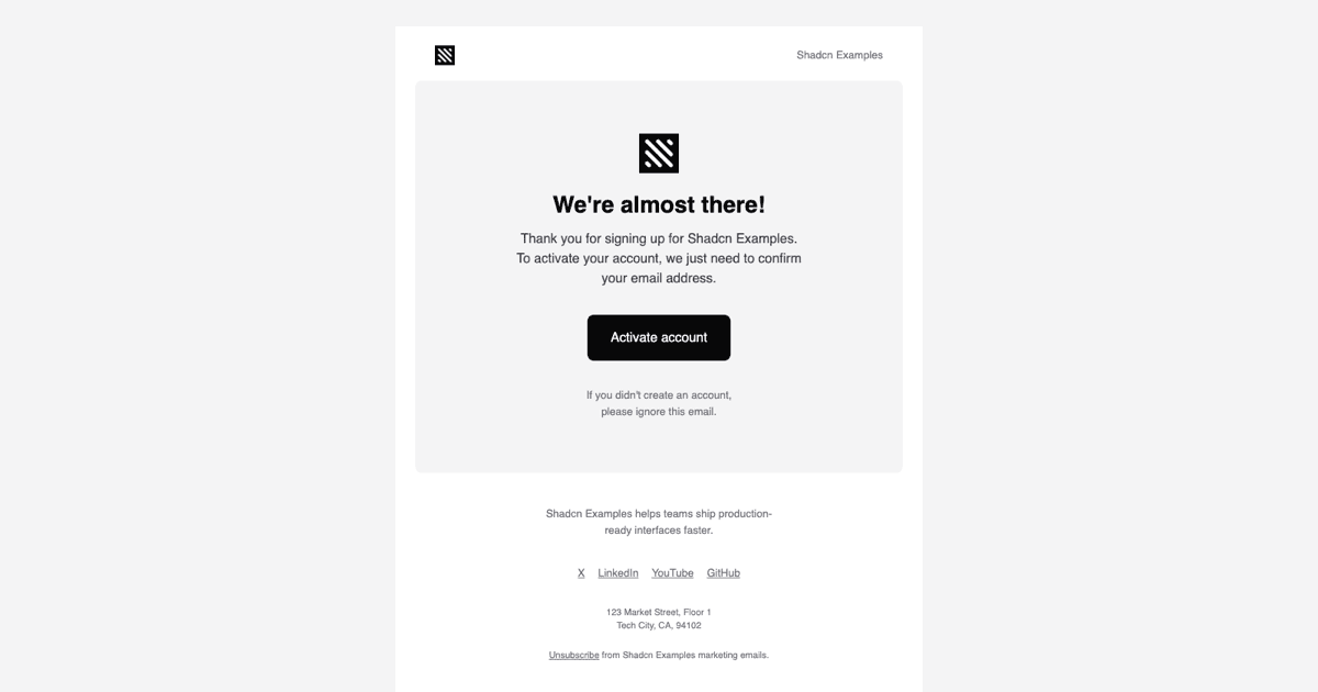
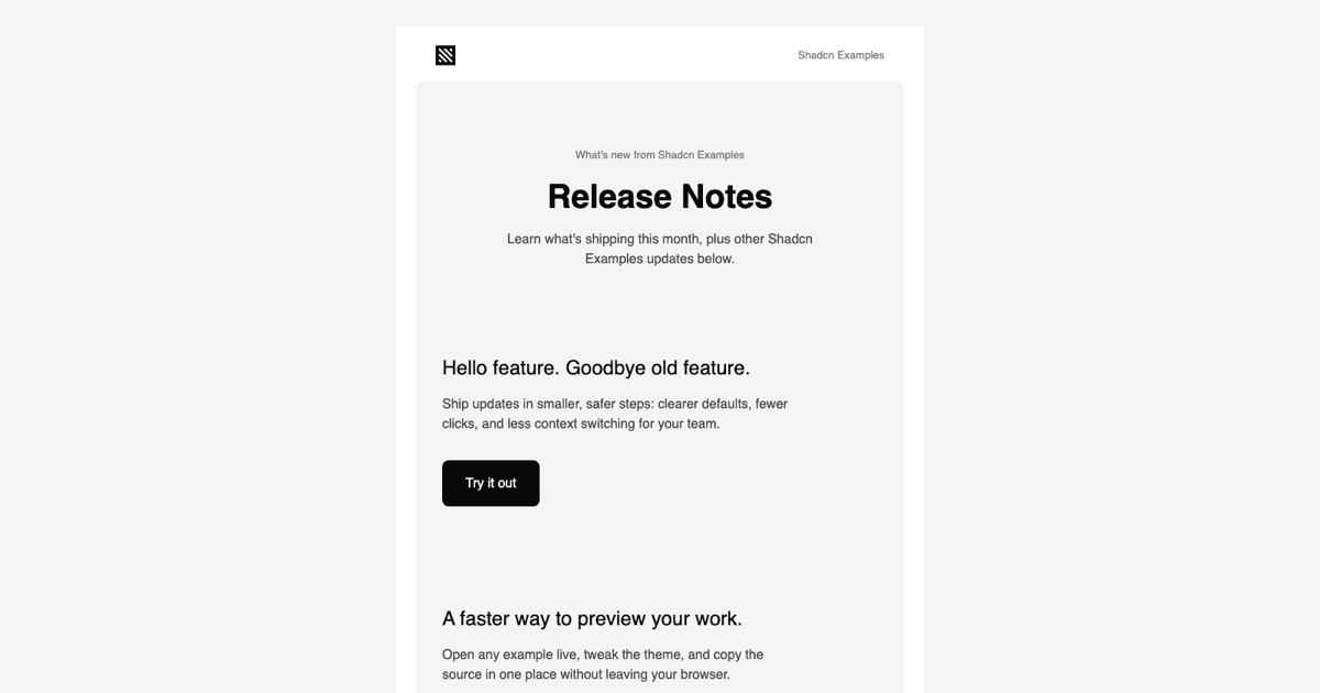
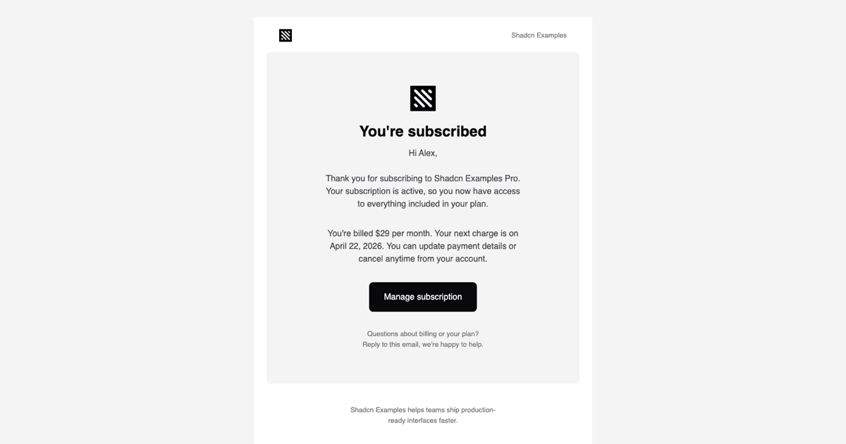
The React version shown here is joined by a Vuejs build using vue-email with shadcn-vue and a Svelte build using svelte-email with shadcn-svelte, each keeping the same header, card, button, and footer structure. Pro members can copy the source from the code tab or install the files with the shadcn CLI command above the preview.