

A CRM Overview Built From Shadcn UI Blocks
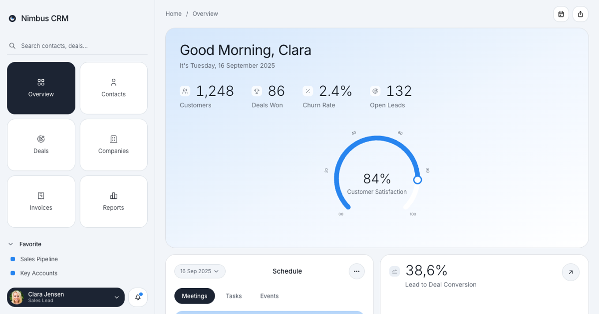
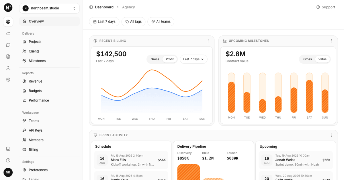
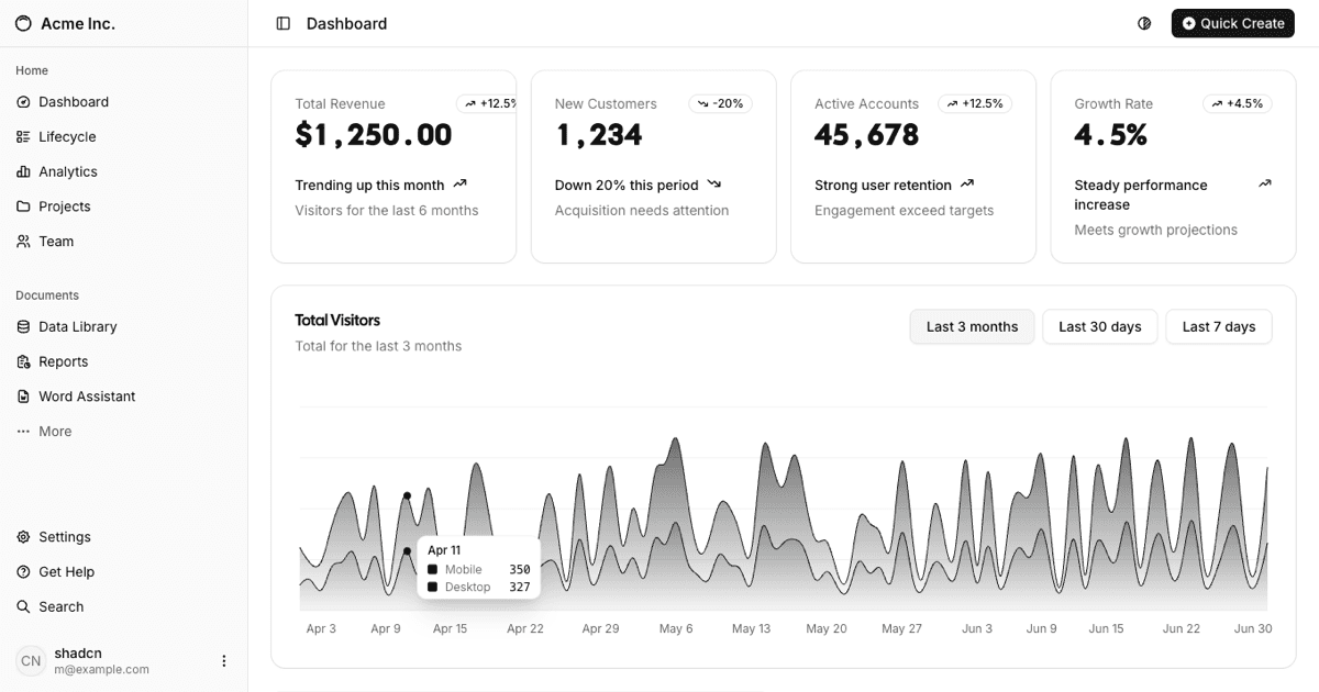
The CRM Admin Dashboard is a full-page Shadcn UI block for sales and customer success teams: a greeting hero with headline metrics and a customer satisfaction gauge, a schedule panel with demo calls, tasks, and events, a lead to deal conversion trend, an account status breakdown, quick action tiles for renewals, tickets, leads, follow-ups, and invoices, and a customer accounts table. It belongs to the admin dashboards collection and shares its sidebar and card conventions with the other dashboards there.
The cool slate and blue palette is applied by overriding the standard shadcn CSS variables (background, card, primary, chart-1, sidebar) on the SidebarProvider, so every component still uses semantic classes such as bg-card, text-muted-foreground, and bg-chart-1. Dark mode is handled the same way with dark: variants of the same variables, and the user menu includes a light and dark toggle powered by next-themes.
Sidebar With Tile Navigation
The left rail is the Shadcn UI Sidebar in offcanvas mode. Instead of a vertical menu it opens with a search field and a two-column grid of square tiles (Overview, Contacts, Deals, Companies, Invoices, Reports) where the active tile uses bg-primary. Below the tiles two Collapsible groups, Favorite and Workspace, use SidebarGroupLabel as the trigger: favorites (Sales Pipeline, Key Accounts, Quarterly Targets) are plain rows with a blue square marker and workspace items are bordered buttons hanging off a thin vertical guide line.
The footer holds a NavUser dropdown rendered as a dark rounded card with avatar, name, role, and chevron, plus a notifications bell that opens a Popover with recent CRM activity, unread dots, and a mark all read action. On screens below the xl breakpoint the rail collapses and a SidebarTrigger appears in the header next to the Home / Overview Breadcrumb.
Hero Metrics and the Satisfaction Gauge
The hero card is a soft blue gradient with a large Good Morning, Clara heading, the current date, and four headline stats rendered as a definition list: Customers, Deals Won, Churn Rate, and Open Leads, each with a small icon chip and a light figure. On mobile the stats fall into a two-column grid; on wider screens they sit in a single row beside the gauge.
The gauge is a hand-written SVG rather than a chart library: a 270 degree track from bottom-left to bottom-right, a blue progress arc computed from the value, a knob at the end, and tick labels 00 to 100 that rotate along the arc. The percentage and the Customer Satisfaction label are absolutely centered over it, and the figure scales with its container.
Schedule, Conversion Trend, and Account Status
The Schedule card combines a date dropdown, a pill Tabs list for Meetings, Tasks, and Events, and stacked item cards; the first item is highlighted with a blue gradient and each shows a title, subtitle, platform and time Badges, and an Avatar group. The conversion card prints 38,6% Lead to Deal Conversion with a Recharts AreaChart: a linear blue line with a faint gradient fill, month ticks from Apr to Sep, a dashed ReferenceLine at the average, and a ChartTooltip from the shadcn chart primitives.
Account Status is built from plain flex columns: three bars (Enterprise, Business, Trial) sized from their percentages, colored with chart-1, chart-2, and chart-3, with blurred percentage bubbles floating above them and the labels inside the bars. Under the conversion and status cards five quick stat tiles (Renewals Due, Open Tickets, New Leads, Follow-ups, Overdue Invoices) show a count and an action link with a round arrow button.
Customer Table, Responsiveness, and Framework Versions
Customer Accounts is a Shadcn UI Table with a rounded muted header row and columns for name with avatar, customer ID, company, email, status, last contact, and owner, plus a per-row DropdownMenu (view account, log activity, create deal, archive). The search field filters rows live, and the options menu sorts by recent contact, name, or company, toggles statuses, and exports the visible rows as CSV. The table sits in an overflow-x-auto wrapper, so on phones it scrolls horizontally while the cards above stack into a single column.
Everything is data-driven from a local data.json, so swapping in your own accounts, meetings, and conversion series is a matter of editing that file. The block is published for React as shown here and also for Vuejs on shadcn-vue and for Svelte on shadcn-svelte, keeping the same sidebar, hero, card grid, and table structure. Premium members can copy the source from the code tab or install it with the shadcn CLI command above the preview.