

A Store Overview in One Shadcn UI Block
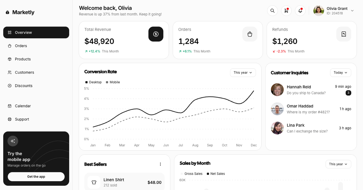
The E-Commerce Admin Dashboard is a full-page Shadcn UI block for running an online store: a welcome header with search, cart, and notification popovers, three KPI cards for revenue, orders, and refunds, a conversion rate line chart, a customer inquiries list, a best sellers list, a sales by month bar chart, and an inventory table. It belongs to the admin dashboards collection and follows the same sidebar and card conventions as the other dashboards there, so it can sit next to the product lists and checkout pages blocks in a storefront admin.
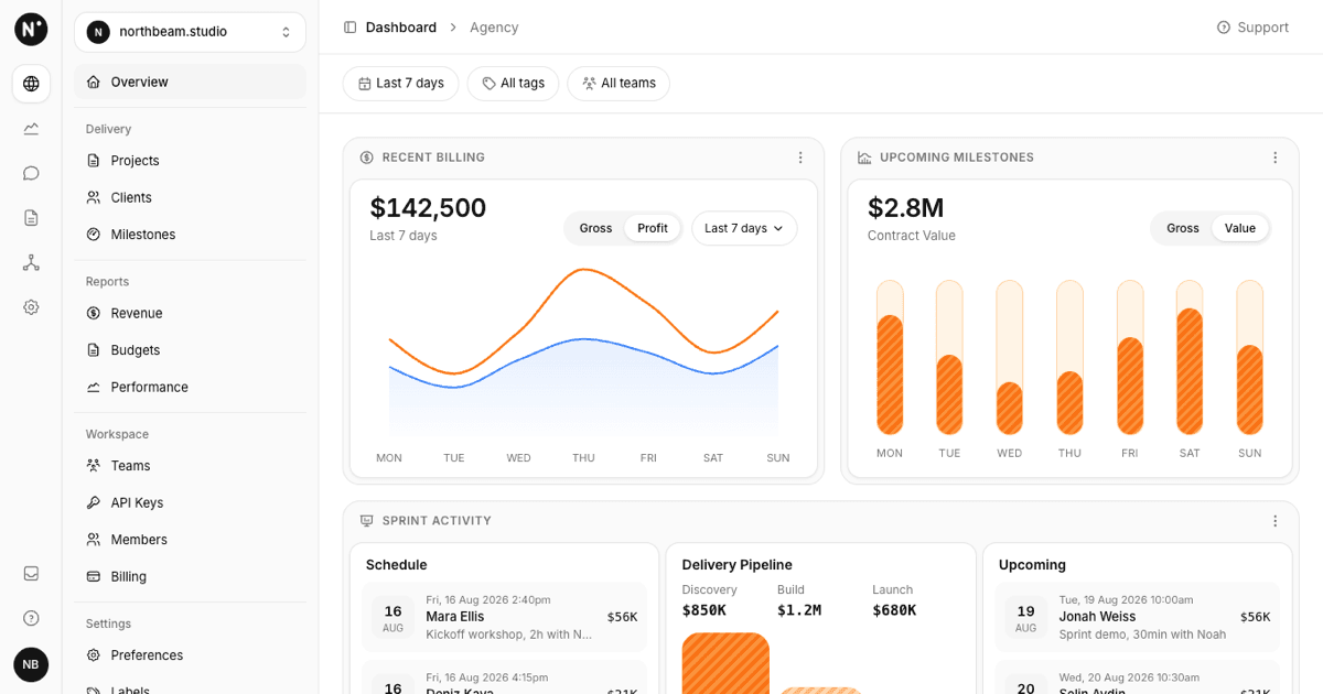
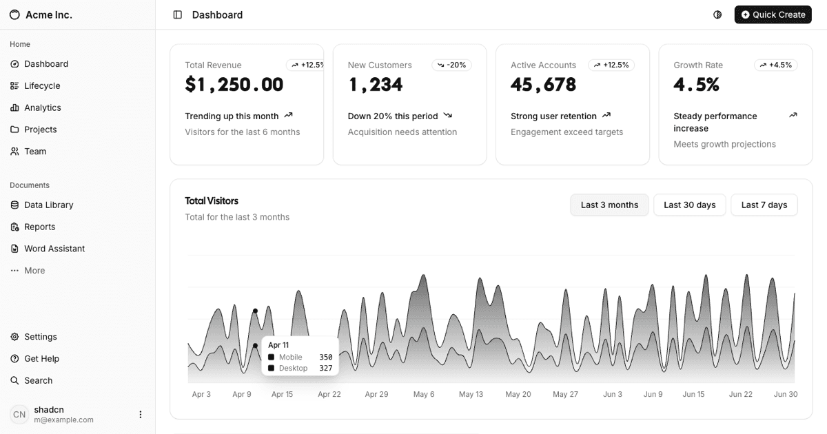
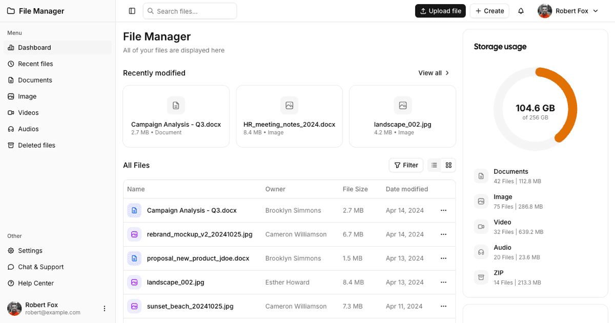
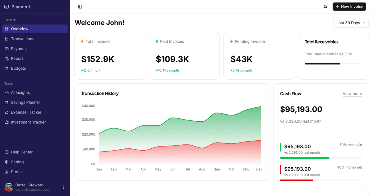
Unlike the themed dashboards in the collection it uses the default shadcn palette: black primary buttons and bars, neutral grays, white cards on a bg-muted/40 page. Nothing overrides CSS variables, so the block inherits whatever theme your project defines and flips to dark mode with it.
Sidebar, Promo Card, and Header Actions
The left rail is the Shadcn UI Sidebar in offcanvas mode with a bag-shaped logo and the Marketly wordmark, a primary menu (Overview, Orders, Products, Customers, Discounts) where the active item is a filled bg-primary pill, a secondary menu (Calendar, Support, Settings), and a black promo card at the bottom that advertises the mobile app with a sparkles icon and a white Get the app button. Below the xl breakpoint the rail collapses and a SidebarTrigger appears next to the page title.
The header greets the store owner and shows growth copy, then three round outline buttons: search opens a Popover with an Input, cart opens a small order summary with a Checkout button, and notifications opens a list of recent store events; red dots mark the cart and bell. The avatar block with name and ID opens a DropdownMenu with Profile, Settings, and Log out.
KPI Cards and the Conversion Chart
Three stat cards print Total Revenue, Orders, and Refunds with a 28px figure, a trend line that switches between a green arrow-up and a red arrow-down with the percentage and This Month label, and an icon tile on the right, black for the first card and muted for the others. The cards sit in a three-column grid that collapses to one column on narrow containers.
Conversion Rate is a Recharts LineChart inside the shadcn ChartContainer: a solid black Desktop line and a dashed gray Mobile line, a percentage Y axis from 0% to 5%, dashed horizontal grid lines, month ticks, a legend in the top left, a tooltip with both values, and a PeriodSelect in the header. Choosing This year, Last year, or Last 6 months swaps the series from data.json, so the filter is functional rather than decorative.
Inquiries, Best Sellers, and Sales by Month
Customer Inquiries lists conversations with Avatar, name, last message, relative time, and an unread Badge; its Today, This week, and All selector filters the rows by a when field. Best Sellers stacks four muted rows with a neutral ProductIcon tile standing in for the photo, the product name, units sold, and the price, plus a kebab DropdownMenu with view, sort, and export actions.
Sales by Month is a BarChart with paired bars per month: a light gray Gross Sales bar and a black Net Sales bar, both with fully rounded ends, a K formatted Y axis, a tooltip with currency values, a legend, and the same working period selector as the conversion chart. Every series is read from data.json, so plugging in real numbers is a data change only.
Inventory Table, Mobile Layout, and Framework Versions
Inventory is a Shadcn UI Table with a rounded muted header row and columns for product (icon tile and name), SKU, status with a colored dot (In Stock, Low Stock, Out of Stock), stock, price, and a per-row actions DropdownMenu. The header offers a black Add Product button, a Filter menu with status checkboxes that filters the rows live, and a sort selector (name, stock, price); the title shows the visible row count and the table scrolls horizontally inside its card on phones.
Grids use container queries on the @container/main wrapper, so the layout depends on the content width next to the sidebar: stat cards stack below 42rem and the two card rows stack below 56rem. The block ships in React as shown here and also for Vuejs on shadcn-vue and for Svelte on shadcn-svelte, keeping the same sidebar, cards, charts, and table. Premium members can copy the source from the code tab or install it with the shadcn CLI command above the preview.