

A Team Dashboard for Agencies and Product Teams
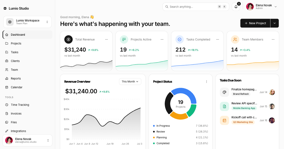
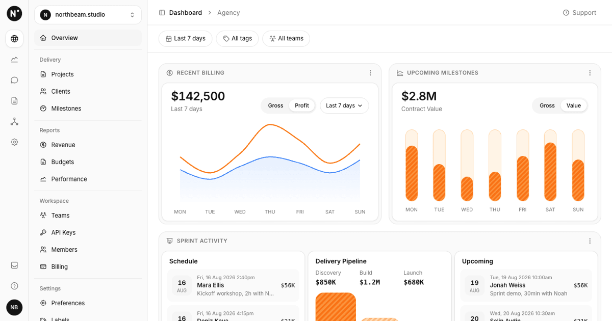
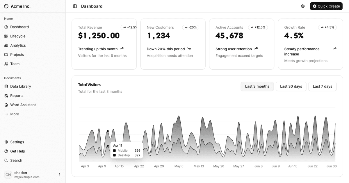
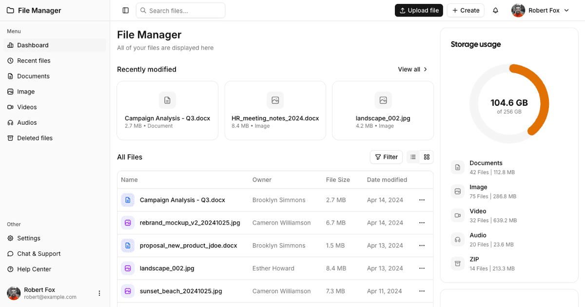
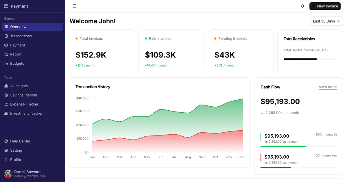
The Project Management Admin Dashboard is a full-page Shadcn UI block that answers the morning question of what is happening with the team: four KPI cards with sparklines, a revenue overview, a project status donut, tasks due soon, recent activity, upcoming deadlines, and a team workload chart. It belongs to the admin dashboards collection and pairs naturally with the kanban boards, task detail pages, and projects lists blocks.
It ships light by default in the standard shadcn palette: a black primary for buttons, the active nav item, and the main charts, neutral grays for surfaces, and categorical blue, emerald, and amber only where data needs separating. Nothing overrides CSS variables, so the block follows your globals.css theme, and the user menu includes a light and dark switch powered by next-themes.
Sidebar, Workspace Switcher, and Command Search
The left rail is the Shadcn UI Sidebar in offcanvas mode. Under the Lumio Studio logo sits a workspace switcher card (Lumio Workspace, Team Plan) that opens a DropdownMenu listing workspaces with a check mark and a Create workspace action. Navigation is grouped: Dashboard, Projects, Tasks, Clients, Team, Reports, Calendar, then Tools (Time Tracking, Invoices, Files, Integrations) and Settings (Workspace Settings, Billing, Activity Log, Help and Support) under small uppercase labels, with the active item marked by a left accent bar. The footer is a user card that opens profile, settings, theme, and log out.
The header has a Search anything button with a Cmd K hint that opens a CommandDialog with grouped results for projects, tasks, and people (the shortcut works too), a bell with an unread counter that opens a notifications Popover with mark-as-read, and the user dropdown. Below it, the greeting and the headline sit next to a New Project split button whose chevron opens new project, new task, and invite member.
KPI Cards With Sparklines and the Revenue Chart
Each stat card (Total Revenue, Projects Active, Tasks Completed, Team Members) shows a tinted round icon, the label, a kebab menu with view, compare, and export actions, the value with a green delta, vs last month, and a small Recharts AreaChart sparkline (black for revenue, emerald, blue, and amber for the others) that bleeds to the bottom edge. The four cards sit in a responsive grid that goes from one to two to four columns with container queries.
Revenue Overview is an AreaChart with a black line over a soft gradient fill, dashed grid, a $k formatted Y axis, and a tooltip; its This Month selector is a working radio menu that swaps the series, total, and delta between This Month, Last Month, and This Quarter from data.json.
Project Status, Tasks Due, Activity, and Deadlines
Project Status is a PieChart donut with four segments (blue In Progress, black Review, amber Planning, emerald Completed), a centered label with the project count, and a legend with counts and percentages computed from the data; its menu offers view all, group by client, and export. Tasks Due Soon lists three tasks with a tinted icon tile, a project badge in the same tone, the due date, and the assignee avatar.
Recent Activity shows who did what with avatars, bold actor and target names, relative time, a small options menu, and a colored status dot per row. Upcoming Deadlines lists projects with their phase, a red due date, and days left. Every card ends with a View all link.
Team Workload, Responsiveness, and Framework Versions
Team Workload is a BarChart of utilization per person with percentage labels on top, a 0 to 100% axis, and a This Week selector that swaps between This Week, Last Week, and This Month. Like the other controls on the page it is wired up rather than decorative.
Layout uses container queries on the @container/main wrapper, so the grid depends on the content width next to the sidebar: one column on phones, two columns on tablets, and the three-column rows from the reference on wide screens; the sidebar becomes a drawer below the xl breakpoint. The block is published for React as shown here and also for Vuejs on shadcn-vue and for Svelte on shadcn-svelte. Premium members can copy the source from the code tab or install it with the shadcn CLI command above the preview.