

An Editorial Take on the Calendar
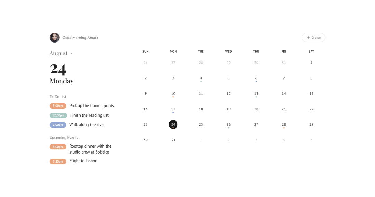
Most calendar blocks look like software. This one looks like a well set magazine page: no table borders, generous whitespace, a large two-digit day number, and serif type for the human parts, the weekday, the to-dos, the events. The structure is a simple two-column split centered on the screen, a narrow day summary on the left and the month grid breathing on the right, with the avatar and greeting sitting quietly in the top corner.
The restraint is the point. The grid draws no boxes, so two treatments do all the talking: a filled circle in the default theme color for the selected day, and small warm dots under the days that actually hold something.
Day Selection Drives Everything
Click any day in the grid and the left column follows: the oversized day number, the serif weekday name, the To-Do List, and the Upcoming Events all re-render for that date. Days with nothing planned get a quiet empty state instead of a blank hole, so the layout never collapses.
The month name at the top left is a real control too. It opens a dropdown of all twelve months, and switching months re-flows the grid, trims trailing weeks so short months do not drag empty rows, and resets the selection to the first day.
Dots That Mean Something
Every marker on the grid is earned. The dot under a day number is computed from the data: if a day has at least one to-do or event, it gets a dot, and if not, it stays clean. There are no decorative highlights pretending to be information, which keeps the calendar honest at a glance.
Because the dots derive from state rather than a hardcoded list, they react to the user. Add a to-do through the Create dialog and the dot appears under that day immediately; move to a month with no records and the grid empties out.
The Create Flow
The Create button in the top corner opens a Shadcn UI Dialog with a title, a time, and three pastel color swatches. Saving appends the to-do to the currently selected day, it appears in the list in the tone you picked, and the day earns its dot on the grid in the same render.
The month name is a control too: it opens a dropdown of all twelve months, and switching re-flows the grid, trims trailing weeks so short months do not drag empty rows, and resets the selection to the first day.
Fitting It Into Your Product
Grab the code from the Code tab or install the block with the shadcn CLI. Typography leans on your project's heading and serif stacks, and surfaces use theme tokens, so the block adapts to dark mode and to your palette with no extra work. On phones the columns stack, the grid tightens its spacing, and the day circles scale down while staying tappable.
If you need a denser, more application-like calendar, the event calendars category holds sidebar and multi-view variants. This minimal block also ships for Vuejs on shadcn-vue and for Svelte on shadcn-svelte with the same layout and interactions.